
 JanBask Training
Contents Index
Graphics in R - Introduction
Even to display a small line or dot on the CRT (Cathode Ray Tube) screen is a very difficult process. It seems very easy that cathode is emitted and bombards over the fluorescent screen and it glows. But it takes a lot of effort to direct the ray and control its frequency for the display of different colour over the screen. This controlling of ray before falling over the fluorescent screen is performed by various programming languages. Various algorithm and techniques are involved in the generation of graphics over the screen. Computer graphics is one of the most important achievements in its history, which will be required throughout the generation. R-programming is one such programming language. R has three graphical in r systems, namely:
- Standard Graphics Package
- Lattice Package
- Grammar-of-graphics Package or ggplot2
In this blog, our first point of interest will be the third package of graphic with R i.e. Grammar-of-graphics or ggplot2. After that, there will be an introduction to the construction of two plot and their type of changing technique. Then we will proceed to the multi-panel display through explaining Coordinate transformation. But before we start one very important point to be noted is that plot() is the main function in the graphics through R. It automatically produces simple plots for vectors, functions or data frames and has many customization options too.
Grammar-of-graphics Package or ggplot2
We can understand Grammar-of Graphics as a framework that goes through a set predefined path in which you have to describe the visualization or graphics in a particular structured manner. This description involves multiple aspects, component, multidimensional data, etc. This package of Grammar-of-Graphics was first proposed by Leland Wilkinson. The name of the book is “THE GRAMMAR OF GRAPHICS” and it is recommended to read this book if are interested in this topic
ggplot2 is one of the most powerful and tangible packages of R graphics. It was first proposed by Hadley Wickham for creating fantastic and elegant graphics. Syntax of ggplot2:
ggplot (diamonds, aes(x=carat), color="blue")
This ggplot2 divides the plot into three different fundamental parts:
Plot = Aesthetics + Geometry + Data.
They are described as follows:
- Data – The function always starts with data, which identifies how many dimensions you want to visualize
- Aesthetic – This attribute checks the required axes based on the data dimensions, the position of different data points in the plot. It can be also used to control colour, size, shape or height of bars, etc.
- Geometry – It defines the type graphics either histogram, box plot, density or dot plot, etc...
Apart from these three, there are some other attributes required in ggplot2, they are:
- Scale – It is used when a specific scale of the graph is required to be mention.
- Statistic – Used when one needs to show some statistical measure in the visualization like measures of central tendency, spread, confidence intervals, etc...
- Facet – Used when one needs to create subplot on certain data dimensions.
- Coordinate System – Used to tell that what kind of coordinate system is required in the visualization – either cartesian or polar.
Data Science Training - Using R and Python
- Detailed Coverage
- Best-in-class Content
- Prepared by Industry leaders
- Latest Technology Covered

Quick Plot
Quick Plot is a helper function denoted by qplot(). It can hide much of the complexities when creating standard graphs. It can be used to create the most common graph types. It does not expose the whole power of the ggplot2. But its can be used to create simple as well as most commonly used charts.
Below is the syntax of qplot():
qplot (X_coordinates, Y_coordinates, data=<123abc>, color=<red, blue, green, etc.), shape=<any geometry>, size=, alpha=, geom=, method=, formula=, facets=, xlim=, ylim=, xlab=, ylab=, main=, sub=)
Following are the description of those terms that were not discussed earlier:
- Alpha – It refers to the transparency of the object and expressed as fraction 0 to 1 as completely transparent to complete opaque respectively.
- xlab, ylab – It refers to the label that is to be specified to x and y-axis.
- xlim, ylim – It refers to the minimum and maximum limit of horizontal and vertical axes. It is a two-element
- x, y – It specifies the variables allocated to vertical and horizontal axes.
- Formula – This is used to employ more efficient smoothing algorithms.
- Main, Sub – To specify titles and subtitles.
Incremental Plot and its Construction
The incremental plot is nothing but a dynamic or time series plotting in which the visualization is customized automatically after every updating of the data. This type of plot build using various time series packages and different plotting system such as ts, zoo, xts, etc. and base R, lattice, etc.…
Following is an example of Incremental plotting:
library(ggplot2)

library(xts)

library(dygraphs)

 i_url <- <dataset>
l_url <- <dataset>

y.read <- function(url){

   dat <- read.table(url,header=TRUE,sep=",")

   df <- dat[,c(1,5)]

   df$Date <- as.Date(as.character(df$Date))

   return(df)}
i <- y.read(i_url)
l <- y.read(l_url)

ggplot(i,aes(Date,Close)) +

  geom_line(aes(color="i")) +

  geom_line(data=l,aes(color="l")) +

  labs(color="Legend") +

  scale_colour_manual("", breaks = c("i", "l"),

                          values = c("blue", "brown")) +

  ggtitle("Closing Stock Prices: I & Linkedin") +

  theme(plot.title = element_text(lineheight=.7, face="bold"))
Coordinate Transformation
We can transform this information to another informational collection with another CRS utilizing the spTransform function from the rgdal package
we utilize the Robinson projection. First, we have to locate the correct documentation.
newcrs <- CRS ("+proj=robin +datum=WGS84")
Now use it
rob <- spTransform(p, newcrs)
rob

## class       : SpatialPolygonsDataFrame

## features    : 12

## extent      : 471320.7, 536010.5, 5269709, 5345677  (xmin, xmax, ymin, ymax)

## crs         : +proj=robin +datum=WGS84 +ellps=WGS84 +towgs84=0,0,0

## variables   : 5

## names       : ID_1, NAME_1, ID_2,   NAME_2, AREA

## min values  : 1, Diekirch,    1, Capellen, 76

## max values  : 3, Luxembourg,   12, Wiltz, 312
After this transformation the units of geometry are no longer in degrees, instead, they are in the form of meters.
It is easy to transform vector data from lat/lon coordinate to planer or vice versa without loss of any precision. But it is not same with raster graph plot. A raster consists of rectangular cells of a similar size (regarding the units of the CRS; their genuine size may fluctuate). It can't transform cell by cell. Or maybe evaluates for the estimations of new cells must be made dependent on the qualities in the old cells. On the off chance that the qualities are class information, the 'closest neighbour' is commonly utilized. In any case a type of interpolation (for example 'bilinear').
Multipanel Display
The multipanel display is to put multiple graphs in a single plot by passing graphical parameters. There are four main approaches to multipanel layouts in R:
-
Grid Graphics - Where I think they exceed expectations is in exploratory data analysis. You may be capable to produce ten ggplot figures in the time it would take you to do likewise in base graphics. Data analysis includes a ton of exploratory data plotting, so try not to think little of the estimation of this. Base graphics sparkle with regards to plot customization. Data introduction for distribution regularly comprises of making profoundly tweaked plots customized to your particular circumstance.
-
Par() - The least difficult strategy in base graphics. Functions admirably for basic lattice designs where each panel is a similar size. Code for the same is given as follows:
max. temp # vector used for plotting
Sun Mon Tue Wed Thu Fri Sat

22  27 26  24 23 26  28

par (mfrow=c (1,2)) # set the plotting area into a 1*2 array

barplot (max. temp, main="Barplot")

pie (max. temp, main="Pie chart", radius=1)
Output:
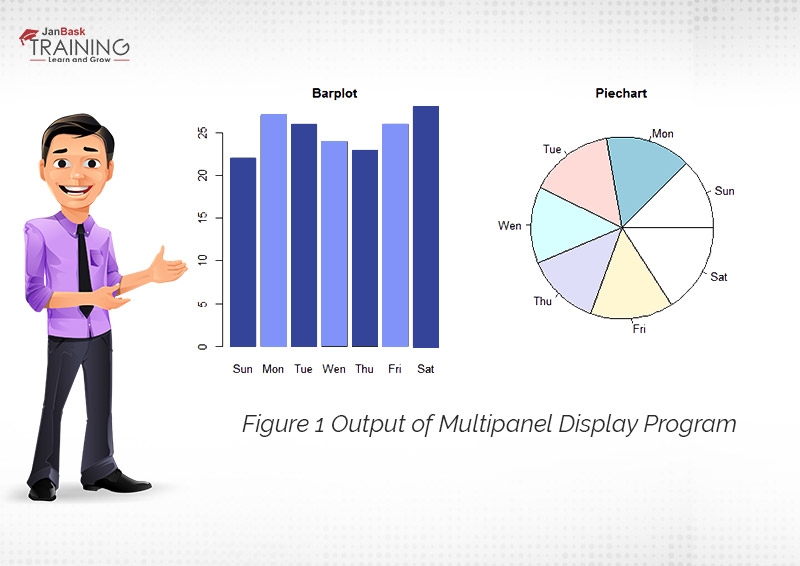
Figure 1 Output of Multipanel Display Program
- Layout () - Notwithstanding what you can do with par (mfrow), design () lets you consolidate panels.
- Split.screen() - Lets you indicate the co-ordinates of your panels. Panels never again must be basic ratios of one another.
Conclusion
At last, it is drawn out from the blog that R programming is one of the best modes of visualization of data as it consists of quick plot feature which helps create a common plot with much less complexity, on the other hand, it has incremental of dynamic or Time series based graph which can be used to visualize time series data. We have functions for the transformation of the coordinate and functions for multipanel displays. Hence Graphics in R could be the best option for plotting graphs in any type of data analysis.
Please leave query and comments in comment sections.




 Upcoming Class : December 4


