Just a moment...
Just a moment...
/*Responsive Media Queries Max 320px */ @media screen and (max-width: 320px) { .sed { width: 38px !important; height: 38px !important; font-size: 22px !important; line-height: 44px !important; } ul.mega-menulist li { padding: 4px 8px !important; } .td-txt .col-xs-7 { width: 78%; } #Course p.slider-cont.blue { font-size: 13px !important; } .mobilescreen span.cont { font-size: 15px !important; } .cert { font-size: 17px !important; padding-left: 0px; } .getcall-box button.buttonctadarkbtn.btn.btn-lg { width: 86% !important; } .callto { width: 48% !important; top: 16px !important; } nav.navbar .navbar-brand { left: -68px !important; top: 10px !important; } nav.navbar .navbar-brand img.logo { width: 60px !important; } .rgt-icon p.cont2.mb0 { line-height: 48px; font-size: 14px; } .jobsare p.slider-text.white { font-size: 33px !important; } .whtlogo { margin: 70px 0 5px -26px; } .half img { width: 274px; margin: 0 auto 10px auto; } .counter .col-xs-10, .counter .col-xs-9 { padding-left: 8px !important; } .headbutton { font-size: 10px !important; width: 154px !important; } .headbutton1 { font-size: 10px; } .select2-container { margin-right: 2px !important; } nav.navbar.bootsnav { margin-bottom: 0; -moz-border-radius: 0px; -webkit-border-radius: 0px; -o-border-radius: 0px; border-radius: 0px; background-color: #fff !important; border: none; border-bottom: solid 1px #e0e0e0; z-index: 9; } .modal-content { -webkit-box-shadow: 0 5px 15px rgba(0, 0, 0, 0.5); background-image: -webkit-gradient( linear, left top, right bottom, from(#02b3e4), to(#02ccba) ); background-image: linear-gradient(to bottom right, #02b3e4, #02ccba); box-shadow: 0 5px 15px rgba(0, 0, 0, 0.5); } .modal-header { border-bottom: none; color: #fff; padding-bottom: 0px; } .modal-title { color: #fff; } } /*Responsive Media Queries Max 480px */ @media screen and (max-width: 480px) { /*Blogs*/ .blogttl { font-size: 15px; padding: 10px; box-shadow: 0 5px 20px 2px rgba(0, 0, 0, 0.12); font-weight: bold; margin-bottom: 10px; } .rght.sticky { display: none; } .blogdtlright h2 { font-size: 1.2em; font-weight: 700; line-height: 26px; margin-top: 20px; margin-bottom: 8px; } .crsbox2 { box-shadow: 0 5px 20px 2px rgba(0, 0, 0, 0.12); margin-bottom: 12px; } .crsbox2 p { position: absolute; bottom: 0; right: 12%; color: #fff; font-size: 18px; text-align: center; } /*Blogs*/ /**** JT Css *****/ nav#heder { z-index: 111111 !important; } nav.navbar.bootsnav.no-full .navbar-collapse { max-height: 227px; } .navbar-brand { float: left; height: 46px !important; } nav#heder { position: fixed !important; } .btn-store, .btn-store2 { font-size: 11px !important; line-height: 15px; width: 86px; text-align: center; padding: 3px 0px !important; } .cert { font-size: 21px; padding-left: 0px; } .select2-container { margin-right: 9px; } .mobilescreen span.cont { color: #fff; font-size: 17px; margin-bottom: 16px; display: block; } .mobilescreen button { border: 2px solid #ffffff !important; color: #fff !important; } .mobilescreen button a.dark.notxtdec { color: #fff !important; } .modal-body { position: relative; padding: 6px; } #myModal3 .modal-dialog, #myModal4 .modal-dialog, #myModal5 .modal-dialog, #myModal6 .modal-dialog { width: 100% !important; top: -20px !important; } #myModal3 .modal-content, #myModal4 .modal-content, #myModal5 .modal-content, #myModal6 .modal-content { width: 96% !important; margin: 0 auto; float: none !important; } #myModal .modal-content { width: 98% !important; background: url(https://www.janbasktraining.com/assets/demo2019/img/popup-mob.webp) top center !important; background-size: cover !important; background-repeat: no-repeat !important; padding-bottom: 61px; } #myModal .modal-dialog { width: 92% !important; } #myModal2 .modal-dialog { width: 92% !important; } #myModal2 .modal-content { width: 98% !important; background: url(https://www.janbasktraining.com/assets/demo2019//img/popup-bg3.webp) top center !important; background-size: cover !important; background-repeat: no-repeat !important; } div#myModal2 .modal-body { padding-top: 144px; } nav.navbar { padding-top: 0px !important; } nav.navbar .navbar-brand { left: -80px; top: 8px; } nav.navbar.bootsnav ul.nav > li > a { padding: 10px 15px; font-size: 15px; border-bottom: 1px solid #eee !important; } ul.phone-strip { width: 64%; background: #fff; float: none; margin: 0 auto; } ul.phone-strip li { list-style: none; float: left; padding: 8px 20px; color: #000; display: table; width: 100%; text-align: center; border: 1px solid #ab2927; margin-bottom: 20px; } ul.phone-strip li:nth-child(2) { background: #ab2927; } ul.phone-strip li:nth-child(2) a { color: #fff; } .callto { width: 40%; float: right; position: absolute; right: 0px; top: 21px; } li.signline:after { content: none; } li.mob-btn { display: none; } ul.mega-menulist li { padding: 4px 12px; font-size: 13px; border-bottom: 1px solid #eee; margin-left: -14px; background: #f7f7f7; } ul.dropdown-menu.mega-menu { min-width: 100% !important; left: 0px; transform: none; background: #fff !important; background-size: contain !important; border-bottom: 4px solid #ab2927 !important; float: left !important; position: initial !important; margin: 0 auto !important; } .lead3:after { width: 3px; height: 20px; } p.course:after { width: 3px; height: 20px; } .percentage .counter p.slider-text { font-size: 28px; margin-top: 10px; color: #414a53; } .counter .col-xs-10, .counter .col-xs-9 { padding-left: 0px; } .counter .col-xs-2 { padding-right: 0px; width: 14%; } .counter .col-xs-3 { padding-right: 0px; width: 18%; } .million .counter p.slider-text.white { font-size: 26px; } .counter p.slider-text { font-size: 26px !important; margin-top: 20px !important; } .percentage img { width: 150px; } .whtlogo img { margin-left: 20px; margin-top: 0px; } .instr-bx.inst2 p.cont2.mb0 { text-align: left; padding-left: 20px; } .padding0 { padding-left: 0px; padding-right: 0px; } .container { width: 100% !important; } .mobilescreen p.form-head.mb0 { position: absolute; background: #eeb617; } .dat { font-size: 14px; font-weight: 700; margin-bottom: 0px; } .est { font-size: 10px; margin-bottom: 0px; } .week { margin-bottom: 0px; } .getcall-box button.buttonctadarkbtn.btn.btn-lg { box-shadow: 5px 4px 3px #bbb0b0; width: 61%; margin-top: 20px; font-size: 14px; } .lineon:before { position: absolute; top: 48px; background: #777; width: 1px; height: 110px; right: 14px; content: none; } #Corporate button.buttonctadarkbtn.btn.btn-lg { padding: 6px 10px; font-size: 12px; margin-bottom: 10px; width: 138px; } .still button.buttonctadarkbtn.btn.btn-lg { padding: 6px 10px; font-size: 12px; width: 138px; } .still img { width: 120px; margin: 0 auto; display: table; } .maria img { width: 120px; margin: 0 auto; float: none !important; } .still { width: 100%; text-align: center; } .tab-pane { margin-bottom: 20px; } #accordion3 .panel-title > a { font-size: 14px !important; line-height: 20px; padding: 10px; } #accordion3 .panel.panel-default { border-radius: 0px; } #accordion3 a.collapsed { border-right: 3px solid #ab2927; border-radius: 0px; } #accordion3 a.collapsed { border-right: 3px solid #ab2927; border-radius: 0px; padding: 10px; } #accordion3 .panel.panel-default { border-radius: 0px; margin-bottom: 24px; } div#accordion3:after { background: #ab2927; position: absolute; top: 0px; content: ''; width: 3px; height: 250px; left: 40px; z-index: -1; } .star-rating-review { text-align: left; } li.fb-icon { margin-right: 0px; } div#accordion3 { position: relative; } #Course p.slider-cont.blue { margin-bottom: 20px; } .fullscreen { display: none; } .mobilescreen { display: block; } #accordion2 .panel-body span { font-size: 13px !important; line-height: 18px !important; display: block; } #accordion2 .panel-body { padding: 10px; } i.fa.fa-sort-down.pull-right { font-size: 20px; line-height: 20px; color: #3598c1; } i.fa.fa-sort-down.pull-right { line-height: 14px; } #accordion2 .panel.panel-default { border-radius: 8px; } .faq-acor #accordion1 .panel-heading .panel-title > a { font-size: 13px !important; } .panel-title > a { font-size: 14px !important; line-height: 20px; } .lead3 { font-size: 16px; line-height: 18px; } .lead2 { font-size: 18px; font-weight: 700; } .wehave { margin: 14px 0 0 0px; padding: 14px 22px; } p { margin-bottom: 10px; } .section { padding: 20px 0; } .getcall-box p.cont2.dark { font-size: 13px; text-align: left; } .getcall-box h3.slider-text2.dark { margin-bottom: 4px; } .cont2 { font-size: 15px; line-height: 20px; } .getcall-box h3.slider-text2 { font-size: 16px; padding-left: 14px; } .getcall-box h3.slider-text2:after { width: 3px; height: 20px; } .instr-bx.inst2 { margin-top: 0px; padding-left: 20px; padding-top: 10px; padding-bottom: 10px; } #Course p.course.red { font-size: 18px; padding-left: 14px; text-align: left; line-height: 20px; } div.bhoechie-tab-content { box-shadow: none; padding: 10px 0px; background: #fff; } .bhoechie-tab { background: #fff; box-shadow: 1px 1px 8px 1px #c5bdbd75; padding: 0px 10px; margin-bottom: 40px; } .instr-bx i { float: left; margin-right: 8px; line-height: 24px; display: block; font-size: 14px; color: #ffc107; } .register p.lead3 { font-size: 16px; line-height: 24px; } .tab-bx:after, .register:after { position: fixed; z-index: -1; } .asper { margin: 10px 0px; } .asper p.cont.white.mb0 { margin: 0px 0px; line-height: 18px; } .jobsare p.slider-text.white { font-size: 44px; } .doyou button.buttonctadarkbtn.btn.btn-md { margin-top: 10px; font-size: 13px; } .doyou p { font-size: 18px; line-height: 24px; } .counter { padding: 0px 0px; border-radius: 5px; } .crm, .million { height: auto; padding: 24px 0px; } .million p.slider-text.white { font-size: 22px; margin-bottom: 4px; } .crm p.slider-text.white { font-size: 22px; margin-bottom: 4px; } .lead1:after { width: 3px; height: 20px; } .lead1 { font-size: 20px; padding-left: 16px; } .headbutton1 { padding: 6px 10px; border: 2px solid #ffffff; font-size: 11px; margin-bottom: 10px; width: 104px; } .headbutton { padding: 6px 10px; border: 2px solid #ffffff; font-size: 11px; margin-bottom: 10px; width: 158px; } .bannerhome p.slider-text.white:after { bottom: -104px; } .kln { } .kln p.cont.white { margin-top: 44px !important; font-size: 13px; } .slider-text { font-size: 18px; line-height: 22px; } .slider-cont { font-size: 12px; line-height: 17px; text-align: justify; } section.sticky-nav-tabs { display: none; } select.custom-select.form-control { margin-right: 14px; } .instr-bx .col-xs-12 { border-bottom: 0px; border-right: 0px !important; padding-bottom: 4px; } .instr-bx p.cont2.mb0 { padding: 4px 0px; text-align: center; } .instr-bx { position: initial; text-align: left; border-radius: 0px; width: 100%; margin: 0 auto; display: table; float: none; box-shadow: none; background: transparent; color: #fff; margin-top: -32px; } .getcall-box { width: 100%; margin-top: 0px; padding: 16px; border-radius: 6px; } /**** JT Css End *****/ .modal-content { -webkit-box-shadow: 0 5px 15px rgba(0, 0, 0, 0.5); background-image: -webkit-gradient( linear, left top, right bottom, from(#02b3e4), to(#02ccba) ); background-image: linear-gradient(to bottom right, #02b3e4, #02ccba); box-shadow: 0 5px 15px rgba(0, 0, 0, 0.5); } .modal-header { border-bottom: none; color: #fff; padding-bottom: 0px; } .modal-title { color: #fff; } .mtpm { margin-top: -40px; } .contactleft { margin-bottom: 40px; } nav.navbar.bootsnav { margin-bottom: 0; -moz-border-radius: 0px; -webkit-border-radius: 0px; -o-border-radius: 0px; border-radius: 0px; background-color: #fff !important; border: none; border-bottom: solid 1px #e0e0e0; z-index: 9; } .fancy2 span:before, .fancy span:before { width: 72px; right: 102%; margin-right: 15px; top: 16px !important; } .fancy2, .fancy { margin-left: 94px; } .nav-justified > li { float: left; width: 25%; } #nav-tabs > li > a { padding: 10px 2px !important; float: none !important; } .events-timeline .timeline-block .content-column .event-date2 { bottom: -84px; } } @media (min-width: 600px) and (max-width: 600px) { img.img-responsive.lazy.img-rounded.kln { width: 114px; } nav.navbar.bootsnav { margin-bottom: 0; -moz-border-radius: 0px; -webkit-border-radius: 0px; -o-border-radius: 0px; border-radius: 0px; background-color: #fff !important; border: none; border-bottom: solid 1px #e0e0e0; z-index: 9; } .fancy2 span:before, .fancy span:before { top: 10px !important; } .events-timeline .timeline-block .content-column .content-box { margin-bottom: 30px; } } /*Responsive Media Queries Max 767px */ @media screen and (max-width: 767px) { .postbx code { word-break: break-word; word-wrap: break-word; } .btnw1 img.img-responsive { width: 18px; float: left; vertical-align: middle; margin: 0px auto 0px auto; margin-right: 4px; } .btnw1 { color: #000 !important; background: #ffcc00; font-weight: 600; margin-top: 8px; padding: 4px 18px !important; border: 0; font-size: 11px !important; line-height: 20px; width: auto; border-radius: 28px; float: left; margin-right: 10px; margin-bottom: 20px; } /* .btnw1 img.img-responsive { width: 18px; float: left; vertical-align: middle; margin: 0px auto 0px auto; margin-right: 4px; } .btnw1 { color: #000 !important; background: #ffcc00; font-weight: 600; margin-top: 8px; padding: 5px 15px; border: 0; font-size: 11px; line-height: 20px; width: auto; border-radius: 28px; float: left; margin-right: 10px; margin-bottom: 20px; }*/ span.enrollbtn { border: 1px dashed #fff; padding: 0px 16px; font-size: 12px; display: block; width: 128px; line-height: 18px; margin-bottom: 10px; } .section.section1.bannerhome.auth { padding-top: 70px; } .rnewyear { display: none; } .content .kln p.cont.white.llt { margin: 0px !important; } .content .blogdtlright img { max-width: 100%; height: auto !important; } .sed { width: 48px; height: 48px; text-align: center; font-size: 22px; line-height: 54px; } .comment_dtl ul, .comment_dtl ol { padding-left: 0px; } .getcall-box.panel-default.cmtt { padding: 16px 0px; } li.bcp { display: none; } .viewall-bx { display: none; } .blogdtlright img { display: table; } #myModal6 .modal-content { width: 98% !important; background: url(https://www.janbasktraining.com/assets/demo2019//img/popup-5.webp) top center !important; background-size: cover !important; background-repeat: no-repeat !important; } div#myModal6 .modal-body { padding-top: 144px; } #myModal5 .modal-content { width: 98% !important; background: url(https://www.janbasktraining.com/assets/demo2019//img/popup-4.webp) top center !important; background-size: cover !important; background-repeat: no-repeat !important; } div#myModal5 .modal-body { padding-top: 144px; } .modal-body button { margin-top: 16px !important; } #myModal4 .modal-content { background: url(https://www.janbasktraining.com/assets/demo2019//img/popup-talk.webp) top center !important; background-size: cover !important; } div#myModal4 .modal-body { padding-top: 144px; } #layout62 .wehave { margin: 26px 0 0 0px; } .form-group { margin-bottom: 15px; float: left; width: 100%; } .section18 p.lead3.white { line-height: 22px; } .hlf { margin-top: 90px; color: #000 !important; } .section18 { margin-top: 30px; } .rgt-icon { width: 76%; margin: 12px auto; } .inst2 .col-xs-12 { border-right: none !important; } nav#heder { z-index: 111111 !important; } nav.navbar.bootsnav.no-full .navbar-collapse { max-height: 100%; overflow-y: auto !important; box-shadow: 1px 1px 8px 0px #eee; } .btn-store, .btn-store2 { font-size: 11px !important; line-height: 15px; width: 86px; text-align: center; padding: 3px 0px !important; } .cert { font-size: 21px; padding-left: 0px; } .select2-container { margin-right: 9px; } .mobilescreen span.cont { color: #fff; font-size: 17px; margin-bottom: 16px; display: block; } .mobilescreen button { border: 2px solid #ffffff !important; color: #fff !important; } .mobilescreen button a.dark.notxtdec { color: #fff !important; } .modal-body { position: relative; padding: 6px; } #myModal3 .modal-dialog { width: 100% !important; top: -20px !important; } #myModal3 .modal-content { width: 98% !important; } #myModal .modal-content { width: 98% !important; background: url(https://www.janbasktraining.com/assets/demo2019/img/popup-mob.webp) !important; background-size: cover !important; background-repeat: no-repeat !important; padding-bottom: 61px; } #myModal .modal-dialog { width: 92% !important; } #myModal2 .modal-dialog { width: 92% !important; } nav.navbar { padding-top: 0px !important; } nav.navbar .navbar-brand { left: -80px; top: 8px; } nav.navbar.bootsnav ul.nav > li > a { padding: 10px 15px; font-size: 15px; border-bottom: 1px solid #eee !important; } ul.phone-strip { } li.mob-btn { display: none; } ul.mega-menulist li { padding: 4px 12px; font-size: 13px; border-bottom: 1px solid #eee; margin-left: -14px; background: #f7f7f7; } ul.dropdown-menu.mega-menu { min-width: 100% !important; left: 0px; transform: none; background: #fff !important; background-size: contain !important; border-bottom: none !important; float: left !important; position: initial !important; margin: 0 auto !important; height: 300px; overflow: scroll; } .lead3:after { width: 3px; height: 20px; } p.course:after { width: 3px; height: 20px; } .percentage .counter p.slider-text { font-size: 28px; margin-top: 10px; color: #414a53; } .counter .col-xs-10, .counter .col-xs-9 { padding-left: 0px; } .counter .col-xs-2 { padding-right: 0px; width: 14%; } .counter .col-xs-3 { padding-right: 0px; width: 18%; } .million .counter p.slider-text.white { font-size: 26px; } .counter p.slider-text { font-size: 26px !important; margin-top: 20px !important; } .percentage img { width: 150px; } .whtlogo img { margin-left: 20px; margin-top: 0px; } .instr-bx.inst2 p.cont2.mb0 { text-align: left; padding-left: 20px; } .padding0 { padding-left: 0px; padding-right: 0px; } .container { width: 100% !important; } .mobilescreen p.form-head.mb0 { position: absolute; background: #eeb617; } .dat { font-size: 14px; font-weight: 700; margin-bottom: 0px; } .est { font-size: 10px; margin-bottom: 0px; } .week { margin-bottom: 0px; } .getcall-box button.buttonctadarkbtn.btn.btn-lg { box-shadow: 5px 4px 3px #bbb0b0; width: 61%; margin-top: 20px; font-size: 14px; } .lineon:before { position: absolute; top: 48px; background: #777; width: 1px; height: 110px; right: 14px; content: none; } #Corporate button.buttonctadarkbtn.btn.btn-lg { padding: 6px 10px; font-size: 12px; margin-bottom: 10px; width: 138px; } .still button.buttonctadarkbtn.btn.btn-lg { padding: 6px 10px; font-size: 12px; width: 138px; } .still img { width: 120px; margin: 0 auto; display: table; } .maria img { width: 120px; margin: 0 auto; float: none !important; } .still { width: 100%; text-align: center; float: left; } .tab-pane { margin-bottom: 20px; } #accordion3 .panel-title > a { font-size: 14px !important; line-height: 20px; padding: 10px; } #accordion3 .panel.panel-default { border-radius: 0px; } #accordion3 a.collapsed { border-right: 3px solid #ab2927; border-radius: 0px; } #accordion3 a.collapsed { border-right: 3px solid #ab2927; border-radius: 0px; padding: 10px; } #accordion3 .panel.panel-default { border-radius: 0px; margin-bottom: 24px; } div#accordion3:after { background: #ab2927; position: absolute; top: 0px; content: ''; width: 3px; height: 250px; left: 40px; z-index: -1; } .star-rating-review { text-align: left; } li.fb-icon { margin-right: 0px; } div#accordion3 { position: relative; } #Course p.slider-cont.blue { margin-bottom: 20px; } .fullscreen { display: none; } .mobilescreen { display: block; } #accordion2 .panel-body span { font-size: 13px !important; line-height: 18px !important; display: block; } #accordion2 .panel-body { padding: 10px; } i.fa.fa-sort-down.pull-right { font-size: 20px; line-height: 20px; color: #3598c1; } i.fa.fa-sort-down.pull-right { line-height: 14px; } #accordion2 .panel.panel-default { border-radius: 8px; } .faq-acor #accordion1 .panel-heading .panel-title > a { font-size: 13px !important; } .panel-title > a { font-size: 14px !important; line-height: 20px; } .lead3 { font-size: 16px; line-height: 18px; } .lead2 { font-size: 18px; font-weight: 700; } .wehave { margin: 14px 0 0 0px; padding: 14px 22px; } p { margin-bottom: 10px; } .section { padding: 20px 0; } .getcall-box p.cont2.dark { font-size: 13px; text-align: left; } .getcall-box h3.slider-text2.dark { margin-bottom: 4px; } .cont2 { font-size: 15px; line-height: 20px; } .getcall-box h3.slider-text2 { font-size: 16px; padding-left: 14px; } .getcall-box h3.slider-text2:after { width: 3px; height: 20px; } .instr-bx.inst2 { margin-top: 0px; padding-left: 20px; padding-top: 10px; padding-bottom: 10px; } .register { padding-bottom: 0px; background-size: cover !important; } #Course p.course.red { font-size: 18px; padding-left: 14px; text-align: left; line-height: 20px; } div.bhoechie-tab-content { box-shadow: none; padding: 10px 0px; background: #fff; } .bhoechie-tab { background: #fff; box-shadow: 1px 1px 8px 1px #c5bdbd75; padding: 0px 10px; margin-bottom: 40px; } .instr-bx i { float: left; margin-right: 8px; line-height: 24px; display: block; font-size: 14px; color: #ffc107; } .register p.lead3 { font-size: 16px; line-height: 24px; } .tab-bx:after, .register:after { position: fixed; z-index: -1; } .asper { margin: 10px 0px; } .asper p.cont.white.mb0 { margin: 0px 0px; line-height: 18px; } .jobsare p.slider-text.white { font-size: 44px; } .doyou button.buttonctadarkbtn.btn.btn-md { margin-top: 10px; font-size: 13px; } .doyou p { font-size: 18px; line-height: 24px; } .counter { padding: 0px 0px; border-radius: 5px; } .crm, .million { height: auto; padding: 24px 0px; } .million p.slider-text.white { font-size: 22px; margin-bottom: 4px; } .crm p.slider-text.white { font-size: 22px; margin-bottom: 4px; } .lead1:after { width: 3px; height: 20px; } .lead1 { font-size: 20px; padding-left: 16px; } .headbutton1 { padding: 6px 10px; border: 2px solid #ffffff; font-size: 11px; margin-bottom: 10px; width: 104px; } .headbutton { padding: 6px 10px; border: 2px solid #ffffff; font-size: 11px; margin-bottom: 10px; width: 158px; } .bannerhome p.slider-text.white:after { bottom: -104px; } .kln { margin-top: 70px; } .kln p.cont.white { margin-top: 44px !important; font-size: 13px; } .slider-text { font-size: 18px; line-height: 22px; } .slider-cont { font-size: 12px; line-height: 17px; text-align: justify; } section.sticky-nav-tabs { display: none; } select.custom-select.form-control { margin-right: 14px; } .instr-bx .col-xs-12 { border-bottom: 0px; border-right: 0px !important; padding-bottom: 4px; } .instr-bx p.cont2.mb0 { padding: 4px 0px; text-align: center; } .instr-bx { position: initial; text-align: left; border-radius: 0px; width: 100%; margin: 0 auto; display: table; float: none; box-shadow: none; background: transparent; color: #fff; margin-top: -32px; } .section.section1.bannerhome { background: linear-gradient( 135deg, rgba(82, 62, 232, 0.92), rgba(0, 220, 175, 0.92) ) !important; } .getcall-box { width: 100%; margin-top: 0px; padding: 16px; border-radius: 6px; } /**** JT Css End *****/ .modal-content { -webkit-box-shadow: 0 5px 15px rgba(0, 0, 0, 0.5); background-image: -webkit-gradient( linear, left top, right bottom, from(#02b3e4), to(#02ccba) ); background-image: linear-gradient(to bottom right, #02b3e4, #02ccba); box-shadow: 0 5px 15px rgba(0, 0, 0, 0.5); } .modal-header { border-bottom: none; color: #fff; padding-bottom: 0px; } .modal-title { color: #fff; } .mtpm { margin-top: -40px; } .contactleft { margin-bottom: 40px; } nav.navbar.bootsnav { margin-bottom: 0; -moz-border-radius: 0px; -webkit-border-radius: 0px; -o-border-radius: 0px; border-radius: 0px; background-color: #fff !important; border: none; border-bottom: solid 1px #e0e0e0; z-index: 9; } .fancy2 span:before, .fancy span:before { width: 72px; right: 102%; margin-right: 15px; top: 16px !important; } .fancy2, .fancy { margin-left: 94px; } .nav-justified > li { float: left; width: 25%; } #nav-tabs > li > a { padding: 10px 2px !important; float: none !important; } .events-timeline .timeline-block .content-column .event-date2 { bottom: -84px; } .fullscreen { display: none; } .mobilescreen { display: block; } .nav-justified > li { float: left; width: 25%; } #nav-tabs > li > a { padding: 10px 2px !important; float: none !important; } } /*Responsive Media Queries Only for 800px to 800px */ @media (min-width: 800px) and (max-width: 800px) { } /*Responsive Media Queries 768px to 991px */ @media (min-width: 768px) and (max-width: 991px) { .section.section1.bannerhome.auth { padding-top: 110px; } .heder2 { top: 28px !important; } .comment_dtl ul, ol { padding-left: 0px; } .getcall-box.panel-default.cmtt { padding: 16px 0px; } nav.navbar.bootsnav ul.nav > li > a { padding: 12px 15px; } nav.navbar.bootsnav .navbar-nav > li { border-top: 1px solid #eee; } ul.dropdown-menu.mega-menu { background: #f7f7f7 !important; background-size: contain !important; border-bottom: 4px solid #ab2927 !important; float: left !important; } li.mob-btn, li.bcp { display: none; } .blogttl { margin-bottom: 18px; } .section.section1.bannerhome { background: linear-gradient( 135deg, rgba(82, 62, 232, 0.92), rgba(0, 220, 175, 0.92) ) !important; } .blogdtlright img { margin: 0 auto 10px auto; display: table; max-width: 100%; } .rght.sticky { display: none; } .rght { width: 100%; } nav.navbar.bootsnav .navbar-nav > li { width: 100%; } .crsbox2 { box-shadow: 0 5px 20px 2px rgba(0, 0, 0, 0.12); margin-bottom: 12px; } .crsbox2 p { position: absolute; bottom: 0; right: 12%; color: #fff; font-size: 18px; text-align: center; } #layout62 .wehave { margin: 26px 0 0 0px; } doyou button.buttonctadarkbtn.btn.btn-md { margin-top: 8px; } .doyou { padding: 14px 10px; } #layout62 .crm, #layout62 .million { height: 170px; } #layout62 .instr-bx { bottom: -79px; } .getcall-box input.form-control.mo-pt { width: 62% !important; } .select2-container { width: 30% !important; margin-right: 12px !important; } .inst2 i.fa { float: none; } .rgt-icon { width: 100%; margin: 0 auto; } nav#heder { z-index: 111111 !important; position: fixed !important; background: #fff; } nav.navbar.bootsnav .navbar-header { padding-left: 0px; padding-right: 0px; } nav.navbar .navbar-brand { left: -196px; } .callto { width: 40%; float: right; position: absolute; right: 0px; top: 21px; } #myModal3 .modal-content .close, #myModal4 .modal-content .close { margin-top: -30px !important; } .grace img { border-radius: 50%; box-shadow: 1px 1px 8px 1px #afafaf; width: 74px; height: 74px; } #Course p.slider-cont.blue { margin-bottom: 24px; } #myModal .modal-dialog { width: 94% !important; margin: 0px auto !important; display: table; } #myModal2 .modal-dialog, #myModal3 .modal-dialog, #myModal4 .modal-dialog, #myModal5 .modal-dialog, #myModal6 .modal-dialog { width: 74% !important; margin: 0px auto !important; display: table; } .modal { z-index: 1111111 !important; } .grace-bx { margin-top: 0px; } p.nophone { font-size: 24px; margin-top: 14px; } .still.maria p.slider-text.dark { margin-bottom: 0px; } .still img { width: 72px; } .still { width: 48%; float: left; margin-right: 12px; } .wehave { padding: 23px 40px; width: 100%; margin: -23px auto 0 auto; float: none; display: table; } #Course { padding-bottom: 0px; } .tab-img { width: 60%; } #accordion3 .panel-title > a { font-size: 14px !important; line-height: 20px; padding: 10px; } #accordion3 .panel.panel-default { border-radius: 0px; } #accordion3 a.collapsed { border-right: 3px solid #ab2927; border-radius: 0px; } #accordion3 a.collapsed { border-right: 3px solid #ab2927; border-radius: 0px; padding: 10px; } #accordion3 .panel.panel-default { border-radius: 0px; margin-bottom: 28px; } div#accordion3:after { background: #ab2927; position: absolute; top: 100px; content: ''; width: 3px; height: 350px; left: 40px; z-index: -1; } .form-head { margin-top: -25px; width: 114px; background: #eeb617; } #Course .row.fullscreen { display: none; } #Course .row.mobilescreen { display: block; } #Course p.course.red { font-size: 22px; padding-left: 20px; } p.course:after { height: 24px; } .register .instr-bx.inst2 { bottom: -70px !important; } .fullscreen { margin-bottom: 20px; } .register { background-size: cover !important; } .cert { font-size: 28px; line-height: 38px; } .asper p.cont.white.mb0 { margin: 0px 0px 18px 0px; line-height: 22px; padding: 0 0 21px 0; } .jobsare img { width: 73px; } .doyou p { font-size: 17px; line-height: 23px; } .opt { width: 334px; height: 394px; } .crm, .million { height: auto; } .padding0 { padding-left: 0px; padding-right: 0px; } .lead1:after { width: 4px; height: 22px; } .lead1 { font-size: 22px; padding-left: 20px; } section.sticky-nav-tabs { display: none; } .headbutton { width: 258px; } .headbutton1 { width: 258px; margin-top: 14px; } .instr-bx p.cont3.mb0 { font-size: 13px; line-height: 20px; } .instr-bx { width: 684px; float: left; border-radius: 44px; padding: 18px 0px; bottom: -78px; } .bannerhome p.slider-text.white:after { bottom: -108px; } .kln p.cont.white { margin-top: 32px !important; } select.custom-select.form-control { margin-right: 12px; } .getcall-box h3.slider-text2 { margin-bottom: 0px; } .getcall-box h3.slider-text2:after { width: 4px; height: 20px; } .getcall-box { width: 100%; float: right; padding: 16px; margin-top: 14px; } .getcall-box p.cont2.dark { font-size: 13px; text-align: left; } .slider-text { font-size: 22px; font-weight: 700; line-height: 24px; } .slider-cont { font-size: 14px; line-height: 20px; } } /*Responsive Media Queries 992px to 1024px */ @media (min-width: 992px) and (max-width: 1024px) { .temp-2-custom-bx .affix { width: 210px !important; } .temp-2-custom-bx .affix { width: 146.66px; } .heder2 { top: 28px !important; } .section.section1.bannerhome.auth .kln { padding: 20px; } .section.section1.bannerhome.auth { background-size: cover !important; padding-top: 50px !important; padding-bottom: 0px !important; background-position: bottom center !important; } .whtlogo img { margin-top: 20px; width: 108px; } .rght.sticky { width: 200px !important; } .blogttl { font-size: 12px; padding: 10px; line-height: 18px; box-shadow: 0 5px 20px 2px rgba(0, 0, 0, 0.12); font-weight: bold; } .tpl { padding-bottom: 0px !important; } .getcall-box.panel.panel-default .form-group { margin-bottom: 0px !important; } #layout63 .jobsare { padding: 21px 0px; } #layout63 .asper p.cont.white.mb0 { margin: 0px 0px; line-height: 18px; font-size: 12px; } #layout63 .jobsare p.slider-text.white { font-size: 22px; } #layout63 img.img-responsive.opt { height: 298px; } #layout63 .counter { padding: 0px 0; } #layout63 .crm { height: 145px; } #layout63 .million { height: 144px; } .sticky-nav-tab h2 { color: #000; font-size: 12px; font-weight: 700; line-height: 20px; display: flex; -webkit-box-pack: center; -ms-flex-pack: center; justify-content: center; -webkit-box-align: center; -ms-flex-align: center; align-items: center; -webkit-box-flex: 1; -ms-flex: 1; padding: 0px; margin: 0px; letter-spacing: 0px; } #layout62 .wehave p.slider-text.dark { font-size: 22px; font-weight: 700; line-height: 28px; } .asper p.cont.white.mb0 { margin: 0px 0px; line-height: 22px; } .tab-content .lead3 { font-size: 16px; padding-left: 12px; } #layout62 .instr-bx { bottom: -116px; } .half { padding: 76px 0px; } .half img { width: 254px; } .doyou { padding: 10px 10px; } nav.navbar.bootsnav ul.nav > li > a { padding: 18px 10px; font-size: 16px; } li.fb-icon { margin-right: 0px; } button.buttonctadarkbtn.btn { font-size: 16px; } .still button.buttonctadarkbtn.btn.btn-lg { padding: 8px 20px; } .list-group p.cont2.mb0 { font-size: 14px; } #Course p.course.red { font-size: 20px; padding-left: 18px; } div#Corporate { padding-top: 0px; } .wehave { margin: 18px 0 0 -50px; padding: 24px; } div.bhoechie-tab-content li.cont3 { font-size: 12px; line-height: 20px; } #Course p.slider-cont.blue { margin-bottom: 20px; font-size: 11.8px; margin-top: -8px; } div.bhoechie-tab-content p.lead2.dark { font-size: 18px; margin-bottom: 4px; } .register .instr-bx.inst2 { width: 100%; } .rgt-icon { width: 86%; margin: 0 auto; } .lead1 { font-size: 20px; padding-left: 20px; } .sticky-nav-tab { font-size: 13px !important; font-weight: 700; } .counter p.slider-text { margin-bottom: 4px; } img.img-responsive.opt { height: 315px; } .percentage .counter p.slider-text { font-size: 54px !important; margin-top: 0px !important; color: #414a53; } .crm p.slider-text.white, .million p.slider-text.white { margin-bottom: 0px; } .crm { padding: 14px 10px; height: auto; } .million { padding: 14px 10px; height: auto; } .jobsare { padding: 24px 0px; } .asper p.cont.white.mb0 { font-size: 16px; } .jobsare p.slider-text.white { font-size: 25px; text-align: left; } .jobsare img { width: 74px; margin-left: -12px; } .sticky-nav-tabs { height: 11vh !important; } .instr-bx { width: 718px; bottom: -102px; } .kln { margin-top: 54px; } .getcall-box { width: 100%; margin-top: 0px; } .container { width: 94%; } input.form-control.sidemob { width: 58% !important; } span.select2.select2-container.select2-container--default { width: 58px !important; } .getcall-box input.form-control { font-size: 12px; } } /*Responsive Media Queries 992px to 1024px */ @media (min-width: 1025px) and (max-width: 1200px) { .tpl { padding-bottom: 0px !important; } .rght.sticky { width: 200px !important; } .rght .getcall-box.panel-default { margin-top: 0px !important; } .sticky-nav-tab h2 { color: #000; font-size: 12px; font-weight: 700; line-height: 20px; display: flex; -webkit-box-pack: center; -ms-flex-pack: center; justify-content: center; -webkit-box-align: center; -ms-flex-align: center; align-items: center; -webkit-box-flex: 1; -ms-flex: 1; padding: 0px; margin: 0px; letter-spacing: 0px; } li.fb-icon { margin-right: 0px; } button.buttonctadarkbtn.btn { font-size: 16px; } .still button.buttonctadarkbtn.btn.btn-lg { padding: 8px 20px; } .list-group p.cont2.mb0 { font-size: 14px; } #Course p.course.red { font-size: 24px; padding-left: 24px; } div#Corporate { padding-top: 0px; } .wehave { margin: 18px 0 0 -50px; padding: 24px; } div.bhoechie-tab-content li.cont3 { font-size: 12px; line-height: 20px; } #Course p.slider-cont.blue { margin-bottom: 20px; } div.bhoechie-tab-content p.lead2.dark { font-size: 18px; margin-bottom: 4px; } .register .instr-bx.inst2 { width: 100%; } .rgt-icon { width: 82%; margin: 0 auto; } .lead1 { font-size: 24px; padding-left: 20px; } .sticky-nav-tab { font-size: 13px !important; font-weight: 700; } .counter p.slider-text { margin-bottom: 4px; } img.img-responsive.opt { height: 315px; } .percentage .counter p.slider-text { font-size: 54px !important; margin-top: 0px !important; color: #414a53; } .crm p.slider-text.white, .million p.slider-text.white { margin-bottom: 0px; } .crm { padding: 14px 10px; height: auto; } .million { padding: 14px 10px; height: auto; } .jobsare { padding-top: 26px; } .asper p.cont.white.mb0 { font-size: 16px; } .jobsare p.slider-text.white { font-size: 28px; } .jobsare img { width: 106px; margin-left: -12px; } .sticky-nav-tabs { height: 11vh !important; } .instr-bx { width: 718px; } .getcall-box { width: 100%; } } @media (min-width: 1201px) and (max-width: 1280px) { .pre23.nav.nav-pills.nav-stacked.affix { width: 249.73px !important; } button.buttonctadarkbtn.btn { background: #ab2927; font-size: 12px; } .new-blog-ak p { margin-bottom: 10px; } .browsecate ul li { font-size: 12px; } .trend-course .courseinfo ul.Real { margin: 0px; padding: 0px 14px; min-height: 56px; } .rghtsideblg p { margin-bottom: 0 !important; } .temp-2-custom-bx .rght { padding: 10px 14px; } .affix .rght-new-x2, .affix .rght-new-x3 { display: none; } .rghtsideblg-new-x { background: transparent !important; display: block; float: left; padding: 0 !important; border: 1px solid #e8e8e8; /* border-bottom: 4px solid #1289ee; */ overflow: auto; margin-bottom: 10px; height: 189px; } .rghtsideblg-new-x { background: transparent !important; display: block; float: left; padding: 0 !important; border: 1px solid #e8e8e8; /* border-bottom: 4px solid #1289ee; */ overflow: auto; margin-bottom: 10px; height: 190px; } .scroll-x li a { padding: 8px 5px; font-size: 12px; line-height: 17px; } .rght-new-x .lead1 { font-size: 0.99em; padding: 8px 15px; } .temp-2-custom-bx .rght .lead5 span { font-size: 0.99em; padding: 8px 15px; } .rghtsideblg-new-x p a { padding: 8px 5px; font-size: 12px; line-height: 17px; display: block; } .temp-2-custom-bx .affix { position: fixed; width: 183.33px !important; } .rght-new-x.sticky { width: 183.33px !important; } .pre1 h4 { position: absolute; left: 40%; top: -18px; font-size: 17px; } .scroll-x { height: 70vh; overflow: auto; } .select2-container--default .select2-selection--single .select2-selection__arrow b { margin-left: 9px !important; margin-top: -3px !important; } .getcall-box.panel.panel-default .form-group { } #layout63 .counter { padding: 4px 0; } #layout63 .percentage .counter p.slider-text { font-size: 70px !important; margin-top: 20px; color: #414a53; } #layout63 h4.lead3.white.hlf { font-size: 17px; } #layout63 .asper p.cont.white.mb0 { margin: 4px 0px; line-height: 20px; font-size: 14px; } .jobsare img { width: 88px; } .sticky-nav-tab h2 { color: #000; font-size: 16px; font-weight: normal; line-height: 20px; display: flex; -webkit-box-pack: center; -ms-flex-pack: center; justify-content: center; -webkit-box-align: center; -ms-flex-align: center; align-items: center; -webkit-box-flex: 1; -ms-flex: 1; padding: 0px; margin: 0px; letter-spacing: 0px; } #layout63 .instr-bx { width: 773px; } #layout62 .instr-bx { bottom: -122px; } #Course p.course.red { padding-left: 18px; } .sticky-nav-tabs-container { bottom: -22px !important; } .getcall-box { width: 100%; margin: 0 auto; float: left; } #Corporate { padding-top: 0px; } .wehave { margin: 26px 0 0 -50px; } .tab-img { padding: 36px 0; } div.bhoechie-tab-content::-webkit-scrollbar { width: 4px; height: 8px; } div.bhoechie-tab-content { height: 428px; overflow: scroll; } div.bhoechie-tab-content::-webkit-scrollbar-thumb { border-radius: 0px; background-color: rgb(171, 41, 39); } #Course p.slider-cont.blue { font-size: 15px; } .half button { margin-top: 28px !important; } .half { padding-bottom: 20px; } .best p.lead3 { font-size: 18px; } .rgt-icon { width: 70%; } .instr-bx.inst2 { width: 100%; } .doyou p { font-size: 18px; } .counter { padding: 18px 0; } section.sticky-nav-tabs { height: 16vh; } .headbutton { padding: 8px 13px; } .instr-bx { width: 758px; } .million, .crm { height: 180px; } } @media screen and (min-width: 1200px) { } @media (min-width: 1200px) and (max-width: 1280px) { .sedtxt h3 { font-size: 16px; line-height: 24px; margin-bottom: 4px; text-transform: capitalize; } .sedtxt p { font-size: 12px; line-height: 20px; color: #656565; } } @media (min-width: 1366px) and (max-width: 1366px) { .sedtxt h3 { font-size: 16px; line-height: 24px; margin-bottom: 4px; text-transform: capitalize; } .sedtxt p { font-size: 12px; line-height: 20px; color: #656565; } .pre23.nav.nav-pills.nav-stacked.affix { width: 249.73px !important; } .new-blog-ak p { margin-bottom: 10px; } .browsecate ul li { font-size: 12px; } .trend-course .courseinfo ul.Real { margin: 0px; padding: 0px 14px; min-height: 56px; } .rghtsideblg p { margin-bottom: 0 !important; } .rghtsideblg-new-x { background: transparent !important; display: block; float: left; padding: 0 !important; border: 1px solid #e8e8e8; /* border-bottom: 4px solid #1289ee; */ overflow: auto; margin-bottom: 10px; height: 270px; } .scroll-x li a { padding: 8px 5px; font-size: 12px; line-height: 17px; } .rght-new-x .lead1 { font-size: 0.99em; padding: 8px 15px; } .rghtsideblg-new-x p a { padding: 8px 5px; font-size: 12px; line-height: 17px; display: block; } .temp-2-custom-bx .affix { position: fixed; width: 197.66px !important; } .rght-new-x.sticky { width: 197.66px !important; } .pre1 h4 { position: absolute; left: 40%; top: -18px; font-size: 17px; } .scroll-x { height: 75vh; overflow: auto; } } /*Responsive Media Queries only for 1440px */ @media (min-width: 1440px) and (max-width: 1440px) { .pre23.nav.nav-pills.nav-stacked.affix { position: fixed !important; top: 110px !important; width: 233.73px!important; margin: 0; box-shadow: none !important; } .rght-new-x.sticky { width: 210px !important; } .temp-2-custom-bx .affix { position: fixed; width: 210px !important; } .pre1 h4 { position: absolute; left: 40%; top: -18px; font-size: 17px; } .scroll-x { height: 75vh; overflow: auto; } .rght { background: #f7f7f7; display: inline-block; padding: 20px 14px; box-shadow: 3px 3px 0px #00000024; } .sticky-nav-tabs-container { bottom: -22px !important; } .affix .rght-new-x2, .affix .rght-new-x3, .affix .rght-new-x4 { display: none !important; } } @media (min-width: 1600px) and (max-width: 1678px) { .sedtxt .comment-para { font-size: 15px !important; line-height: 22px !important; color: #656565; } .sedtxt a { font-size: 21px !important; font-weight: 400 !important; } div#style-2 ul li p { font-size: 15px; } .temp-2-custom-bx .affix { top: 120px !important; } .rght-new-x.sticky { width: 236.66px !important; } .temp-2-custom-bx .affix { position: fixed; width: 236.66px !important; } .pre1 h4 { position: absolute; left: 40%; top: -18px; font-size: 17px; } .scroll-x { height: 80vh; overflow: auto; } .rght.sticky { min-width: 325px !important; } .blogttl { font-size: 15px; padding: 10px; box-shadow: 0 5px 20px 2px rgba(0, 0, 0, 0.12); font-weight: bold; min-height: 125px !important; } div#batches { background-size: cover !important; } div.bhoechie-tab-content { box-shadow: 1px 1px 8px 1px #eee; padding: 16px 20px; height: 460px; overflow: scroll; } div.bhoechie-tab-content li.cont3 { font-size: 18px; } div.bhoechie-tab-menu div.list-group > a p.cont2.mb0 { font-size: 17px; line-height: 22px; } .sticky-nav-tabs-container { bottom: -22px !important; } .bannerhome p.slider-text.white:after { bottom: -98px; } .instr-bx { bottom: -95px; } .counter { padding: 20px 0 4px 0px; } .sticky-nav-tabs, .spa-slide { height: 14vh !important; } img.img-responsive.opt { height: 394px; width: 100%; } .tab-img { padding: 0px 0px 20px 0; } } @media (min-width: 1679px) and (max-width: 1680px) { .sedtxt .comment-para { font-size: 15px !important; line-height: 22px !important; color: #656565; } .sedtxt a { font-size: 22px !important; font-weight: 400 !important; } div#style-2 ul li p { font-size: 14px !important; line-height: 22px; } div#mainNav .temp-2-custom-bx .affix { position: fixed; width: 318.98px !important; } div#style-2 ul li p { font-size: 15px; } .rght-new-x.sticky { width: 249.98px !important; } .temp-2-custom-bx .affix { position: fixed; width: 249.98px !important; } .pre1 h4 { position: absolute; left: 40%; top: -18px; font-size: 17px; } .scroll-x { height: 80vh; overflow: auto; } .blog-img-width, .feat img { width: 100%; height: 170px; } a.crtfdbutton { line-height: 30px !important; margin-top: 22px; } .blogttl { font-size: 18px; } .rghtsideblg p { line-height: 24px; } .rght { margin-top: 10px; } a.crtfdbutton { margin: 22px 0px 22px 14px; padding: 6px 14px !important; font-size: 19px !important; border-radius: 48px; } a.crtfdbutton:hover { margin: 22px 0px 22px 14px; padding: 6px 14px !important; font-size: 19px !important; border-radius: 48px; } .rght.sticky { width: 319px !important; } #layout63 .instr-bx { width: 998px; padding: 28px 0px; } div#why-Salesforce .padding0 { padding-left: 15px; padding-right: 15px; } .tab-img img { width: 95%; } .tab-img { height: 581px; } div.bhoechie-tab-content { box-shadow: 1px 1px 8px 1px #eee; padding: 16px 20px; height: 582px; overflow: scroll; } div.bhoechie-tab-content li.cont3 { font-size: 18px; } div.bhoechie-tab-menu div.list-group > a p.cont2.mb0 { font-size: 17px; line-height: 22px; } .sticky-nav-tabs-container { bottom: -22px !important; } .bannerhome p.slider-text.white:after { width: 170px; bottom: -172px; } div#Corporate { padding-top: 0px; } .rgt-icon { width: 77%; margin: 0 auto; } .instr-bx.inst2 { width: 100%; bottom: -108px !important; } img.img-responsive.opt { height: 454px; width: 328px; margin: 0 auto; } .instr-bx { background: #f7f7f7; width: 940px; bottom: -122px !important; } .getcall-box { border: 0px; border-radius: 0px; text-align: center; padding: 26px 23px; width: 100%; float: right; margin-top: 0px; } .kln .col-sm-12.col-lg-4 { width: 34%; } .tab-img { padding: 14px 0px 80px 0; } div#batches { background-size: cover !important; } } @media screen and (min-width: 1601px) { .blogdtlright h3 { font-size: 24px; padding: 20px 0 0 0; } body { font-family: 'Roboto', sans-serif; /* font-family: 'Open Sans', sans-serif;*/ position: relative; font-size: 18px; line-height: 26px; color: #222; } a { color: #222; } a, a:active, a:focus, a:hover { outline: none; -webkit-transition: all 0.3s ease-in-out; -moz-transition: all 0.3s ease-in-out; -o-transition: all 0.3s ease-in-out; -ms-transition: all 0.3s ease-in-out; transition: all 0.3s ease-in-out; } a:hover { text-decoration: none; } .container { width: 84% !important; } ul.survive li { font-size: 18px; } .blogdtlright h1 { font-size: 1.6em; } .blogdtlright h2 { font-size: 30px; } .blogdtlright h3 { font-size: 24px; } .blogdtlright h4 { font-size: 20px; } .blogdtlright h6 { font-size: 16px; } .blogdtlright h5 { font-size: 13px; } .cont2 { font-size: 22px; line-height: 30px; } .cont3 { font-size: 18px; line-height: 24px; } .dropdown-menu { font-size: 18px; } .slider-text { font-size: 40px; font-weight: 700; line-height: 40px; } .slider-cont { font-size: 22px; line-height: 34px; } .section { padding: 70px 0px; } .slider-text2 { font-size: 34px; color: #1b87cb; letter-spacing: 0; line-height: 44px; } .slider-texthome { font-size: 42px; color: #1b87cb; letter-spacing: 0; line-height: 54px; } .lead1 { font-size: 1.3em; padding-left: 28px; } .lead2 { font-size: 24px; } .getcall-box h3.slider-text2 { font-size: 34px; font-weight: bold; } .getcall-box p.cont2.dark { font-size: 20px; text-align: left; } .headbutton { font-size: 17px; font-weight: normal; } .instr-bx p.cont3.mb0 { font-size: 18px; } .blogdtlright pre { font-size: 18px; } .form-control { font-size: 17px; } .sticky-nav-tabs-container { height: 88px; } .sticky-nav-tab { font-size: 24px !important; height: 7vh !important; } .sticky-nav-tabs { height: 14vh !important; } ul.mega-menulist li { padding: 4px 12px; font-size: 16px; } div#why-Salesforce { padding-top: 88px; padding-bottom: 70px !important; } .crm p.slider-text.white, .million .counter p.slider-text.white { font-size: 44px; } .cont { font-size: 20px; line-height: 28px; } .crm, .million { height: 222px; } .padding0 { padding-left: 0px; padding-right: 0px; } .doyou p { font-size: 25px; line-height: 28px; } .counter .col-lg-4 { width: 23%; } .counter .col-lg-3 { width: 20%; } .crm p.slider-text.white, .million p.slider-text.white { font-size: 48px; } .doyou { background: #f7f7f7; color: #360d0e; padding: 22px 10px; box-shadow: 1px 1px 8px 1px #c5bdbd75; width: 100%; float: left; } .td-start { font-size: 20px !important; padding: 20px 0px; } .td-txt { font-size: 20px; } .dat { font-size: 17px; } .kln { margin-top: 102px; } .est { font-size: 14px; margin-bottom: 0px; } .btn-store, .btn-store2 { font-size: 15px !important; padding: 6px 14px; } .btn-store1 { padding: 6px 16px !important; } .headbutton1 { font-size: 17px; } .percentage { height: 453px; } .asper p.cont.white.mb0 { line-height: 28px; font-size: 21px; } .jobsare { padding: 8px 10px; } .cert { font-size: 40px; text-align: center; font-weight: 700; } .td-txt { padding: 16px 0px; } .half img { width: 406px; margin: 20px auto 10px auto; } .lead3 { font-size: 27px; padding-bottom: 20px; } .inst2 i.fa { font-size: 20px; } div#batches { background-size: cover !important; } #Course p.course.red { font-size: 34px; } div.bhoechie-tab-menu div.list-group > a.active p.form-head { background: #eda900; font-weight: bold; color: #000; font-size: 16px; } div.bhoechie-tab-menu div.list-group > a.active, div.bhoechie-tab-menu div.list-group > a.active .glyphicon, div.bhoechie-tab-menu div.list-group > a.active .fa { padding: 20px 10px; } div.bhoechie-tab-menu div.list-group > a { padding: 20px 10px; } .lead2 { font-size: 28px; } div.bhoechie-tab-content ul li { font-size: 21px; line-height: 32px; } div.bhoechie-tab-content::-webkit-scrollbar { width: 4px; height: 8px; } div.bhoechie-tab-content::-webkit-scrollbar-thumb { border-radius: 0px; background-color: rgb(171, 41, 39); } .tab-img img { width: 79%; margin: 14px auto 14px auto; } .tab-img { padding: 20px 0; } #Corporate img { width: 872px; } .wehave p.lead3.red { line-height: 34px; font-size: 30px; } .wehave .lead3:after { top: 32%; } .wehave { margin: 54px 0 0 -160px; padding: 54px 70px; } .wehave .slider-text { font-size: 48px; line-height: 58px; } .grace p.lead2.dark { font-size: 26px; margin-bottom: 8px; } .faq-acor .panel-title > a { padding: 12px 15px; font-size: 20px; } .still p.slider-text.dark { font-size: 34px; } .still.maria p.slider-text.dark { font-size: 36px; font-weight: normal; } .still.maria span.red { font-size: 30px; font-weight: bold; } p.nophone { font-size: 34px; margin-top: 0px; } .grace p.lead4.red.mb0 { line-height: 54px; font-size: 28px; } .lineon { position: relative; line-height: 46px; font-size: 28px; } .footlnk li a { font-size: 20px; line-height: 36px; } .lead3:after { top: 32%; } #resp-tab1 span.cont { font-size: 24px; line-height: 28px; } nav.navbar .navbar-brand img.logo { margin: 6px 0 0; width: auto; } nav.navbar.bootsnav ul.nav > li > a { padding: 33px 20px; font-size: 22px; } ul.phone-strip { padding: 26px 0px; font-size: 22px; } li.mob-btn { border-radius: 48px; line-height: 40px; width: 194px; margin: 22px 0px 22px 14px; } nav.navbar .navbar-brand img.logo { margin-top: 14px; } .modal { z-index: 1111111 !important; } .half { padding: 46px 0px; } .grace-bx { height: 440px; } .blogdtlright td { padding: 5px 14px; font-size: 16px; } } @media (min-width: 1900px) and (max-width: 1920px) { .sedtxt .comment-para { font-size: 15px !important; line-height: 22px !important; color: #656565; } .sedtxt a { font-size: 22px !important; font-weight: 400 !important; } .temp-2-custom-bx .affix { width: 303.73px; } div#mainNav .temp-2-custom-bx .affix { width: 306.16px !important; } .scroll-x li { border-bottom: 0px; padding: 2px 0px; } div#style-2 ul li p { font-size: 16px !important; } .scroll-x li a { padding: 10px 10px; color: #323232; font-size: 14px; line-height: 20px; } .rght-new-x.sticky { width: 287.16px !important; } .blogdtlright li { font-size: 1em; line-height: 1.5em; text-align: left; padding-bottom: 10px; } .blogdtlright p { font-size: 1em; line-height: 1.5em; text-align: justify; margin-bottom: 10px; } .temp-2-custom-bx .affix { position: fixed; top: 140px !important; width: 287.16px; margin: 0; } nav.navbar .navbar-brand { padding: 11px 0; float: left; } .blog-img-width, .feat img { width: 100%; height: 196px; } a.crtfdbutton { margin: 22px 0px 22px 14px; padding: 10px 14px !important; font-size: 19px !important; border-radius: 48px; } a.crtfdbutton:hover { margin: 22px 0px 22px 14px; padding: 10px 14px !important; font-size: 19px !important; border-radius: 48px; } .blogttl { font-size: 18px; } .rghtsideblg p { line-height: 24px; } .rght { margin-top: 10px; } a.crtfdbutton:hover .blogttl { font-size: 15px; padding: 10px; box-shadow: 0 5px 20px 2px rgba(0, 0, 0, 0.12); font-weight: bold; min-height: 130px; } .rght.sticky { width: 369px !important; background: #f7f7f7 !important; } div#batches { background-size: cover !important; } .sticky-nav-tabs-container { bottom: -22px !important; } .bannerhome p.slider-text.white:after { width: 170px; bottom: -172px; } img.img-responsive.opt { height: 454px; width: 392px; } .instr-bx { border-radius: 62px; padding: 30px 0px; font-size: 18px; bottom: -122px; } .getcall-box { padding: 28px 28px; width: 100%; } .headbutton { font-size: 17px; font-weight: normal; } .kln .col-sm-12.col-lg-4 { width: 30%; } img.img-responsive.opt { height: 454px; width: 377px; } .whtlogo { width: 100%; float: left; } .instr-bx.inst2 { position: initial; } .instr-bx.inst2 .cont2 { font-size: 21px; line-height: 30px; } div#why-Salesforce { padding-top: 88px; padding-bottom: 70px !important; } .iconav { width: 40px; height: 40px; } img.img-responsive.opt { height: 454px; width: 378px; } ul.phone-strip { padding: 30px 0px; font-size: 22px; } .sticky-nav-tab-slider { bottom: -1px !important; } .tab-img { padding: 50px 0px 80px 0; } .instr-bx p.cont3.mb0 { font-size: 18px !important; } div.bhoechie-tab-content { height: 608px; } .tab-img img { width: 79%; margin: 14px auto 14px auto; } .best p.lead3 { margin-bottom: 0px; font-size: 25px; } .best { margin-top: 0px; margin-bottom: 40px; font-size: 30px; } .panel-title > a { font-size: 22px !important; text-decoration: none; } } /*css*/ .content .header { display: none; } .blog-img-width, .feat img { width: 100%; } Just a moment...

Grab Deal : Upto 30% off on live classes + 2 free self-paced courses - SCHEDULE CALL

- Hadoop Blogs -

Hbase Architecture & Main Server Components

You must have heard about HBase Architecture many times and also must have come across various resources that help to understand about them in a better way. This article is dedicated to people who are still struggling to understand every detail about Hbase Architecture & Main server components. To let you know end to end information about this topic we will discuss the following points;

  1. Why HBase is in high demand and has gained so much popularity?
  2. Basics of Apache HBase Architectural Components.

HBase is meant to provide low-latency random writes as well as reads on top of the HDFS. HBase architecture has one HBase master node i.e. HMaster and has several slaves that we call region servers. Each region server or slave serves a particular set of regions, and a particular region can be served only by a single region server. In HBase, the tables are randomly distributed by the system when they become too difficult to handle. Aligned and sorted set of rows that are stored collectively together is referred as a region. It can be considered as one of the most simple and foundational units of horizontal scalability in HBase.

Why Hbase Is In High Demand And Has Gained So Much Popularity?

HBase provides us the convenience of scalability as well as partitioning for highly specific storage and retrieval. It has gained tremendous popularity due to the increase in the popularity of Big data Space. This space can be used to store, manage as well as process huge amount of multi-structured data. When we talk about HBase, it is not only a NoSQL but also a column-oriented database that is built on top of Hadoop in order to overcome any type of limitations of HDFS because it enables faster reads and writes in an optimized manner.

Read: A Beginner's Tutorial Guide For Pyspark - Python + Spark

Basics Of Apache Hbase Architectural Components

HBase actually consists of three types of servers in a master-slave type of architecture. Region servers serve data for both the reads as well as writes. Whenever we need to access data, clients communicate with HBase Region Servers at a one go directly without wasting any time. DDL (create, delete tables) operations are very well handled by the HBase Master process. Zookeeper, being a part of HDFS, maintains a live cluster state every time without any fail. The Hadoop Data Node is responsible for storing the data that the Region Server manages. Now entire HBase data is stored in nothing but HDFS files. The Region Servers are associated with the HDFS Data Nodes, and this enables to put the data close to where it is required the most. HBase data can be considered absolutely local at the time when it is written, but the time when the region is moved, it not at all remains local until compaction.

Important Components Of Hbase Architecture Are Mentioned Below-

  1. HMaster
  2. Region Server
  3. Zookeeper

1). HMaster

This is mainly responsible for the simple process where regions are assigned to region servers for load balancing in the Hadoop Cluster. Roles and Responsibilities that HMaster fulfill include; Hbase Architecture & Main Server Components

  • Management and monitoring of the Hadoop Cluster
  • Failover control
  • DDL Operations
  • Acts as an interface to create, update as well as deleting tables.
  • HBase is mainly responsible for any type of operations like modifications in metadata operation, client demands to change the schema, etc.

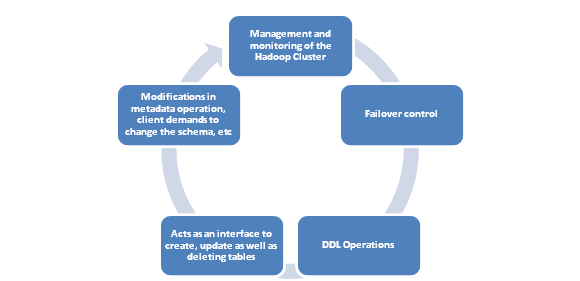
So, basically, HMaster is a lightweight process.

Read: Pig Vs Hive: Difference Two Key Components of Hadoop Big Data

2). Region Server

These worker nodes are solely responsible for any kind of reading, writing, deletion or for any kind of update requests from clients.  A region server can serve as much as 1,000 regions. Hbase Architecture & Main Server Components 
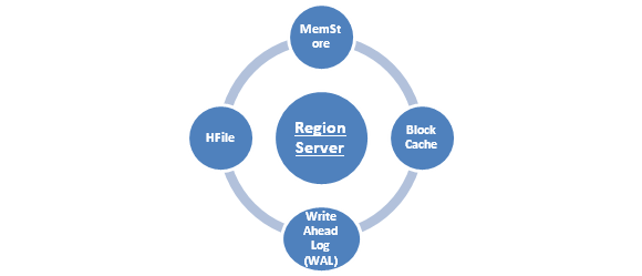
It runs on every node in Hadoop cluster and also works on HDFS DataNode and have various components that include the following;

  • MemStore- MemStore is responsible to write cache, and simultaneously stores new data that is pending to be written to the disk. Every column family in a region never fails to have a MemStore.
  • Block Cache – This one is the read cache. As the name suggests, here most of the read data is stored in the read cache. Whenever the block cache storage becomes full, the recently used data is evicted from the processed or saved data.
  • Write Ahead Log (WAL) is a file that is responsible for storing new data that is not persisted to the permanent storage.
  • HFile is an actual storage file that is responsible for storing the rows assorted key values on a disk.

3). Zookeeper

Zookeeper is an important essential because HBase uses this ZooKeeper as distributed coordination service for every type of region servers that are already in the function. ZooKeeper is actually a centralized monitoring server that is responsible for maintaining the exact configuration information for providing a synchronized result. Hbase Architecture & Main Server Components 
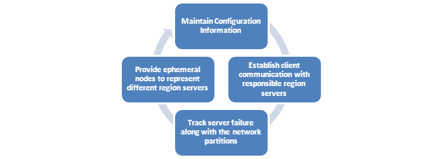
So, when a client wishes to communicate effectively with regions, ZooKeeper must be contacted at the first place in order to connect with the responsible region server as well as the HMaster. Their service is really vast. Take a glance at few services that ZooKeeper is responsible for;

  • Maintain Configuration Information
  • Establish client communication with responsible region servers.
  • Track server failure along with the network partitions.
  • Provide ephemeral nodes to represent different region servers.

Understanding the fundamental of HBase architecture is not easy. But running the HBase efficiently on top of HDFS in production is the real challenging task when it comes to row key designs manual splitting, monitoring compactions, etc.

Read: Hadoop Hive Modules & Data Type with Examples

HBase is an essential component of the Hadoop ecosystem that holds the fault tolerance feature of HDFS. Yes, the HBase provides the much-needed real-time read or write access to data and hence the HBase can be referred to the data storage instead of a database as it lacks on few common features of traditional RDBMS like typed columns, triggers, secondary indexes and advanced query languages.

Conclusion-

Understanding HBase Architecture and main server components is not an overnight thing and so we have put maximum efforts to let know Why HBase is in high demand and has gained so much popularity coverings basics of Apache HBase Architectural Components.

Read: Salary Structure of Big Data Hadoop Developer & Administrator


fbicons FaceBook twitterTwitter lingedinLinkedIn pinterest Pinterest emailEmail

     Logo

    JanBask Training Team

    The JanBask Training Team includes certified professionals and expert writers dedicated to helping learners navigate their career journeys in QA, Cybersecurity, Salesforce, and more. Each article is carefully researched and reviewed to ensure quality and relevance.


Comments

Trending Courses

Cyber Security Course

Cyber Security

  • Introduction to cybersecurity
  • Cryptography and Secure Communication 
  • Cloud Computing Architectural Framework
  • Security Architectures and Models
Cyber Security Course

Upcoming Class

1 day 19 Sep 2025

QA Course

QA

  • Introduction and Software Testing
  • Software Test Life Cycle
  • Automation Testing and API Testing
  • Selenium framework development using Testing
QA Course

Upcoming Class

4 days 22 Sep 2025

Salesforce Course

Salesforce

  • Salesforce Configuration Introduction
  • Security & Automation Process
  • Sales & Service Cloud
  • Apex Programming, SOQL & SOSL
Salesforce Course

Upcoming Class

1 day 19 Sep 2025

Business Analyst Course

Business Analyst

  • BA & Stakeholders Overview
  • BPMN, Requirement Elicitation
  • BA Tools & Design Documents
  • Enterprise Analysis, Agile & Scrum
Business Analyst Course

Upcoming Class

1 day 19 Sep 2025

MS SQL Server Course

MS SQL Server

  • Introduction & Database Query
  • Programming, Indexes & System Functions
  • SSIS Package Development Procedures
  • SSRS Report Design
MS SQL Server Course

Upcoming Class

1 day 19 Sep 2025

Data Science Course

Data Science

  • Data Science Introduction
  • Hadoop and Spark Overview
  • Python & Intro to R Programming
  • Machine Learning
Data Science Course

Upcoming Class

8 days 26 Sep 2025

DevOps Course

DevOps

  • Intro to DevOps
  • GIT and Maven
  • Jenkins & Ansible
  • Docker and Cloud Computing
DevOps Course

Upcoming Class

7 days 25 Sep 2025

Hadoop Course

Hadoop

  • Architecture, HDFS & MapReduce
  • Unix Shell & Apache Pig Installation
  • HIVE Installation & User-Defined Functions
  • SQOOP & Hbase Installation
Hadoop Course

Upcoming Class

8 days 26 Sep 2025

Python Course

Python

  • Features of Python
  • Python Editors and IDEs
  • Data types and Variables
  • Python File Operation
Python Course

Upcoming Class

2 days 20 Sep 2025

Artificial Intelligence Course

Artificial Intelligence

  • Components of AI
  • Categories of Machine Learning
  • Recurrent Neural Networks
  • Recurrent Neural Networks
Artificial Intelligence Course

Upcoming Class

16 days 04 Oct 2025

Machine Learning Course

Machine Learning

  • Introduction to Machine Learning & Python
  • Machine Learning: Supervised Learning
  • Machine Learning: Unsupervised Learning
Machine Learning Course

Upcoming Class

29 days 17 Oct 2025

 Tableau Course

Tableau

  • Introduction to Tableau Desktop
  • Data Transformation Methods
  • Configuring tableau server
  • Integration with R & Hadoop
 Tableau Course

Upcoming Class

8 days 26 Sep 2025

Search Posts

Reset

Receive Latest Materials and Offers on Hadoop Course

Interviews