DevOps Engineer job role has climbed to 2nd rank in Glassdoor’s list of “America’s best 50 jobs”.
A study conducted by Grand View Research states that the “DevOps market will reach a valuation of $12.85 billion by the year 2025”. By being the major fuel to brands like Netflix, Walmart, Amazon, DevOps technology has taken the IT world by storm. Opting a career in DevOps is the next best thing for today & future of work. If you have been searching for “How to Learn DevOps online?”, this is a complete DevOps tutorial, where you will learn:
What is DevOps & why is it used?
DevOps is a combination of two words - Dev = Development, Ops = Operations, defining culture, or infrastructure where the development & operations team collaborate & communicate to deploy codes to result in faster production in an automated manner.
DevOps speeds up the organization’s ability to deploy the technology products faster and gives scope to serve the customers in a better & competitive way.
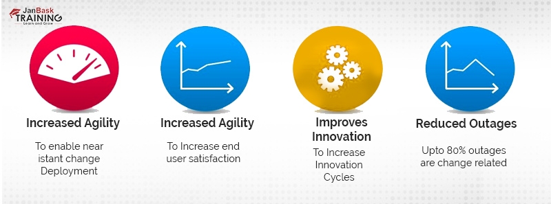
Benefits of DevOps to Organizations
DevOps is a concept of the contemporary world that promotes continuous integration and continuous development application and software at high speed and high velocity. Various beginners to professionals are fascinated by its alignment with any SDLC and various cloud platforms, let’s identify what are the other reasons that are making this technology a pioneer for enterprises and individuals.
Focuses on continuous improvements - Since DevOps ensures to align the business with IT, the bridge between delivery cycle and feedback gets shrunken and it gets easy to improve the processes for the internal and external customers over different platforms.
Reduces the failures - DevOps is implemented on top of the agile model, making it easy to promote collaboration, modular programming or so - which makes it easy to identify faults and errors in each task. DevOps is implemented in conjunction with fault detection techniques, which minimizes the failure rates with ease.
Gives extensive scope of innovation - Since the DevOps culture and processes are practiced with constant cooperation and continuous delivery, the team gets the constant scope to work on creative and innovative outcomes.
Tasks are not siloed - In IT, A silo software development describes a situation where any particular management system works in the discretion or isolation from other systems. Silos lead to disparate systems in the same business environments, to overcome the shortcomings of the silo, DevOps is the perfect addition that ensures in an organization, there is no conventional departmentation and allows the systems, processes, teams to cooperate and collaborate - to result in continuous and innovative outcomes.
Performance-centric environment - DevOps embodies organizations with a combination of power-based and performance-based features. The technology enforces a way out for the organization’s teams & processes to collaborate, in a way the quality of the product is uplifted, while the workforce is taught to become creative and innovative with regular integration and deployment phases.
Why do Organizations use DevOps?
DevOps integrates the development & operations team to engineer a unified & end-user centric product.
DevOps sync the “development” and “operations” team delivery deadlines.
DevOps decreases the costs done individually on designing, deploying, testing.
Automate the coding deployment with various tools to avoid errors in production.
DevOps helps to create an omission-free product for end-customers disposal.
DevOps reduces defects across the SDLC, breaks the large & complex codebase into simpler & manageable chunks, and can be fairly used for eCommerce to websites hosted on cloud platforms.
DevOps acknowledges a lower failure rate of new releases, reduces products time-to-market by 50%, and incorporates infrastructure issues to provide quality application development.
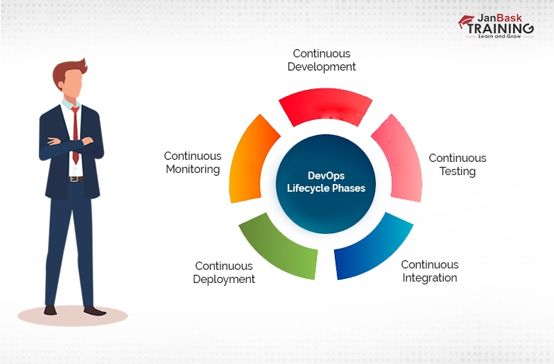
DevOps Lifecycle
DevOps brings all the development, IT professionals, operations teams with developers, system admins, QA Testers under one roof and constitutes a unified DevOps lifecycle as follows:
Phases
Explanation
Development
The entire development process is divided into smaller chunks to speed up the software development & delivery process.
Testing
QA teams leverage automated testing tools like Selenium to identify performance failure issues & bugs in the app prepared.
Integration
New functionality & features are added via integration with the prevalent codes, followed by rigorous testing.
Deployment
The developed product is deployed with careful interventions.
Monitoring
The operations team monitors the product for optimum performance & service uptime.
DevOps Workflows
Workflow reflects the visual & sequential implementation of the provided input.
It briefs about the actions that are performed and the outputs created for the operations process.
DevOps workflows give the ability to arrange & separate the jobs requested by users.
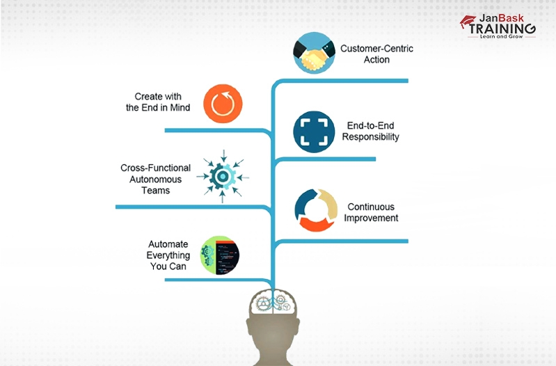
DevOps Principles
There are 6 DevOps principles that are important to follow while adopting DevOps.
To automate everything - To leverage automation throughout the SDLC to minimize errors & increase efficiency.
To have continuous improvement - To improve the products for reducing the wastage.
To work as a team - All the members of the development, designers & testing team must collaborate & communicate as one unified team.
To take end-to-end responsibility - To provide continuous performance support until the product’s lifetime, to ensure its maximized quality.
To take customer-centric actions - To constantly invest in products or services in the customer-centric way.
To keep on monitoring & testing everything - To identify & follow the robust testing & monitoring procedures.
DevOps Automation Tools
The following are the DevOps key tools that help with robust and automated deployment and monitoring of business applications.
Docker - A high-end DevOps tool that helps with architecting and running distributed applications on diverse systems. It is suitable for container management and helps with assembling the applications real quick.
Puppet - A widely-adopted DevOps tool that helps with automation testing, versioning, and continuous delivery. It helps to deliver & release the key technology changes quite fast & constantly.
Ansible - Ansible is used for end-to-end automation throughout the application lifecycle, the tool enhances productivity by taking care of complex deployments.
Jenkins - A popular DevOps tool that helps to monitor the execution of repeated jobs. Jenkins lets you integrate the changes fast and access the results quickly.
Nagios - The Nagios tool is suitable for monitoring the IT infrastructure, it can easily identify the errors and resurrect them with the help of log monitoring systems, server, and standard network.
Focused on diminishing the barriers between business management and the development teams.
It is all about diminishing the barriers between the development & operation teams.
Agile development is managed on sprints and has a small and fixed duration to complete the specific process.
It has consolidated deadlines rather than small & frequent ones.
Agile requires training of all team members with equal skills for emergencies.
DevOps divides the skills between the operations and development teams by maintaining consistent communication.
Have a focus on non-functional & functional readiness of the product.
Have a focus on business & operational readiness of the product.
Bridges the gap between development teams & customer requirements.
Bridges the gap between operations & development teams to ultimately build the customer-centric product.
Less critical to testing and implementation procedures.
Have elaborative processes to pursue deployment, testing & implementation stages.
Has less inclination to automated procedures.
Has more inclination to automated procedures.
DevOps Engineer Career Path
DevOps Engineer Career Path - Roles & Responsibilities, Skills
Firstly, let us understand who are DevOps Engineers?
DevOps Engineers are the IT professionals who work in collaboration with system operators, software developers and other required IT staff to ensure the robust and secured code releases. They collaborate & communicate with the development, testing, and operations team to ensure the safe deployment and testing of business software products.
DevOps engineer is someone who has extreme knowledge about SDLC and automation tools that are required for developing the CI/CD pipeline.
DevOps engineers can be developers who have an inclination towards network operations and deployment or could be sysadmins who do coding and scripting.
DevOps engineers are required to do coding & scripting to connect elements of code, bring incremental changes in the code versions, and oversee frequent deployment and testing regimes.
What are the typical roles & responsibilities of DevOps Engineers?
To design, build, and deploy automated modules for ensuring smooth procedures within the development environment - by involving great tests, risk management techniques or so.
To automate & orchestrate workload across diverse public cloud providers.
To have automation experience with any configuration/deployment management system - Terraform, Ansible, Chef, Puppet.
To leverage CI and CD tools for automating testing & deployment regimes.
To support the external and internal customers over different platforms.
To conduct system troubleshooting across platforms & app domains.
To identify, design, analyze the automation scripts & systems.
To ensure quality and reduce development costs.
To involve the best cloud security solutions for any system issues.
To possess great knowledge around platforms, coding, configuration & version management, tracking & assessing release performance, network optimization, integration, troubleshooting, provisioning & deployment.
What skills DevOps Engineers are expected to possess?
Problem-solving - To have a great instinct to solve any minute to complex problems with ease.
Project planning and management - To monitor software and regulate the tools and be well-versed with a complete end-to-end project handling process along with tracking of costs, risks, benefits, and more other aspects related to the project.
Technical Knowledge - Must have great technical knowledge around development language, configuration tools, etc.
Interpersonal skills - Since DevOps professionals are required to interact with the key teams, they should be quite approachable, foresighted, team players, and organized yet multitaskers.
Quick Learner - Must be a quick learner who is swift and quick at adopting new things.
Other skills to have - Empathy and Unselfishness, result & details-oriented approaches, logical and analytical skills.
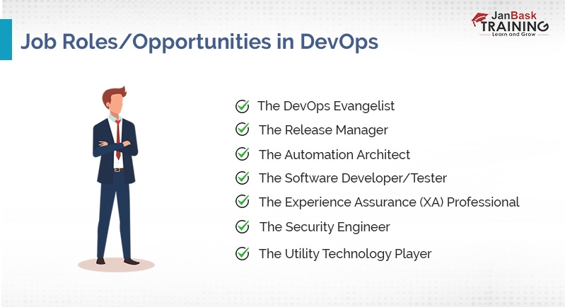
What are the job opportunities in DevOps?
DevOps being the most in-demand skill has an ocean size career opportunities. Anyone trained and certified in DevOps roles can expect to be an irreplaceable part in the following job roles:
Code Release Manager - Code release managers are responsible to ensure that all the timeline, quality of the process, and resources are all accounted for and considered. Coordinating all the aspects of projects and production into one integrated solution.
DevOps Evangelist - Responsible for identifying the key roles from DevOps delivery methods, and making sure the IT professionals and teams are familiar with its deployment benefits.
Software Developer & Teaser - To perform testing and monitoring and ensure the code meets all the business’s explicit requirements.
Experience Assurance - Responsible to enhance the user experience in an application, by identifying all the bugs and performance lapses.
Security Engineer - Integrates robust security features into the application and ensures it is in parity with the business’s required security.
Future Scope of DevOps
Now, let see what is the future scope of DevOps?
DevOps has a bright and unending future scope as highlighted by these facts:
DevOps Certifications Types and DevOps Certification Training
To become a certified DevOps professional, DevOps certification training is immensely important. DevOps Certifications are available from DevOps, AWS, Red Hat, Microsoft - which you can think of qualifying for right after finishing your quick weeks-long DevOps training for certification.
The popular DevOps Certifications that are good to have for career advancements are:
Certified Agile Process Owner (CAPO)
Certified Agile Service Manager (CASM)
DevOps Test Engineering (DTE)
Continuous Delivery Architecture (CDA)
DevSecOps Engineering (DSOE)
DevOps Leader (DOL)
SRE (Site Reliability Engineering) Foundation
DevOps Foundation
Conclusion
Concluding Thoughts on How to Learn DevOps Online!
This was a complete & quick tutorial for users searching for “how to learn DevOps online” - with a brief introduction to what is DevOps and why it is beneficial, DevOps stages, DevOps principles, DevOps Workflows, DevOps Automation tools, how DevOps is different from agile development, DevOps career path inclusive of DevOps Engineer roles & responsibilities, DevOps Engineer skills, the future of DevOps, and DevOps certification types.
If you are inspired by the robust attributes of DevOps and would want to get trained in this massive technology with real-world projects implementation in-depth, JanBask Training’s DevOps Certification Training is the best response to your query “how to learn DevOps online”.
The JanBask Training Team includes certified professionals and expert writers dedicated to helping learners navigate their career journeys in QA, Cybersecurity, Salesforce, and more. Each article is carefully researched and reviewed to ensure quality and relevance.

 Jun 27, 2020
  5.8k
5.8k


 FaceBook
 Twitter
 LinkedIn
 Pinterest
 Email
Email


 Jul 06, 2020
 5.8k
5.8k

 5.8k
5.8k