Just a moment...
/* ============================================================== Template name : Bootsnav - Multi Purpose Header Categorie : Bootstrap Menu in CSS Author : adamnurdin01 Version : v.1.2 Created : 2016-06-02 Last update : 2016-10-19 ============================================================== */ /* MEGAMENU STYLE =================================*/ nav.bootsnav .dropdown.megamenu-fw { position: static; } nav.bootsnav .container { position: relative; } nav.bootsnav .megamenu-fw .dropdown-menu { left: auto; } nav.bootsnav .megamenu-content { padding: 15px; width: 100% !important; } nav.bootsnav .megamenu-content .title{ margin-top: 0; } nav.bootsnav .dropdown.megamenu-fw .dropdown-menu { left: 0; right: 0; } /* Navbar =================================*/ nav.navbar.bootsnav{ margin-bottom: 0; -moz-border-radius: 0px; -webkit-border-radius: 0px; -o-border-radius: 0px; border-radius: 0px; background-color:transparent; border: none; /* border-bottom: solid 1px #e0e0e0;*/ z-index: 9; } .sticky{ background-color:#fff !important; padding:5px 0 !important ;border-bottom: solid 1px #e0e0e0;box-shadow: 0 0 4px #e2e2e2; } .navbar-left > li > a{ color: #444 !important; background-color: transparent; outline: none; margin-bottom: -2px; } nav.navbar.bootsnav ul.nav > li > a{ color: #fff; background-color: transparent; outline: none; margin-bottom: -2px; } nav.navbar.bootsnav ul.nav li.megamenu-fw > a:hover, nav.navbar.bootsnav ul.nav li.megamenu-fw > a:focus, nav.navbar.bootsnav ul.nav li.active > a:hover, nav.navbar.bootsnav ul.nav li.active > a:focus, nav.navbar.bootsnav ul.nav li.active > a{ background-color: transparent; } nav.navbar.bootsnav .navbar-toggle{ background-color: #fff; border: none; padding: 0; font-size: 18px; position: relative; top: 5px; } nav.navbar.bootsnav ul.nav .dropdown-menu .dropdown-menu{ top: 0; left: 100%; } nav.navbar.bootsnav ul.nav ul.dropdown-menu > li > a{ white-space:normal; } ul.menu-col{ padding: 0; margin: 0; list-style: none; } ul.menu-col li a{ color: #6f6f6f; } ul.menu-col li a:hover, ul.menu-col li a:focus{ text-decoration: none; } /* Navbar Full =================================*/ nav.bootsnav.navbar-full{ padding-bottom: 10px; padding-top: 10px; } nav.bootsnav.navbar-full .navbar-header{ display: block; width: 100%; } nav.bootsnav.navbar-full .navbar-toggle{ display: inline-block; margin-right: 0; position: relative; top: 0; font-size: 30px; -webkit-transition: all 1s ease-in-out; -moz-transition: all 1s ease-in-out; -o-transition: all 1s ease-in-out; -ms-transition: all 1s ease-in-out; transition: all 1s ease-in-out; } nav.bootsnav.navbar-full .navbar-collapse{ position: fixed; width: 100%; height: 100% !important; top: 0; left: 0; padding: 0; display: none !important; z-index: 9; } nav.bootsnav.navbar-full .navbar-collapse.in{ display: block !important; } nav.bootsnav.navbar-full .navbar-collapse .nav-full{ overflow: auto; } nav.bootsnav.navbar-full .navbar-collapse .wrap-full-menu{ display: table-cell; vertical-align: middle; background-color: #fff; overflow: auto; } nav.bootsnav.navbar-full .navbar-collapse .nav-full::-webkit-scrollbar { width: 0; } nav.bootsnav.navbar-full .navbar-collapse .nav-full::-moz-scrollbar { width: 0; } nav.bootsnav.navbar-full .navbar-collapse .nav-full::-ms-scrollbar { width: 0; } nav.bootsnav.navbar-full .navbar-collapse .nav-full::-o-scrollbar { width: 0; } nav.bootsnav.navbar-full .navbar-collapse ul.nav{ display: block; width: 100%; overflow: auto; } nav.bootsnav.navbar-full .navbar-collapse ul.nav a:hover, nav.bootsnav.navbar-full .navbar-collapse ul.nav a:focus, nav.bootsnav.navbar-full .navbar-collapse ul.nav a{ background-color: transparent; } nav.bootsnav.navbar-full .navbar-collapse ul.nav > li{ float: none; display: block; text-align: center; } nav.bootsnav.navbar-full .navbar-collapse ul.nav > li > a{ display: table; margin: auto; text-transform: uppercase; font-weight: bold; letter-spacing: 2px; font-size: 24px; padding: 10px 15px; } li.close-full-menu > a{ padding-top: 0px; padding-bottom: 0px; } li.close-full-menu{ padding-top: 30px; padding-bottom: 30px; } /* Atribute Navigation =================================*/ .attr-nav{ float: right; display: inline-block; margin-left: 13px; margin-right: -15px; } .attr-nav > ul{ padding: 0; margin: 0 0 -7px 0; list-style: none; display: inline-block; } .attr-nav > ul > li{ float: left; display: block; } .attr-nav > ul > li > a{ color: #6f6f6f; display: block; padding: 28px 15px; position: relative; } .attr-nav > ul > li > a span.badge{ position: absolute; top: 50%; margin-top: -15px; right: 5px; font-size: 10px; padding: 0; width: 15px; height: 15px; padding-top: 2px; } .attr-nav > ul > li.dropdown ul.dropdown-menu{ -moz-border-radius: 0px; -webkit-border-radius: 0px; -o-border-radius: 0px; border-radius: 0px; -moz-box-shadow: 0px 0px 0px; -webkit-box-shadow: 0px 0px 0px; -o-box-shadow: 0px 0px 0px; box-shadow: 0px 0px 0px; border: solid 1px #e0e0e0; } ul.cart-list{ padding: 0 !important; width: 250px !important; } ul.cart-list > li{ position: relative; border-bottom: solid 1px #efefef; padding: 15px 15px 23px 15px !important; } ul.cart-list > li > a.photo{ padding: 0 !important; margin-right: 15px; float: left; display: block; width: 50px; height: 50px; left: 15px; top: 15px; } ul.cart-list > li img{ width: 50px; height: 50px; border: solid 1px #efefef; } ul.cart-list > li > h6{ margin: 0; } ul.cart-list > li > h6 > a.photo{ padding: 0 !important; display: block; } ul.cart-list > li > p{ margin-bottom: 0; } ul.cart-list > li.total{ background-color: #f5f5f5; padding-bottom: 15px !important; } ul.cart-list > li.total > .btn{ display: inline-block; border-bottom: solid 1px #efefef; } ul.cart-list > li .price{ font-weight: bold; } ul.cart-list > li.total > span{ padding-top: 8px; } /* Top Search =================================*/ .top-search{ background-color:#fff; position:absolute; width:100%; z-index:99999 !important;box-shadow: 0 0 4px #e2e2e2; padding: 3px 0; display: none; } .clsdeskmenu{ float:right;} .clsdeskmenu i{ font-size: 27px; color: #444; padding: 25px 10px;} .top-search input.form-control{ background-color: transparent; border: none; -moz-box-shadow: 0px 0px 0px; -webkit-box-shadow: 0px 0px 0px; -o-box-shadow: 0px 0px 0px; box-shadow: 0px 0px 0px; color: #fff; height: 40px; padding: 0 15px; } .top-search .input-group-addon{ background-color: transparent; border: none; color: #fff; padding-left: 0; padding-right: 0; } .top-search .input-group-addon.close-search{ cursor: pointer; } /* Side Menu =================================*/ body{ -webkit-transition: all 0.3s ease-in-out; -moz-transition: all 0.3s ease-in-out; -o-transition: all 0.3s ease-in-out; -ms-transition: all 0.3s ease-in-out; transition: all 0.3s ease-in-out; } body.on-side{ margin-left: -280px; } .side{ position: fixed; overflow-y: auto; top: 0; right: -280px; width: 280px; padding: 25px 30px; height: 100%; display: block; background-color: #333; -webkit-transition: all 0.3s ease-in-out; -moz-transition: all 0.3s ease-in-out; -o-transition: all 0.3s ease-in-out; -ms-transition: all 0.3s ease-in-out; transition: all 0.3s ease-in-out; z-index: 9; } .side.on{ right: 0; } .side .close-side{ float: right; color: #fff; position: relative; z-index: 2; font-size: 16px; } .side .widget{ position: relative; z-index: 1; margin-bottom: 25px; } .side .widget .title{ color: #fff; margin-bottom: 15px; } .side .widget ul.link{ padding: 0; margin: 0; list-style: none; } .side .widget ul.link li a{ color: #9f9f9f; letter-spacing: 1px; } .side .widget ul.link li a:focus, .side .widget ul.link li a:hover{ color: #fff; text-decoration: none; } /* Share =================================*/ nav.navbar.bootsnav .share{ padding: 0 30px; margin-bottom: 30px; } nav.navbar.bootsnav .share ul{ display: inline-block; padding: 0; margin: 0 0 -7px 0; list-style: none; } nav.navbar.bootsnav .share ul > li{ float: left; display: block; margin-right: 5px; } nav.navbar.bootsnav .share ul > li > a{ display: table-cell; vertical-align: middle; text-align: center; width: 35px; height: 35px; -moz-border-radius: 50%; -webkit-border-radius: 50%; -o-border-radius: 50%; border-radius: 50%; background-color: #cfcfcf; color: #fff; } /* Transparent =================================*/ nav.navbar.bootsnav.navbar-fixed{ position: fixed; display: block; width: 100%; } nav.navbar.bootsnav.no-background{ -webkit-transition: all 1s ease-in-out; -moz-transition: all 1s ease-in-out; -o-transition: all 1s ease-in-out; -ms-transition: all 1s ease-in-out; transition: all 1s ease-in-out; } /* Navbar Sticky =================================*/ .wrap-sticky{ position: relative; -webkit-transition: all 0.3s ease-in-out; -moz-transition: all 0.3s ease-in-out; -o-transition: all 0.3s ease-in-out; -ms-transition: all 0.3s ease-in-out; transition: all 0.3s ease-in-out; } .wrap-sticky nav.navbar.bootsnav{ position: absolute; width: 100%; left: 0; top: 0; } .wrap-sticky nav.navbar.bootsnav.sticked{ position: fixed; -webkit-transition: all 0.2s ease-in-out; -moz-transition: all 0.2s ease-in-out; -o-transition: all 0.2s ease-in-out; -ms-transition: all 0.2s ease-in-out; transition: all 0.2s ease-in-out; } body.on-side .wrap-sticky nav.navbar.bootsnav.sticked{ left: -280px; } /* Navbar Responsive =================================*/ @media (min-width: 1024px) and (max-width:1400px) { body.wrap-nav-sidebar .wrapper .container{ width: 100%; padding-left: 30px; padding-right: 30px; } } @media (min-width: 1024px) { #navbar-menu2{ display:none !important;} /* General Navbar =================================*/ nav.navbar.bootsnav ul.nav .dropdown-menu .dropdown-menu{ margin-top: -2px; } nav.navbar.bootsnav ul.nav.navbar-right .dropdown-menu .dropdown-menu{ left: -200px; } nav.navbar.bootsnav ul.nav > li > a{ padding: 30px 15px; font-weight: 600; } nav.navbar.bootsnav ul.nav > li.dropdown > a.dropdown-toggle:after{ content: '▼'; font-size:16px; margin-left: 5px; margin-top: 2px; } nav.navbar.bootsnav li.dropdown ul.dropdown-menu{ -moz-box-shadow: 0px 0px 0px; -webkit-box-shadow: 0px 0px 0px; -o-box-shadow: 0px 0px 0px; box-shadow: 0px 0px 0px; -moz-border-radius: 0px; -webkit-border-radius: 0px; -o-border-radius: 0px; border-radius: 0px; padding: 0; width: auto !important; background: #fff; border: solid 1px #e0e0e0; border-top: solid 5px; } nav.navbar.bootsnav li.dropdown ul.dropdown-menu > li{ width:250px;} nav.navbar.bootsnav li.dropdown ul.megamenu-content > li{ width:auto !important;} nav.navbar.bootsnav li.dropdown ul.dropdown-menu > li a:hover, nav.navbar.bootsnav li.dropdown ul.dropdown-menu > li a:hover{ background-color: transparent; } nav.navbar.bootsnav li.dropdown ul.dropdown-menu > li > a{ padding: 10px 15px; border-bottom: solid 1px #eee; color: #6f6f6f; } nav.navbar.bootsnav li.dropdown ul.dropdown-menu > li:last-child > a{ border-bottom: none; } nav.navbar.bootsnav ul.navbar-right li.dropdown ul.dropdown-menu li a{ text-align: right; } nav.navbar.bootsnav li.dropdown ul.dropdown-menu li.dropdown > a.dropdown-toggle:before{ float: right; content: '►'; margin-top: 0; } nav.navbar.bootsnav ul.navbar-right li.dropdown ul.dropdown-menu li.dropdown > a.dropdown-toggle:before{ float: left; content: '►'; margin-top: 0; } nav.navbar.bootsnav li.dropdown ul.dropdown-menu ul.dropdown-menu{ top: -3px; } nav.navbar.bootsnav ul.dropdown-menu.megamenu-content{ padding: 0 15px !important; } nav.navbar.bootsnav ul.dropdown-menu.megamenu-content > li{ padding: 25px 0 20px; } nav.navbar.bootsnav ul.dropdown-menu.megamenu-content.tabbed{ padding: 0; } nav.navbar.bootsnav ul.dropdown-menu.megamenu-content.tabbed > li{ padding: 0; } nav.navbar.bootsnav ul.dropdown-menu.megamenu-content .col-menu{ padding: 0 30px; margin: 0 -0.5px; border-left: solid 1px #f0f0f0; border-right: solid 1px #f0f0f0; } nav.navbar.bootsnav ul.dropdown-menu.megamenu-content .col-menu:first-child{ border-left: none; } nav.navbar.bootsnav ul.dropdown-menu.megamenu-content .col-menu:last-child{ border-left: none; border-right: none; } nav.navbar.bootsnav ul.dropdown-menu.megamenu-content .content{ display: none; } nav.navbar.bootsnav ul.dropdown-menu.megamenu-content .content ul.menu-col li a{ text-align: left; padding: 5px 0; display: block; width: 100%; margin-bottom: 0; border-bottom: none; color: #6f6f6f; } nav.navbar.bootsnav.on ul.dropdown-menu.megamenu-content .content{ display: block !important; height: auto !important; } /* Navbar Transparent =================================*/ nav.navbar.bootsnav.no-background{ background-color: transparent; border: none; } nav.navbar.bootsnav.navbar-transparent .attr-nav{ padding-left: 15px; margin-left: 30px; } nav.navbar.bootsnav.navbar-transparent.white{ background-color: rgba(255,255,255,0.3); border-bottom: solid 1px #bbb; } nav.navbar.navbar-inverse.bootsnav.navbar-transparent.dark, nav.navbar.bootsnav.navbar-transparent.dark{ background-color: rgba(0,0,0,0.3); border-bottom: solid 1px #555; } nav.navbar.bootsnav.navbar-transparent.white .attr-nav{ border-left: solid 1px #bbb; } nav.navbar.navbar-inverse.bootsnav.navbar-transparent.dark .attr-nav, nav.navbar.bootsnav.navbar-transparent.dark .attr-nav{ border-left: solid 1px #555; } nav.navbar.bootsnav.no-background.white .attr-nav > ul > li > a, nav.navbar.bootsnav.navbar-transparent.white .attr-nav > ul > li > a, nav.navbar.bootsnav.navbar-transparent.white ul.nav > li > a, nav.navbar.bootsnav.no-background.white ul.nav > li > a{ color: #fff; } nav.navbar.bootsnav.navbar-transparent.dark .attr-nav > ul > li > a, nav.navbar.bootsnav.navbar-transparent.dark ul.nav > li > a{ color: #eee; } nav.navbar.bootsnav.navbar-fixed.navbar-transparent .logo-scrolled, nav.navbar.bootsnav.navbar-fixed.no-background .logo-scrolled{ display: none; } nav.navbar.bootsnav.navbar-fixed.navbar-transparent .logo-display, nav.navbar.bootsnav.navbar-fixed.no-background .logo-display{ display: block; } nav.navbar.bootsnav.navbar-fixed .logo-display{ display: none; } nav.navbar.bootsnav.navbar-fixed .logo-scrolled{ display: block; } /* Atribute Navigation =================================*/ .attr-nav > ul > li.dropdown ul.dropdown-menu{ margin-top: 0; margin-left: 55px; width: 250px; left: -250px; } /* Menu Center =================================*/ nav.navbar.bootsnav.menu-center .container{ position: relative; } nav.navbar.bootsnav.menu-center ul.nav.navbar-center{ float:none; margin: 0 auto; display: table; table-layout: fixed; } nav.navbar.bootsnav.menu-center .navbar-header, nav.navbar.bootsnav.menu-center .attr-nav{ position: absolute; } nav.navbar.bootsnav.menu-center .attr-nav{ right: 15px; } /* Navbar Brand top =================================*/ nav.bootsnav.navbar-brand-top .navbar-header{ display: block; width: 100%; text-align: center; background:#fff; border-radius:5px; } nav.bootsnav.navbar-brand-top ul.nav > li.dropdown > ul.dropdown-menu{ margin-top: 2px; } nav.bootsnav.navbar-brand-top ul.nav > li.dropdown.megamenu-fw > ul.dropdown-menu{ margin-top: 0; } nav.bootsnav.navbar-brand-top .navbar-header .navbar-brand{ display: inline-block; float: none; margin: 0; } nav.bootsnav.navbar-brand-top .navbar-collapse{ text-align: center; } nav.bootsnav.navbar-brand-top ul.nav{ display: inline-block; float: none; margin: 0 0 -5px 0; } /* Navbar Center =================================*/ nav.bootsnav.brand-center .navbar-header{ display: block; width: 100%; position: absolute; text-align: center; top: 0; left: 0; } nav.bootsnav.brand-center .navbar-brand{ display: inline-block; float: none; } nav.bootsnav.brand-center .navbar-collapse{ text-align: center; display: inline-block; padding-left: 0; padding-right: 0; } nav.bootsnav.brand-center ul.nav > li.dropdown > ul.dropdown-menu{ margin-top: 2px; } nav.bootsnav.brand-center ul.nav > li.dropdown.megamenu-fw > ul.dropdown-menu{ margin-top: 0; } nav.bootsnav.brand-center .navbar-collapse .col-half{ width: 50%; float: left; display: block; } nav.bootsnav.brand-center .navbar-collapse .col-half.left{ text-align: right; padding-right: 100px; } nav.bootsnav.brand-center .navbar-collapse .col-half.right{ text-align: left; padding-left: 100px; } nav.bootsnav.brand-center ul.nav{ float: none !important; margin-bottom: -5px !important; display: inline-block !important; } nav.bootsnav.brand-center ul.nav.navbar-right{ margin: 0; } nav.bootsnav.brand-center.center-side .navbar-collapse .col-half.left{ text-align: left; padding-right: 100px; } nav.bootsnav.brand-center.center-side .navbar-collapse .col-half.right{ text-align: right; padding-left: 100px; } /* Navbar Sidebar =================================*/ body.wrap-nav-sidebar .wrapper{ padding-left: 260px; overflow-x: hidden; } nav.bootsnav.navbar-sidebar{ position: fixed; width: 260px; overflow: hidden; left: 0; padding: 0 0 0 0 !important; background: #fff; border-right: solid 1px #dfdfdf; } nav.bootsnav.navbar-sidebar .scroller{ width: 280px; overflow-y:auto; overflow-x: hidden; } nav.bootsnav.navbar-sidebar .container-fluid, nav.bootsnav.navbar-sidebar .container{ padding: 0 !important; } nav.bootsnav.navbar-sidebar .navbar-header{ float: none; display: block; width: 260px; padding: 10px 15px; margin: 10px 0 0 0 !important; } nav.bootsnav.navbar-sidebar .navbar-collapse{ padding: 0 !important; width: 260px; } nav.bootsnav.navbar-sidebar ul.nav{ float: none; display: block; width: 100%; padding: 0 15px !important; margin: 0 0 30px 0; } nav.bootsnav.navbar-sidebar ul.nav li{ float: none !important; } nav.bootsnav.navbar-sidebar ul.nav > li > a{ padding: 10px 15px; font-weight: bold; } nav.bootsnav.navbar-sidebar ul.nav > li.dropdown > a:after{ float: right; } nav.bootsnav.navbar-sidebar ul.nav li.dropdown ul.dropdown-menu{ left: 100%; top: 0; position: relative !important; left: 0 !important; width: 100% !important; height: auto !important; background-color: transparent; border: none !important; padding: 0; -moz-box-shadow: 0px 0px 0px; -webkit-box-shadow: 0px 0px 0px; -o-box-shadow: 0px 0px 0px; box-shadow: 0px 0px 0px; } nav.bootsnav.navbar-sidebar ul.nav .megamenu-content .col-menu{ border: none !important; } nav.bootsnav.navbar-sidebar ul.nav > li.dropdown > ul.dropdown-menu{ margin-bottom: 15px; } nav.bootsnav.navbar-sidebar ul.nav li.dropdown ul.dropdown-menu{ padding-left: 0; float: none; margin-bottom: 0; } nav.bootsnav.navbar-sidebar ul.nav li.dropdown ul.dropdown-menu li a{ padding: 5px 15px; color: #6f6f6f; border: none; } nav.bootsnav.navbar-sidebar ul.nav li.dropdown ul.dropdown-menu ul.dropdown-menu{ padding-left: 15px; margin-top: 0; } nav.bootsnav.navbar-sidebar ul.nav li.dropdown ul.dropdown-menu li.dropdown > a:before{ font-family: 'FontAwesome'; content: "\f105"; float: right; } nav.bootsnav.navbar-sidebar ul.nav li.dropdown.on ul.dropdown-menu li.dropdown.on > a:before{ content: "\f107"; } nav.bootsnav.navbar-sidebar ul.dropdown-menu.megamenu-content > li{ padding: 0 !important; } nav.bootsnav.navbar-sidebar .dropdown .megamenu-content .col-menu{ display: block; float: none !important; padding: 0; margin: 0; width: 100%; } nav.bootsnav.navbar-sidebar .dropdown .megamenu-content .col-menu .title{ padding: 7px 0; text-transform: none; font-weight: 400; letter-spacing: 0px; margin-bottom: 0; cursor: pointer; color: #6f6f6f; } nav.bootsnav.navbar-sidebar .dropdown .megamenu-content .col-menu .title:before{ font-family: 'FontAwesome'; content: "\f105"; float: right; } nav.bootsnav.navbar-sidebar .dropdown .megamenu-content .col-menu.on .title:before{ content: "\f107"; } nav.bootsnav.navbar-sidebar .dropdown .megamenu-content .col-menu{ border: none; } nav.bootsnav.navbar-sidebar .dropdown .megamenu-content .col-menu .content{ padding: 0 0 0 15px; } nav.bootsnav.navbar-sidebar .dropdown .megamenu-content .col-menu ul.menu-col li a{ padding: 3px 0 !important; } } @media (max-width: 992px) { .attr-nav .search{ display:none !important;} /* Navbar Responsive =================================*/ nav.navbar.bootsnav .navbar-brand { display: inline-block; float: none !important; margin: 0 !important; } nav.navbar.bootsnav .navbar-header { float: none; display: block; text-align: center; padding-left: 30px; padding-right: 30px; } nav.navbar.bootsnav .navbar-toggle { display: inline-block; float: left; margin-right: -200px; margin-top: 10px; } nav.navbar.bootsnav .navbar-collapse { border: none; margin-bottom: 0; } nav.navbar.bootsnav.no-full .navbar-collapse{ max-height: 350px; overflow-y: auto !important; } nav.navbar.bootsnav .navbar-collapse.collapse { display: none !important; } nav.navbar.bootsnav .navbar-collapse.collapse.in { display: block !important; } nav.navbar.bootsnav .navbar-nav { float: none !important; padding-left: 30px; padding-right: 30px; margin: 0px -15px; } nav.navbar.bootsnav .navbar-nav > li { float: none; } nav.navbar.bootsnav li.dropdown a.dropdown-toggle:before{ content: '▼'; float: right; font-size: 16px; margin-left: 10px; } nav.navbar.bootsnav li.dropdown.on > a.dropdown-toggle:before{ content: '▼'; } nav.navbar.bootsnav .navbar-nav > li > a{ display: block; width: 100%; border-bottom: solid 1px #e0e0e0; padding: 10px 0; border-top: solid 1px #e0e0e0; margin-bottom: -1px; } nav.navbar.bootsnav .navbar-nav > li:first-child > a{ border-top: none; } nav.navbar.bootsnav ul.navbar-nav.navbar-left > li:last-child > ul.dropdown-menu{ border-bottom: solid 1px #e0e0e0; } nav.navbar.bootsnav ul.nav li.dropdown li a.dropdown-toggle{ float: none !important; position: relative; display: block; width: 100%; } nav.navbar.bootsnav ul.nav li.dropdown ul.dropdown-menu{ width: 100%; position: relative !important; background-color: transparent; float: none; border: none; padding: 0 0 0 15px !important; margin: 0 0 18px 0 !important; -moz-box-shadow: 0px 0px 0px; -webkit-box-shadow: 0px 0px 0px; -o-box-shadow: 0px 0px 0px; box-shadow: 0px 0px 0px; -moz-border-radius: 0px 0px 0px; -webkit-border-radius: 0px 0px 0px; -o-border-radius: 0px 0px 0px; border-radius: 0px 0px 0px; } nav.navbar.bootsnav ul.nav li.dropdown ul.dropdown-menu > li > a{ display: block; width: 100%; border-bottom: solid 1px #e0e0e0; padding: 10px 0; color: #6f6f6f; } nav.navbar.bootsnav ul.nav ul.dropdown-menu li a:hover, nav.navbar.bootsnav ul.nav ul.dropdown-menu li a:focus{ background-color: transparent; } nav.navbar.bootsnav ul.nav ul.dropdown-menu ul.dropdown-menu{ float: none !important; left: 0; padding: 0 0 0 15px; position: relative; background: transparent; width: 100%; } nav.navbar.bootsnav ul.nav ul.dropdown-menu li.dropdown.on > ul.dropdown-menu{ display: inline-block; margin-top: -10px; } nav.navbar.bootsnav li.dropdown ul.dropdown-menu li.dropdown > a.dropdown-toggle:after{ display: none; } nav.navbar.bootsnav .dropdown .megamenu-content .col-menu .title{ padding: 10px 15px 10px 0; line-height: 24px; text-transform: none; font-weight: 400; letter-spacing: 0px; margin-bottom: 0; cursor: pointer; border-bottom: solid 1px #e0e0e0; color: #6f6f6f; } nav.navbar.bootsnav .dropdown .megamenu-content .col-menu ul > li > a{ display: block; width: 100%; border-bottom: solid 1px #e0e0e0; padding: 8px 0; } nav.navbar.bootsnav .dropdown .megamenu-content .col-menu .title:before{ font-family: 'FontAwesome'; content: "\f105"; float: right; font-size: 16px; margin-left: 10px; position: relative; right: -15px; } nav.navbar.bootsnav .dropdown .megamenu-content .col-menu:last-child .title{ border-bottom: none; } nav.navbar.bootsnav .dropdown .megamenu-content .col-menu.on:last-child .title{ border-bottom: solid 1px #e0e0e0; } nav.navbar.bootsnav .dropdown .megamenu-content .col-menu:last-child ul.menu-col li:last-child a{ border-bottom: none; } nav.navbar.bootsnav .dropdown .megamenu-content .col-menu.on .title:before{ content: "\f107"; } nav.navbar.bootsnav .dropdown .megamenu-content .col-menu .content{ padding: 0 0 0 15px; } nav.bootsnav.brand-center .navbar-collapse{ display: block; } nav.bootsnav.brand-center ul.nav{ margin-bottom: 0px !important; } nav.bootsnav.brand-center .navbar-collapse .col-half{ width: 100%; float: none; display: block; } nav.bootsnav.brand-center .navbar-collapse .col-half.left{ margin-bottom: 0; } nav.bootsnav .megamenu-content{ padding: 0; } nav.bootsnav .megamenu-content .col-menu{ padding-bottom: 0; } nav.bootsnav .megamenu-content .title{ cursor: pointer; display: block; padding: 10px 15px; margin-bottom: 0; font-weight: normal; } nav.bootsnav .megamenu-content .content{ display: none; } .attr-nav{ position: absolute; right: 60px; } .attr-nav > ul{ padding: 0; margin: 0 -15px -7px 0; } .attr-nav > ul > li > a{ padding: 16px 15px 15px; } .attr-nav > ul > li.dropdown > a.dropdown-toggle:before{ display: none; } .attr-nav > ul > li.dropdown ul.dropdown-menu{ margin-top: 2px; margin-left: 55px; width: 250px; left: -250px; border-top: solid 5px; } .top-search .container{ padding: 0 45px; } /* Navbar full Responsive =================================*/ nav.bootsnav.navbar-full ul.nav{ margin-left: 0; } nav.bootsnav.navbar-full ul.nav > li > a{ border: none; } nav.bootsnav.navbar-full .navbar-brand { float: left !important; padding-left: 0; } nav.bootsnav.navbar-full .navbar-toggle { display: inline-block; float: right; margin-right: 0; margin-top: 10px; } nav.bootsnav.navbar-full .navbar-header { padding-left: 15px; padding-right: 15px; } /* Navbar Sidebar =================================*/ nav.navbar.bootsnav.navbar-sidebar .share{ padding: 30px 15px; margin-bottom: 0; } /* Tabs =================================*/ nav.navbar.bootsnav .megamenu-content.tabbed{ padding-left: 0 !mportant; } nav.navbar.bootsnav .tabbed > li{ padding: 25px 0; margin-left: -15px !important; } /* Mobile Navigation =================================*/ body > .wrapper{ -webkit-transition: all 0.3s ease-in-out; -moz-transition: all 0.3s ease-in-out; -o-transition: all 0.3s ease-in-out; -ms-transition: all 0.3s ease-in-out; transition: all 0.3s ease-in-out; } body.side-right > .wrapper{ margin-left: 280px; margin-right: -280px !important; } nav.navbar.bootsnav.navbar-mobile .navbar-collapse{ position: fixed; overflow-y: auto !important; overflow-x: hidden !important; display: block; background: #fff; z-index: 99; width: 280px; height: 100% !important; left: -280px; top: 0; padding: 0; -webkit-transition: all 0.3s ease-in-out; -moz-transition: all 0.3s ease-in-out; -o-transition: all 0.3s ease-in-out; -ms-transition: all 0.3s ease-in-out; transition: all 0.3s ease-in-out; } nav.navbar.bootsnav.navbar-mobile .navbar-collapse.in{ left: 0; } nav.navbar.bootsnav.navbar-mobile ul.nav{ width: 293px; padding-right: 0; padding-left: 15px; } nav.navbar.bootsnav.navbar-mobile ul.nav > li > a{ padding: 15px 15px; } nav.navbar.bootsnav.navbar-mobile ul.nav ul.dropdown-menu > li > a{ padding-right: 15px !important; padding-top: 15px !important; padding-bottom: 15px !important; } nav.navbar.bootsnav.navbar-mobile ul.nav ul.dropdown-menu .col-menu .title{ padding-right: 30px !important; padding-top: 13px !important; padding-bottom: 13px !important; } nav.navbar.bootsnav.navbar-mobile ul.nav ul.dropdown-menu .col-menu ul.menu-col li a{ padding-top: 13px !important; padding-bottom: 13px !important; } nav.navbar.bootsnav.navbar-mobile .navbar-collapse [class*=' col-'] { width: 100%; } nav.navbar.bootsnav.navbar-fixed .logo-scrolled{ display: block !important; } nav.navbar.bootsnav.navbar-fixed .logo-display{ display: none !important; } nav.navbar.bootsnav.navbar-mobile .tab-menu, nav.navbar.bootsnav.navbar-mobile .tab-content{ width: 100%; display: block; } } @media (max-width: 767px) { nav.navbar.bootsnav .navbar-header { padding-left: 15px; padding-right: 15px; } nav.navbar.bootsnav .navbar-nav { padding-left: 15px; padding-right: 15px; } .attr-nav{ right: 30px; } .attr-nav > ul{ margin-right: -10px; } .attr-nav > ul > li > a{ padding: 16px 10px 15px; padding-left: 0 !important; } .attr-nav > ul > li.dropdown ul.dropdown-menu{ left: -275px; } .top-search .container{ padding: 0 15px; } nav.bootsnav.navbar-full .navbar-collapse{ left: 15px; } nav.bootsnav.navbar-full .navbar-header{ padding-right: 0; } nav.bootsnav.navbar-full .navbar-toggle { margin-right: -15px; } nav.bootsnav.navbar-full ul.nav > li > a{ font-size: 18px !important; line-height: 24px !important; padding: 5px 10px !important; } /* Navbar Sidebar =================================*/ nav.navbar.bootsnav.navbar-sidebar .share{ padding: 30px 15px !important; } /* Navbar Sidebar =================================*/ nav.navbar.bootsnav.navbar-sidebar .share{ padding: 30px 0 !important; margin-bottom: 0; } nav.navbar.bootsnav.navbar-mobile.navbar-sidebar .share{ padding: 30px 15px !important; margin-bottom: 0; } /* Mobile Navigation =================================*/ body.side-right > .wrapper{ margin-left: 280px; margin-right: -280px !important; } nav.navbar.bootsnav.navbar-mobile .navbar-collapse{ margin-left: 0; } nav.navbar.bootsnav.navbar-mobile ul.nav{ margin-left: -15px; } nav.navbar.bootsnav.navbar-mobile ul.nav{ border-top: solid 1px #fff; } li.close-full-menu{ padding-top: 15px !important; padding-bottom: 15px !important; } } @media (min-width: 480px) and (max-width: 640px) { nav.bootsnav.navbar-full ul.nav{ padding-top: 30px; padding-bottom: 30px; } } Just a moment...
/*Responsive Media Queries Max 320px */ @media screen and (max-width: 320px) { .sed { width: 38px !important; height: 38px !important; font-size: 22px !important; line-height: 44px !important; } ul.mega-menulist li { padding: 4px 8px !important; } .td-txt .col-xs-7 { width: 78%; } #Course p.slider-cont.blue { font-size: 13px !important; } .mobilescreen span.cont { font-size: 15px !important; } .cert { font-size: 17px !important; padding-left: 0px; } .getcall-box button.buttonctadarkbtn.btn.btn-lg { width: 86% !important; } .callto { width: 48% !important; top: 16px !important; } nav.navbar .navbar-brand { left: -68px !important; top: 10px !important; } nav.navbar .navbar-brand img.logo { width: 60px !important; } .rgt-icon p.cont2.mb0 { line-height: 48px; font-size: 14px; } .jobsare p.slider-text.white { font-size: 33px !important; } .whtlogo { margin: 70px 0 5px -26px; } .half img { width: 274px; margin: 0 auto 10px auto; } .counter .col-xs-10, .counter .col-xs-9 { padding-left: 8px !important; } .headbutton { font-size: 10px !important; width: 154px !important; } .headbutton1 { font-size: 10px; } .select2-container { margin-right: 2px !important; } nav.navbar.bootsnav { margin-bottom: 0; -moz-border-radius: 0px; -webkit-border-radius: 0px; -o-border-radius: 0px; border-radius: 0px; background-color: #fff !important; border: none; border-bottom: solid 1px #e0e0e0; z-index: 9; } .modal-content { -webkit-box-shadow: 0 5px 15px rgba(0, 0, 0, 0.5); background-image: -webkit-gradient( linear, left top, right bottom, from(#02b3e4), to(#02ccba) ); background-image: linear-gradient(to bottom right, #02b3e4, #02ccba); box-shadow: 0 5px 15px rgba(0, 0, 0, 0.5); } .modal-header { border-bottom: none; color: #fff; padding-bottom: 0px; } .modal-title { color: #fff; } } /*Responsive Media Queries Max 480px */ @media screen and (max-width: 480px) { /*Blogs*/ .blogttl { font-size: 15px; padding: 10px; box-shadow: 0 5px 20px 2px rgba(0, 0, 0, 0.12); font-weight: bold; margin-bottom: 10px; } .rght.sticky { display: none; } .blogdtlright h2 { font-size: 1.2em; font-weight: 700; line-height: 26px; margin-top: 20px; margin-bottom: 8px; } .crsbox2 { box-shadow: 0 5px 20px 2px rgba(0, 0, 0, 0.12); margin-bottom: 12px; } .crsbox2 p { position: absolute; bottom: 0; right: 12%; color: #fff; font-size: 18px; text-align: center; } /*Blogs*/ /**** JT Css *****/ nav#heder { z-index: 111111 !important; } nav.navbar.bootsnav.no-full .navbar-collapse { max-height: 227px; } .navbar-brand { float: left; height: 46px !important; } nav#heder { position: fixed !important; } .btn-store, .btn-store2 { font-size: 11px !important; line-height: 15px; width: 86px; text-align: center; padding: 3px 0px !important; } .cert { font-size: 21px; padding-left: 0px; } .select2-container { margin-right: 9px; } .mobilescreen span.cont { color: #fff; font-size: 17px; margin-bottom: 16px; display: block; } .mobilescreen button { border: 2px solid #ffffff !important; color: #fff !important; } .mobilescreen button a.dark.notxtdec { color: #fff !important; } .modal-body { position: relative; padding: 6px; } #myModal3 .modal-dialog, #myModal4 .modal-dialog, #myModal5 .modal-dialog, #myModal6 .modal-dialog { width: 100% !important; top: -20px !important; } #myModal3 .modal-content, #myModal4 .modal-content, #myModal5 .modal-content, #myModal6 .modal-content { width: 96% !important; margin: 0 auto; float: none !important; } #myModal .modal-content { width: 98% !important; background: url(https://www.janbasktraining.com/assets/demo2019/img/popup-mob.webp) top center !important; background-size: cover !important; background-repeat: no-repeat !important; padding-bottom: 61px; } #myModal .modal-dialog { width: 92% !important; } #myModal2 .modal-dialog { width: 92% !important; } #myModal2 .modal-content { width: 98% !important; background: url(https://www.janbasktraining.com/assets/demo2019//img/popup-bg3.webp) top center !important; background-size: cover !important; background-repeat: no-repeat !important; } div#myModal2 .modal-body { padding-top: 144px; } nav.navbar { padding-top: 0px !important; } nav.navbar .navbar-brand { left: -80px; top: 8px; } nav.navbar.bootsnav ul.nav > li > a { padding: 10px 15px; font-size: 15px; border-bottom: 1px solid #eee !important; } ul.phone-strip { width: 64%; background: #fff; float: none; margin: 0 auto; } ul.phone-strip li { list-style: none; float: left; padding: 8px 20px; color: #000; display: table; width: 100%; text-align: center; border: 1px solid #ab2927; margin-bottom: 20px; } ul.phone-strip li:nth-child(2) { background: #ab2927; } ul.phone-strip li:nth-child(2) a { color: #fff; } .callto { width: 40%; float: right; position: absolute; right: 0px; top: 21px; } li.signline:after { content: none; } li.mob-btn { display: none; } ul.mega-menulist li { padding: 4px 12px; font-size: 13px; border-bottom: 1px solid #eee; margin-left: -14px; background: #f7f7f7; } ul.dropdown-menu.mega-menu { min-width: 100% !important; left: 0px; transform: none; background: #fff !important; background-size: contain !important; border-bottom: 4px solid #ab2927 !important; float: left !important; position: initial !important; margin: 0 auto !important; } .lead3:after { width: 3px; height: 20px; } p.course:after { width: 3px; height: 20px; } .percentage .counter p.slider-text { font-size: 28px; margin-top: 10px; color: #414a53; } .counter .col-xs-10, .counter .col-xs-9 { padding-left: 0px; } .counter .col-xs-2 { padding-right: 0px; width: 14%; } .counter .col-xs-3 { padding-right: 0px; width: 18%; } .million .counter p.slider-text.white { font-size: 26px; } .counter p.slider-text { font-size: 26px !important; margin-top: 20px !important; } .percentage img { width: 150px; } .whtlogo img { margin-left: 20px; margin-top: 0px; } .instr-bx.inst2 p.cont2.mb0 { text-align: left; padding-left: 20px; } .padding0 { padding-left: 0px; padding-right: 0px; } .container { width: 100% !important; } .mobilescreen p.form-head.mb0 { position: absolute; background: #eeb617; } .dat { font-size: 14px; font-weight: 700; margin-bottom: 0px; } .est { font-size: 10px; margin-bottom: 0px; } .week { margin-bottom: 0px; } .getcall-box button.buttonctadarkbtn.btn.btn-lg { box-shadow: 5px 4px 3px #bbb0b0; width: 61%; margin-top: 20px; font-size: 14px; } .lineon:before { position: absolute; top: 48px; background: #777; width: 1px; height: 110px; right: 14px; content: none; } #Corporate button.buttonctadarkbtn.btn.btn-lg { padding: 6px 10px; font-size: 12px; margin-bottom: 10px; width: 138px; } .still button.buttonctadarkbtn.btn.btn-lg { padding: 6px 10px; font-size: 12px; width: 138px; } .still img { width: 120px; margin: 0 auto; display: table; } .maria img { width: 120px; margin: 0 auto; float: none !important; } .still { width: 100%; text-align: center; } .tab-pane { margin-bottom: 20px; } #accordion3 .panel-title > a { font-size: 14px !important; line-height: 20px; padding: 10px; } #accordion3 .panel.panel-default { border-radius: 0px; } #accordion3 a.collapsed { border-right: 3px solid #ab2927; border-radius: 0px; } #accordion3 a.collapsed { border-right: 3px solid #ab2927; border-radius: 0px; padding: 10px; } #accordion3 .panel.panel-default { border-radius: 0px; margin-bottom: 24px; } div#accordion3:after { background: #ab2927; position: absolute; top: 0px; content: ''; width: 3px; height: 250px; left: 40px; z-index: -1; } .star-rating-review { text-align: left; } li.fb-icon { margin-right: 0px; } div#accordion3 { position: relative; } #Course p.slider-cont.blue { margin-bottom: 20px; } .fullscreen { display: none; } .mobilescreen { display: block; } #accordion2 .panel-body span { font-size: 13px !important; line-height: 18px !important; display: block; } #accordion2 .panel-body { padding: 10px; } i.fa.fa-sort-down.pull-right { font-size: 20px; line-height: 20px; color: #3598c1; } i.fa.fa-sort-down.pull-right { line-height: 14px; } #accordion2 .panel.panel-default { border-radius: 8px; } .faq-acor #accordion1 .panel-heading .panel-title > a { font-size: 13px !important; } .panel-title > a { font-size: 14px !important; line-height: 20px; } .lead3 { font-size: 16px; line-height: 18px; } .lead2 { font-size: 18px; font-weight: 700; } .wehave { margin: 14px 0 0 0px; padding: 14px 22px; } p { margin-bottom: 10px; } .section { padding: 20px 0; } .getcall-box p.cont2.dark { font-size: 13px; text-align: left; } .getcall-box h3.slider-text2.dark { margin-bottom: 4px; } .cont2 { font-size: 15px; line-height: 20px; } .getcall-box h3.slider-text2 { font-size: 16px; padding-left: 14px; } .getcall-box h3.slider-text2:after { width: 3px; height: 20px; } .instr-bx.inst2 { margin-top: 0px; padding-left: 20px; padding-top: 10px; padding-bottom: 10px; } #Course p.course.red { font-size: 18px; padding-left: 14px; text-align: left; line-height: 20px; } div.bhoechie-tab-content { box-shadow: none; padding: 10px 0px; background: #fff; } .bhoechie-tab { background: #fff; box-shadow: 1px 1px 8px 1px #c5bdbd75; padding: 0px 10px; margin-bottom: 40px; } .instr-bx i { float: left; margin-right: 8px; line-height: 24px; display: block; font-size: 14px; color: #ffc107; } .register p.lead3 { font-size: 16px; line-height: 24px; } .tab-bx:after, .register:after { position: fixed; z-index: -1; } .asper { margin: 10px 0px; } .asper p.cont.white.mb0 { margin: 0px 0px; line-height: 18px; } .jobsare p.slider-text.white { font-size: 44px; } .doyou button.buttonctadarkbtn.btn.btn-md { margin-top: 10px; font-size: 13px; } .doyou p { font-size: 18px; line-height: 24px; } .counter { padding: 0px 0px; border-radius: 5px; } .crm, .million { height: auto; padding: 24px 0px; } .million p.slider-text.white { font-size: 22px; margin-bottom: 4px; } .crm p.slider-text.white { font-size: 22px; margin-bottom: 4px; } .lead1:after { width: 3px; height: 20px; } .lead1 { font-size: 20px; padding-left: 16px; } .headbutton1 { padding: 6px 10px; border: 2px solid #ffffff; font-size: 11px; margin-bottom: 10px; width: 104px; } .headbutton { padding: 6px 10px; border: 2px solid #ffffff; font-size: 11px; margin-bottom: 10px; width: 158px; } .bannerhome p.slider-text.white:after { bottom: -104px; } .kln { } .kln p.cont.white { margin-top: 44px !important; font-size: 13px; } .slider-text { font-size: 18px; line-height: 22px; } .slider-cont { font-size: 12px; line-height: 17px; text-align: justify; } section.sticky-nav-tabs { display: none; } select.custom-select.form-control { margin-right: 14px; } .instr-bx .col-xs-12 { border-bottom: 0px; border-right: 0px !important; padding-bottom: 4px; } .instr-bx p.cont2.mb0 { padding: 4px 0px; text-align: center; } .instr-bx { position: initial; text-align: left; border-radius: 0px; width: 100%; margin: 0 auto; display: table; float: none; box-shadow: none; background: transparent; color: #fff; margin-top: -32px; } .getcall-box { width: 100%; margin-top: 0px; padding: 16px; border-radius: 6px; } /**** JT Css End *****/ .modal-content { -webkit-box-shadow: 0 5px 15px rgba(0, 0, 0, 0.5); background-image: -webkit-gradient( linear, left top, right bottom, from(#02b3e4), to(#02ccba) ); background-image: linear-gradient(to bottom right, #02b3e4, #02ccba); box-shadow: 0 5px 15px rgba(0, 0, 0, 0.5); } .modal-header { border-bottom: none; color: #fff; padding-bottom: 0px; } .modal-title { color: #fff; } .mtpm { margin-top: -40px; } .contactleft { margin-bottom: 40px; } nav.navbar.bootsnav { margin-bottom: 0; -moz-border-radius: 0px; -webkit-border-radius: 0px; -o-border-radius: 0px; border-radius: 0px; background-color: #fff !important; border: none; border-bottom: solid 1px #e0e0e0; z-index: 9; } .fancy2 span:before, .fancy span:before { width: 72px; right: 102%; margin-right: 15px; top: 16px !important; } .fancy2, .fancy { margin-left: 94px; } .nav-justified > li { float: left; width: 25%; } #nav-tabs > li > a { padding: 10px 2px !important; float: none !important; } .events-timeline .timeline-block .content-column .event-date2 { bottom: -84px; } } @media (min-width: 600px) and (max-width: 600px) { img.img-responsive.lazy.img-rounded.kln { width: 114px; } nav.navbar.bootsnav { margin-bottom: 0; -moz-border-radius: 0px; -webkit-border-radius: 0px; -o-border-radius: 0px; border-radius: 0px; background-color: #fff !important; border: none; border-bottom: solid 1px #e0e0e0; z-index: 9; } .fancy2 span:before, .fancy span:before { top: 10px !important; } .events-timeline .timeline-block .content-column .content-box { margin-bottom: 30px; } } /*Responsive Media Queries Max 767px */ @media screen and (max-width: 767px) { .postbx code { word-break: break-word; word-wrap: break-word; } .btnw1 img.img-responsive { width: 18px; float: left; vertical-align: middle; margin: 0px auto 0px auto; margin-right: 4px; } .btnw1 { color: #000 !important; background: #ffcc00; font-weight: 600; margin-top: 8px; padding: 4px 18px !important; border: 0; font-size: 11px !important; line-height: 20px; width: auto; border-radius: 28px; float: left; margin-right: 10px; margin-bottom: 20px; } /* .btnw1 img.img-responsive { width: 18px; float: left; vertical-align: middle; margin: 0px auto 0px auto; margin-right: 4px; } .btnw1 { color: #000 !important; background: #ffcc00; font-weight: 600; margin-top: 8px; padding: 5px 15px; border: 0; font-size: 11px; line-height: 20px; width: auto; border-radius: 28px; float: left; margin-right: 10px; margin-bottom: 20px; }*/ span.enrollbtn { border: 1px dashed #fff; padding: 0px 16px; font-size: 12px; display: block; width: 128px; line-height: 18px; margin-bottom: 10px; } .section.section1.bannerhome.auth { padding-top: 70px; } .rnewyear { display: none; } .content .kln p.cont.white.llt { margin: 0px !important; } .content .blogdtlright img { max-width: 100%; height: auto !important; } .sed { width: 48px; height: 48px; text-align: center; font-size: 22px; line-height: 54px; } .comment_dtl ul, .comment_dtl ol { padding-left: 0px; } .getcall-box.panel-default.cmtt { padding: 16px 0px; } li.bcp { display: none; } .viewall-bx { display: none; } .blogdtlright img { display: table; } #myModal6 .modal-content { width: 98% !important; background: url(https://www.janbasktraining.com/assets/demo2019//img/popup-5.webp) top center !important; background-size: cover !important; background-repeat: no-repeat !important; } div#myModal6 .modal-body { padding-top: 144px; } #myModal5 .modal-content { width: 98% !important; background: url(https://www.janbasktraining.com/assets/demo2019//img/popup-4.webp) top center !important; background-size: cover !important; background-repeat: no-repeat !important; } div#myModal5 .modal-body { padding-top: 144px; } .modal-body button { margin-top: 16px !important; } #myModal4 .modal-content { background: url(https://www.janbasktraining.com/assets/demo2019//img/popup-talk.webp) top center !important; background-size: cover !important; } div#myModal4 .modal-body { padding-top: 144px; } #layout62 .wehave { margin: 26px 0 0 0px; } .form-group { margin-bottom: 15px; float: left; width: 100%; } .section18 p.lead3.white { line-height: 22px; } .hlf { margin-top: 90px; color: #000 !important; } .section18 { margin-top: 30px; } .rgt-icon { width: 76%; margin: 12px auto; } .inst2 .col-xs-12 { border-right: none !important; } nav#heder { z-index: 111111 !important; } nav.navbar.bootsnav.no-full .navbar-collapse { max-height: 100%; overflow-y: auto !important; box-shadow: 1px 1px 8px 0px #eee; } .btn-store, .btn-store2 { font-size: 11px !important; line-height: 15px; width: 86px; text-align: center; padding: 3px 0px !important; } .cert { font-size: 21px; padding-left: 0px; } .select2-container { margin-right: 9px; } .mobilescreen span.cont { color: #fff; font-size: 17px; margin-bottom: 16px; display: block; } .mobilescreen button { border: 2px solid #ffffff !important; color: #fff !important; } .mobilescreen button a.dark.notxtdec { color: #fff !important; } .modal-body { position: relative; padding: 6px; } #myModal3 .modal-dialog { width: 100% !important; top: -20px !important; } #myModal3 .modal-content { width: 98% !important; } #myModal .modal-content { width: 98% !important; background: url(https://www.janbasktraining.com/assets/demo2019/img/popup-mob.webp) !important; background-size: cover !important; background-repeat: no-repeat !important; padding-bottom: 61px; } #myModal .modal-dialog { width: 92% !important; } #myModal2 .modal-dialog { width: 92% !important; } nav.navbar { padding-top: 0px !important; } nav.navbar .navbar-brand { left: -80px; top: 8px; } nav.navbar.bootsnav ul.nav > li > a { padding: 10px 15px; font-size: 15px; border-bottom: 1px solid #eee !important; } ul.phone-strip { } li.mob-btn { display: none; } ul.mega-menulist li { padding: 4px 12px; font-size: 13px; border-bottom: 1px solid #eee; margin-left: -14px; background: #f7f7f7; } ul.dropdown-menu.mega-menu { min-width: 100% !important; left: 0px; transform: none; background: #fff !important; background-size: contain !important; border-bottom: none !important; float: left !important; position: initial !important; margin: 0 auto !important; height: 300px; overflow: scroll; } .lead3:after { width: 3px; height: 20px; } p.course:after { width: 3px; height: 20px; } .percentage .counter p.slider-text { font-size: 28px; margin-top: 10px; color: #414a53; } .counter .col-xs-10, .counter .col-xs-9 { padding-left: 0px; } .counter .col-xs-2 { padding-right: 0px; width: 14%; } .counter .col-xs-3 { padding-right: 0px; width: 18%; } .million .counter p.slider-text.white { font-size: 26px; } .counter p.slider-text { font-size: 26px !important; margin-top: 20px !important; } .percentage img { width: 150px; } .whtlogo img { margin-left: 20px; margin-top: 0px; } .instr-bx.inst2 p.cont2.mb0 { text-align: left; padding-left: 20px; } .padding0 { padding-left: 0px; padding-right: 0px; } .container { width: 100% !important; } .mobilescreen p.form-head.mb0 { position: absolute; background: #eeb617; } .dat { font-size: 14px; font-weight: 700; margin-bottom: 0px; } .est { font-size: 10px; margin-bottom: 0px; } .week { margin-bottom: 0px; } .getcall-box button.buttonctadarkbtn.btn.btn-lg { box-shadow: 5px 4px 3px #bbb0b0; width: 61%; margin-top: 20px; font-size: 14px; } .lineon:before { position: absolute; top: 48px; background: #777; width: 1px; height: 110px; right: 14px; content: none; } #Corporate button.buttonctadarkbtn.btn.btn-lg { padding: 6px 10px; font-size: 12px; margin-bottom: 10px; width: 138px; } .still button.buttonctadarkbtn.btn.btn-lg { padding: 6px 10px; font-size: 12px; width: 138px; } .still img { width: 120px; margin: 0 auto; display: table; } .maria img { width: 120px; margin: 0 auto; float: none !important; } .still { width: 100%; text-align: center; float: left; } .tab-pane { margin-bottom: 20px; } #accordion3 .panel-title > a { font-size: 14px !important; line-height: 20px; padding: 10px; } #accordion3 .panel.panel-default { border-radius: 0px; } #accordion3 a.collapsed { border-right: 3px solid #ab2927; border-radius: 0px; } #accordion3 a.collapsed { border-right: 3px solid #ab2927; border-radius: 0px; padding: 10px; } #accordion3 .panel.panel-default { border-radius: 0px; margin-bottom: 24px; } div#accordion3:after { background: #ab2927; position: absolute; top: 0px; content: ''; width: 3px; height: 250px; left: 40px; z-index: -1; } .star-rating-review { text-align: left; } li.fb-icon { margin-right: 0px; } div#accordion3 { position: relative; } #Course p.slider-cont.blue { margin-bottom: 20px; } .fullscreen { display: none; } .mobilescreen { display: block; } #accordion2 .panel-body span { font-size: 13px !important; line-height: 18px !important; display: block; } #accordion2 .panel-body { padding: 10px; } i.fa.fa-sort-down.pull-right { font-size: 20px; line-height: 20px; color: #3598c1; } i.fa.fa-sort-down.pull-right { line-height: 14px; } #accordion2 .panel.panel-default { border-radius: 8px; } .faq-acor #accordion1 .panel-heading .panel-title > a { font-size: 13px !important; } .panel-title > a { font-size: 14px !important; line-height: 20px; } .lead3 { font-size: 16px; line-height: 18px; } .lead2 { font-size: 18px; font-weight: 700; } .wehave { margin: 14px 0 0 0px; padding: 14px 22px; } p { margin-bottom: 10px; } .section { padding: 20px 0; } .getcall-box p.cont2.dark { font-size: 13px; text-align: left; } .getcall-box h3.slider-text2.dark { margin-bottom: 4px; } .cont2 { font-size: 15px; line-height: 20px; } .getcall-box h3.slider-text2 { font-size: 16px; padding-left: 14px; } .getcall-box h3.slider-text2:after { width: 3px; height: 20px; } .instr-bx.inst2 { margin-top: 0px; padding-left: 20px; padding-top: 10px; padding-bottom: 10px; } .register { padding-bottom: 0px; background-size: cover !important; } #Course p.course.red { font-size: 18px; padding-left: 14px; text-align: left; line-height: 20px; } div.bhoechie-tab-content { box-shadow: none; padding: 10px 0px; background: #fff; } .bhoechie-tab { background: #fff; box-shadow: 1px 1px 8px 1px #c5bdbd75; padding: 0px 10px; margin-bottom: 40px; } .instr-bx i { float: left; margin-right: 8px; line-height: 24px; display: block; font-size: 14px; color: #ffc107; } .register p.lead3 { font-size: 16px; line-height: 24px; } .tab-bx:after, .register:after { position: fixed; z-index: -1; } .asper { margin: 10px 0px; } .asper p.cont.white.mb0 { margin: 0px 0px; line-height: 18px; } .jobsare p.slider-text.white { font-size: 44px; } .doyou button.buttonctadarkbtn.btn.btn-md { margin-top: 10px; font-size: 13px; } .doyou p { font-size: 18px; line-height: 24px; } .counter { padding: 0px 0px; border-radius: 5px; } .crm, .million { height: auto; padding: 24px 0px; } .million p.slider-text.white { font-size: 22px; margin-bottom: 4px; } .crm p.slider-text.white { font-size: 22px; margin-bottom: 4px; } .lead1:after { width: 3px; height: 20px; } .lead1 { font-size: 20px; padding-left: 16px; } .headbutton1 { padding: 6px 10px; border: 2px solid #ffffff; font-size: 11px; margin-bottom: 10px; width: 104px; } .headbutton { padding: 6px 10px; border: 2px solid #ffffff; font-size: 11px; margin-bottom: 10px; width: 158px; } .bannerhome p.slider-text.white:after { bottom: -104px; } .kln { margin-top: 70px; } .kln p.cont.white { margin-top: 44px !important; font-size: 13px; } .slider-text { font-size: 18px; line-height: 22px; } .slider-cont { font-size: 12px; line-height: 17px; text-align: justify; } section.sticky-nav-tabs { display: none; } select.custom-select.form-control { margin-right: 14px; } .instr-bx .col-xs-12 { border-bottom: 0px; border-right: 0px !important; padding-bottom: 4px; } .instr-bx p.cont2.mb0 { padding: 4px 0px; text-align: center; } .instr-bx { position: initial; text-align: left; border-radius: 0px; width: 100%; margin: 0 auto; display: table; float: none; box-shadow: none; background: transparent; color: #fff; margin-top: -32px; } .section.section1.bannerhome { background: linear-gradient( 135deg, rgba(82, 62, 232, 0.92), rgba(0, 220, 175, 0.92) ) !important; } .getcall-box { width: 100%; margin-top: 0px; padding: 16px; border-radius: 6px; } /**** JT Css End *****/ .modal-content { -webkit-box-shadow: 0 5px 15px rgba(0, 0, 0, 0.5); background-image: -webkit-gradient( linear, left top, right bottom, from(#02b3e4), to(#02ccba) ); background-image: linear-gradient(to bottom right, #02b3e4, #02ccba); box-shadow: 0 5px 15px rgba(0, 0, 0, 0.5); } .modal-header { border-bottom: none; color: #fff; padding-bottom: 0px; } .modal-title { color: #fff; } .mtpm { margin-top: -40px; } .contactleft { margin-bottom: 40px; } nav.navbar.bootsnav { margin-bottom: 0; -moz-border-radius: 0px; -webkit-border-radius: 0px; -o-border-radius: 0px; border-radius: 0px; background-color: #fff !important; border: none; border-bottom: solid 1px #e0e0e0; z-index: 9; } .fancy2 span:before, .fancy span:before { width: 72px; right: 102%; margin-right: 15px; top: 16px !important; } .fancy2, .fancy { margin-left: 94px; } .nav-justified > li { float: left; width: 25%; } #nav-tabs > li > a { padding: 10px 2px !important; float: none !important; } .events-timeline .timeline-block .content-column .event-date2 { bottom: -84px; } .fullscreen { display: none; } .mobilescreen { display: block; } .nav-justified > li { float: left; width: 25%; } #nav-tabs > li > a { padding: 10px 2px !important; float: none !important; } } /*Responsive Media Queries Only for 800px to 800px */ @media (min-width: 800px) and (max-width: 800px) { } /*Responsive Media Queries 768px to 991px */ @media (min-width: 768px) and (max-width: 991px) { .section.section1.bannerhome.auth { padding-top: 110px; } .heder2 { top: 28px !important; } .comment_dtl ul, ol { padding-left: 0px; } .getcall-box.panel-default.cmtt { padding: 16px 0px; } nav.navbar.bootsnav ul.nav > li > a { padding: 12px 15px; } nav.navbar.bootsnav .navbar-nav > li { border-top: 1px solid #eee; } ul.dropdown-menu.mega-menu { background: #f7f7f7 !important; background-size: contain !important; border-bottom: 4px solid #ab2927 !important; float: left !important; } li.mob-btn, li.bcp { display: none; } .blogttl { margin-bottom: 18px; } .section.section1.bannerhome { background: linear-gradient( 135deg, rgba(82, 62, 232, 0.92), rgba(0, 220, 175, 0.92) ) !important; } .blogdtlright img { margin: 0 auto 10px auto; display: table; max-width: 100%; } .rght.sticky { display: none; } .rght { width: 100%; } nav.navbar.bootsnav .navbar-nav > li { width: 100%; } .crsbox2 { box-shadow: 0 5px 20px 2px rgba(0, 0, 0, 0.12); margin-bottom: 12px; } .crsbox2 p { position: absolute; bottom: 0; right: 12%; color: #fff; font-size: 18px; text-align: center; } #layout62 .wehave { margin: 26px 0 0 0px; } doyou button.buttonctadarkbtn.btn.btn-md { margin-top: 8px; } .doyou { padding: 14px 10px; } #layout62 .crm, #layout62 .million { height: 170px; } #layout62 .instr-bx { bottom: -79px; } .getcall-box input.form-control.mo-pt { width: 62% !important; } .select2-container { width: 30% !important; margin-right: 12px !important; } .inst2 i.fa { float: none; } .rgt-icon { width: 100%; margin: 0 auto; } nav#heder { z-index: 111111 !important; position: fixed !important; background: #fff; } nav.navbar.bootsnav .navbar-header { padding-left: 0px; padding-right: 0px; } nav.navbar .navbar-brand { left: -196px; } .callto { width: 40%; float: right; position: absolute; right: 0px; top: 21px; } #myModal3 .modal-content .close, #myModal4 .modal-content .close { margin-top: -30px !important; } .grace img { border-radius: 50%; box-shadow: 1px 1px 8px 1px #afafaf; width: 74px; height: 74px; } #Course p.slider-cont.blue { margin-bottom: 24px; } #myModal .modal-dialog { width: 94% !important; margin: 0px auto !important; display: table; } #myModal2 .modal-dialog, #myModal3 .modal-dialog, #myModal4 .modal-dialog, #myModal5 .modal-dialog, #myModal6 .modal-dialog { width: 74% !important; margin: 0px auto !important; display: table; } .modal { z-index: 1111111 !important; } .grace-bx { margin-top: 0px; } p.nophone { font-size: 24px; margin-top: 14px; } .still.maria p.slider-text.dark { margin-bottom: 0px; } .still img { width: 72px; } .still { width: 48%; float: left; margin-right: 12px; } .wehave { padding: 23px 40px; width: 100%; margin: -23px auto 0 auto; float: none; display: table; } #Course { padding-bottom: 0px; } .tab-img { width: 60%; } #accordion3 .panel-title > a { font-size: 14px !important; line-height: 20px; padding: 10px; } #accordion3 .panel.panel-default { border-radius: 0px; } #accordion3 a.collapsed { border-right: 3px solid #ab2927; border-radius: 0px; } #accordion3 a.collapsed { border-right: 3px solid #ab2927; border-radius: 0px; padding: 10px; } #accordion3 .panel.panel-default { border-radius: 0px; margin-bottom: 28px; } div#accordion3:after { background: #ab2927; position: absolute; top: 100px; content: ''; width: 3px; height: 350px; left: 40px; z-index: -1; } .form-head { margin-top: -25px; width: 114px; background: #eeb617; } #Course .row.fullscreen { display: none; } #Course .row.mobilescreen { display: block; } #Course p.course.red { font-size: 22px; padding-left: 20px; } p.course:after { height: 24px; } .register .instr-bx.inst2 { bottom: -70px !important; } .fullscreen { margin-bottom: 20px; } .register { background-size: cover !important; } .cert { font-size: 28px; line-height: 38px; } .asper p.cont.white.mb0 { margin: 0px 0px 18px 0px; line-height: 22px; padding: 0 0 21px 0; } .jobsare img { width: 73px; } .doyou p { font-size: 17px; line-height: 23px; } .opt { width: 334px; height: 394px; } .crm, .million { height: auto; } .padding0 { padding-left: 0px; padding-right: 0px; } .lead1:after { width: 4px; height: 22px; } .lead1 { font-size: 22px; padding-left: 20px; } section.sticky-nav-tabs { display: none; } .headbutton { width: 258px; } .headbutton1 { width: 258px; margin-top: 14px; } .instr-bx p.cont3.mb0 { font-size: 13px; line-height: 20px; } .instr-bx { width: 684px; float: left; border-radius: 44px; padding: 18px 0px; bottom: -78px; } .bannerhome p.slider-text.white:after { bottom: -108px; } .kln p.cont.white { margin-top: 32px !important; } select.custom-select.form-control { margin-right: 12px; } .getcall-box h3.slider-text2 { margin-bottom: 0px; } .getcall-box h3.slider-text2:after { width: 4px; height: 20px; } .getcall-box { width: 100%; float: right; padding: 16px; margin-top: 14px; } .getcall-box p.cont2.dark { font-size: 13px; text-align: left; } .slider-text { font-size: 22px; font-weight: 700; line-height: 24px; } .slider-cont { font-size: 14px; line-height: 20px; } } /*Responsive Media Queries 992px to 1024px */ @media (min-width: 992px) and (max-width: 1024px) { .temp-2-custom-bx .affix { width: 210px !important; } .temp-2-custom-bx .affix { width: 146.66px; } .heder2 { top: 28px !important; } .section.section1.bannerhome.auth .kln { padding: 20px; } .section.section1.bannerhome.auth { background-size: cover !important; padding-top: 50px !important; padding-bottom: 0px !important; background-position: bottom center !important; } .whtlogo img { margin-top: 20px; width: 108px; } .rght.sticky { width: 200px !important; } .blogttl { font-size: 12px; padding: 10px; line-height: 18px; box-shadow: 0 5px 20px 2px rgba(0, 0, 0, 0.12); font-weight: bold; } .tpl { padding-bottom: 0px !important; } .getcall-box.panel.panel-default .form-group { margin-bottom: 0px !important; } #layout63 .jobsare { padding: 21px 0px; } #layout63 .asper p.cont.white.mb0 { margin: 0px 0px; line-height: 18px; font-size: 12px; } #layout63 .jobsare p.slider-text.white { font-size: 22px; } #layout63 img.img-responsive.opt { height: 298px; } #layout63 .counter { padding: 0px 0; } #layout63 .crm { height: 145px; } #layout63 .million { height: 144px; } .sticky-nav-tab h2 { color: #000; font-size: 12px; font-weight: 700; line-height: 20px; display: flex; -webkit-box-pack: center; -ms-flex-pack: center; justify-content: center; -webkit-box-align: center; -ms-flex-align: center; align-items: center; -webkit-box-flex: 1; -ms-flex: 1; padding: 0px; margin: 0px; letter-spacing: 0px; } #layout62 .wehave p.slider-text.dark { font-size: 22px; font-weight: 700; line-height: 28px; } .asper p.cont.white.mb0 { margin: 0px 0px; line-height: 22px; } .tab-content .lead3 { font-size: 16px; padding-left: 12px; } #layout62 .instr-bx { bottom: -116px; } .half { padding: 76px 0px; } .half img { width: 254px; } .doyou { padding: 10px 10px; } nav.navbar.bootsnav ul.nav > li > a { padding: 18px 10px; font-size: 16px; } li.fb-icon { margin-right: 0px; } button.buttonctadarkbtn.btn { font-size: 16px; } .still button.buttonctadarkbtn.btn.btn-lg { padding: 8px 20px; } .list-group p.cont2.mb0 { font-size: 14px; } #Course p.course.red { font-size: 20px; padding-left: 18px; } div#Corporate { padding-top: 0px; } .wehave { margin: 18px 0 0 -50px; padding: 24px; } div.bhoechie-tab-content li.cont3 { font-size: 12px; line-height: 20px; } #Course p.slider-cont.blue { margin-bottom: 20px; font-size: 11.8px; margin-top: -8px; } div.bhoechie-tab-content p.lead2.dark { font-size: 18px; margin-bottom: 4px; } .register .instr-bx.inst2 { width: 100%; } .rgt-icon { width: 86%; margin: 0 auto; } .lead1 { font-size: 20px; padding-left: 20px; } .sticky-nav-tab { font-size: 13px !important; font-weight: 700; } .counter p.slider-text { margin-bottom: 4px; } img.img-responsive.opt { height: 315px; } .percentage .counter p.slider-text { font-size: 54px !important; margin-top: 0px !important; color: #414a53; } .crm p.slider-text.white, .million p.slider-text.white { margin-bottom: 0px; } .crm { padding: 14px 10px; height: auto; } .million { padding: 14px 10px; height: auto; } .jobsare { padding: 24px 0px; } .asper p.cont.white.mb0 { font-size: 16px; } .jobsare p.slider-text.white { font-size: 25px; text-align: left; } .jobsare img { width: 74px; margin-left: -12px; } .sticky-nav-tabs { height: 11vh !important; } .instr-bx { width: 718px; bottom: -102px; } .kln { margin-top: 54px; } .getcall-box { width: 100%; margin-top: 0px; } .container { width: 94%; } input.form-control.sidemob { width: 58% !important; } span.select2.select2-container.select2-container--default { width: 58px !important; } .getcall-box input.form-control { font-size: 12px; } } /*Responsive Media Queries 992px to 1024px */ @media (min-width: 1025px) and (max-width: 1200px) { .tpl { padding-bottom: 0px !important; } .rght.sticky { width: 200px !important; } .rght .getcall-box.panel-default { margin-top: 0px !important; } .sticky-nav-tab h2 { color: #000; font-size: 12px; font-weight: 700; line-height: 20px; display: flex; -webkit-box-pack: center; -ms-flex-pack: center; justify-content: center; -webkit-box-align: center; -ms-flex-align: center; align-items: center; -webkit-box-flex: 1; -ms-flex: 1; padding: 0px; margin: 0px; letter-spacing: 0px; } li.fb-icon { margin-right: 0px; } button.buttonctadarkbtn.btn { font-size: 16px; } .still button.buttonctadarkbtn.btn.btn-lg { padding: 8px 20px; } .list-group p.cont2.mb0 { font-size: 14px; } #Course p.course.red { font-size: 24px; padding-left: 24px; } div#Corporate { padding-top: 0px; } .wehave { margin: 18px 0 0 -50px; padding: 24px; } div.bhoechie-tab-content li.cont3 { font-size: 12px; line-height: 20px; } #Course p.slider-cont.blue { margin-bottom: 20px; } div.bhoechie-tab-content p.lead2.dark { font-size: 18px; margin-bottom: 4px; } .register .instr-bx.inst2 { width: 100%; } .rgt-icon { width: 82%; margin: 0 auto; } .lead1 { font-size: 24px; padding-left: 20px; } .sticky-nav-tab { font-size: 13px !important; font-weight: 700; } .counter p.slider-text { margin-bottom: 4px; } img.img-responsive.opt { height: 315px; } .percentage .counter p.slider-text { font-size: 54px !important; margin-top: 0px !important; color: #414a53; } .crm p.slider-text.white, .million p.slider-text.white { margin-bottom: 0px; } .crm { padding: 14px 10px; height: auto; } .million { padding: 14px 10px; height: auto; } .jobsare { padding-top: 26px; } .asper p.cont.white.mb0 { font-size: 16px; } .jobsare p.slider-text.white { font-size: 28px; } .jobsare img { width: 106px; margin-left: -12px; } .sticky-nav-tabs { height: 11vh !important; } .instr-bx { width: 718px; } .getcall-box { width: 100%; } } @media (min-width: 1201px) and (max-width: 1280px) { .pre23.nav.nav-pills.nav-stacked.affix { width: 249.73px !important; } button.buttonctadarkbtn.btn { background: #ab2927; font-size: 12px; } .new-blog-ak p { margin-bottom: 10px; } .browsecate ul li { font-size: 12px; } .trend-course .courseinfo ul.Real { margin: 0px; padding: 0px 14px; min-height: 56px; } .rghtsideblg p { margin-bottom: 0 !important; } .temp-2-custom-bx .rght { padding: 10px 14px; } .affix .rght-new-x2, .affix .rght-new-x3 { display: none; } .rghtsideblg-new-x { background: transparent !important; display: block; float: left; padding: 0 !important; border: 1px solid #e8e8e8; /* border-bottom: 4px solid #1289ee; */ overflow: auto; margin-bottom: 10px; height: 189px; } .rghtsideblg-new-x { background: transparent !important; display: block; float: left; padding: 0 !important; border: 1px solid #e8e8e8; /* border-bottom: 4px solid #1289ee; */ overflow: auto; margin-bottom: 10px; height: 190px; } .scroll-x li a { padding: 8px 5px; font-size: 12px; line-height: 17px; } .rght-new-x .lead1 { font-size: 0.99em; padding: 8px 15px; } .temp-2-custom-bx .rght .lead5 span { font-size: 0.99em; padding: 8px 15px; } .rghtsideblg-new-x p a { padding: 8px 5px; font-size: 12px; line-height: 17px; display: block; } .temp-2-custom-bx .affix { position: fixed; width: 183.33px !important; } .rght-new-x.sticky { width: 183.33px !important; } .pre1 h4 { position: absolute; left: 40%; top: -18px; font-size: 17px; } .scroll-x { height: 70vh; overflow: auto; } .select2-container--default .select2-selection--single .select2-selection__arrow b { margin-left: 9px !important; margin-top: -3px !important; } .getcall-box.panel.panel-default .form-group { } #layout63 .counter { padding: 4px 0; } #layout63 .percentage .counter p.slider-text { font-size: 70px !important; margin-top: 20px; color: #414a53; } #layout63 h4.lead3.white.hlf { font-size: 17px; } #layout63 .asper p.cont.white.mb0 { margin: 4px 0px; line-height: 20px; font-size: 14px; } .jobsare img { width: 88px; } .sticky-nav-tab h2 { color: #000; font-size: 16px; font-weight: normal; line-height: 20px; display: flex; -webkit-box-pack: center; -ms-flex-pack: center; justify-content: center; -webkit-box-align: center; -ms-flex-align: center; align-items: center; -webkit-box-flex: 1; -ms-flex: 1; padding: 0px; margin: 0px; letter-spacing: 0px; } #layout63 .instr-bx { width: 773px; } #layout62 .instr-bx { bottom: -122px; } #Course p.course.red { padding-left: 18px; } .sticky-nav-tabs-container { bottom: -22px !important; } .getcall-box { width: 100%; margin: 0 auto; float: left; } #Corporate { padding-top: 0px; } .wehave { margin: 26px 0 0 -50px; } .tab-img { padding: 36px 0; } div.bhoechie-tab-content::-webkit-scrollbar { width: 4px; height: 8px; } div.bhoechie-tab-content { height: 428px; overflow: scroll; } div.bhoechie-tab-content::-webkit-scrollbar-thumb { border-radius: 0px; background-color: rgb(171, 41, 39); } #Course p.slider-cont.blue { font-size: 15px; } .half button { margin-top: 28px !important; } .half { padding-bottom: 20px; } .best p.lead3 { font-size: 18px; } .rgt-icon { width: 70%; } .instr-bx.inst2 { width: 100%; } .doyou p { font-size: 18px; } .counter { padding: 18px 0; } section.sticky-nav-tabs { height: 16vh; } .headbutton { padding: 8px 13px; } .instr-bx { width: 758px; } .million, .crm { height: 180px; } } @media screen and (min-width: 1200px) { } @media (min-width: 1200px) and (max-width: 1280px) { .sedtxt h3 { font-size: 16px; line-height: 24px; margin-bottom: 4px; text-transform: capitalize; } .sedtxt p { font-size: 12px; line-height: 20px; color: #656565; } } @media (min-width: 1366px) and (max-width: 1366px) { .sedtxt h3 { font-size: 16px; line-height: 24px; margin-bottom: 4px; text-transform: capitalize; } .sedtxt p { font-size: 12px; line-height: 20px; color: #656565; } .pre23.nav.nav-pills.nav-stacked.affix { width: 249.73px !important; } .new-blog-ak p { margin-bottom: 10px; } .browsecate ul li { font-size: 12px; } .trend-course .courseinfo ul.Real { margin: 0px; padding: 0px 14px; min-height: 56px; } .rghtsideblg p { margin-bottom: 0 !important; } .rghtsideblg-new-x { background: transparent !important; display: block; float: left; padding: 0 !important; border: 1px solid #e8e8e8; /* border-bottom: 4px solid #1289ee; */ overflow: auto; margin-bottom: 10px; height: 270px; } .scroll-x li a { padding: 8px 5px; font-size: 12px; line-height: 17px; } .rght-new-x .lead1 { font-size: 0.99em; padding: 8px 15px; } .rghtsideblg-new-x p a { padding: 8px 5px; font-size: 12px; line-height: 17px; display: block; } .temp-2-custom-bx .affix { position: fixed; width: 197.66px !important; } .rght-new-x.sticky { width: 197.66px !important; } .pre1 h4 { position: absolute; left: 40%; top: -18px; font-size: 17px; } .scroll-x { height: 75vh; overflow: auto; } } /*Responsive Media Queries only for 1440px */ @media (min-width: 1440px) and (max-width: 1440px) { .pre23.nav.nav-pills.nav-stacked.affix { position: fixed !important; top: 110px !important; width: 233.73px!important; margin: 0; box-shadow: none !important; } .rght-new-x.sticky { width: 210px !important; } .temp-2-custom-bx .affix { position: fixed; width: 210px !important; } .pre1 h4 { position: absolute; left: 40%; top: -18px; font-size: 17px; } .scroll-x { height: 75vh; overflow: auto; } .rght { background: #f7f7f7; display: inline-block; padding: 20px 14px; box-shadow: 3px 3px 0px #00000024; } .sticky-nav-tabs-container { bottom: -22px !important; } .affix .rght-new-x2, .affix .rght-new-x3, .affix .rght-new-x4 { display: none !important; } } @media (min-width: 1600px) and (max-width: 1678px) { .sedtxt .comment-para { font-size: 15px !important; line-height: 22px !important; color: #656565; } .sedtxt a { font-size: 21px !important; font-weight: 400 !important; } div#style-2 ul li p { font-size: 15px; } .temp-2-custom-bx .affix { top: 120px !important; } .rght-new-x.sticky { width: 236.66px !important; } .temp-2-custom-bx .affix { position: fixed; width: 236.66px !important; } .pre1 h4 { position: absolute; left: 40%; top: -18px; font-size: 17px; } .scroll-x { height: 80vh; overflow: auto; } .rght.sticky { min-width: 325px !important; } .blogttl { font-size: 15px; padding: 10px; box-shadow: 0 5px 20px 2px rgba(0, 0, 0, 0.12); font-weight: bold; min-height: 125px !important; } div#batches { background-size: cover !important; } div.bhoechie-tab-content { box-shadow: 1px 1px 8px 1px #eee; padding: 16px 20px; height: 460px; overflow: scroll; } div.bhoechie-tab-content li.cont3 { font-size: 18px; } div.bhoechie-tab-menu div.list-group > a p.cont2.mb0 { font-size: 17px; line-height: 22px; } .sticky-nav-tabs-container { bottom: -22px !important; } .bannerhome p.slider-text.white:after { bottom: -98px; } .instr-bx { bottom: -95px; } .counter { padding: 20px 0 4px 0px; } .sticky-nav-tabs, .spa-slide { height: 14vh !important; } img.img-responsive.opt { height: 394px; width: 100%; } .tab-img { padding: 0px 0px 20px 0; } } @media (min-width: 1679px) and (max-width: 1680px) { .sedtxt .comment-para { font-size: 15px !important; line-height: 22px !important; color: #656565; } .sedtxt a { font-size: 22px !important; font-weight: 400 !important; } div#style-2 ul li p { font-size: 14px !important; line-height: 22px; } div#mainNav .temp-2-custom-bx .affix { position: fixed; width: 318.98px !important; } div#style-2 ul li p { font-size: 15px; } .rght-new-x.sticky { width: 249.98px !important; } .temp-2-custom-bx .affix { position: fixed; width: 249.98px !important; } .pre1 h4 { position: absolute; left: 40%; top: -18px; font-size: 17px; } .scroll-x { height: 80vh; overflow: auto; } .blog-img-width, .feat img { width: 100%; height: 170px; } a.crtfdbutton { line-height: 30px !important; margin-top: 22px; } .blogttl { font-size: 18px; } .rghtsideblg p { line-height: 24px; } .rght { margin-top: 10px; } a.crtfdbutton { margin: 22px 0px 22px 14px; padding: 6px 14px !important; font-size: 19px !important; border-radius: 48px; } a.crtfdbutton:hover { margin: 22px 0px 22px 14px; padding: 6px 14px !important; font-size: 19px !important; border-radius: 48px; } .rght.sticky { width: 319px !important; } #layout63 .instr-bx { width: 998px; padding: 28px 0px; } div#why-Salesforce .padding0 { padding-left: 15px; padding-right: 15px; } .tab-img img { width: 95%; } .tab-img { height: 581px; } div.bhoechie-tab-content { box-shadow: 1px 1px 8px 1px #eee; padding: 16px 20px; height: 582px; overflow: scroll; } div.bhoechie-tab-content li.cont3 { font-size: 18px; } div.bhoechie-tab-menu div.list-group > a p.cont2.mb0 { font-size: 17px; line-height: 22px; } .sticky-nav-tabs-container { bottom: -22px !important; } .bannerhome p.slider-text.white:after { width: 170px; bottom: -172px; } div#Corporate { padding-top: 0px; } .rgt-icon { width: 77%; margin: 0 auto; } .instr-bx.inst2 { width: 100%; bottom: -108px !important; } img.img-responsive.opt { height: 454px; width: 328px; margin: 0 auto; } .instr-bx { background: #f7f7f7; width: 940px; bottom: -122px !important; } .getcall-box { border: 0px; border-radius: 0px; text-align: center; padding: 26px 23px; width: 100%; float: right; margin-top: 0px; } .kln .col-sm-12.col-lg-4 { width: 34%; } .tab-img { padding: 14px 0px 80px 0; } div#batches { background-size: cover !important; } } @media screen and (min-width: 1601px) { .blogdtlright h3 { font-size: 24px; padding: 20px 0 0 0; } body { font-family: 'Roboto', sans-serif; /* font-family: 'Open Sans', sans-serif;*/ position: relative; font-size: 18px; line-height: 26px; color: #222; } a { color: #222; } a, a:active, a:focus, a:hover { outline: none; -webkit-transition: all 0.3s ease-in-out; -moz-transition: all 0.3s ease-in-out; -o-transition: all 0.3s ease-in-out; -ms-transition: all 0.3s ease-in-out; transition: all 0.3s ease-in-out; } a:hover { text-decoration: none; } .container { width: 84% !important; } ul.survive li { font-size: 18px; } .blogdtlright h1 { font-size: 1.6em; } .blogdtlright h2 { font-size: 30px; } .blogdtlright h3 { font-size: 24px; } .blogdtlright h4 { font-size: 20px; } .blogdtlright h6 { font-size: 16px; } .blogdtlright h5 { font-size: 13px; } .cont2 { font-size: 22px; line-height: 30px; } .cont3 { font-size: 18px; line-height: 24px; } .dropdown-menu { font-size: 18px; } .slider-text { font-size: 40px; font-weight: 700; line-height: 40px; } .slider-cont { font-size: 22px; line-height: 34px; } .section { padding: 70px 0px; } .slider-text2 { font-size: 34px; color: #1b87cb; letter-spacing: 0; line-height: 44px; } .slider-texthome { font-size: 42px; color: #1b87cb; letter-spacing: 0; line-height: 54px; } .lead1 { font-size: 1.3em; padding-left: 28px; } .lead2 { font-size: 24px; } .getcall-box h3.slider-text2 { font-size: 34px; font-weight: bold; } .getcall-box p.cont2.dark { font-size: 20px; text-align: left; } .headbutton { font-size: 17px; font-weight: normal; } .instr-bx p.cont3.mb0 { font-size: 18px; } .blogdtlright pre { font-size: 18px; } .form-control { font-size: 17px; } .sticky-nav-tabs-container { height: 88px; } .sticky-nav-tab { font-size: 24px !important; height: 7vh !important; } .sticky-nav-tabs { height: 14vh !important; } ul.mega-menulist li { padding: 4px 12px; font-size: 16px; } div#why-Salesforce { padding-top: 88px; padding-bottom: 70px !important; } .crm p.slider-text.white, .million .counter p.slider-text.white { font-size: 44px; } .cont { font-size: 20px; line-height: 28px; } .crm, .million { height: 222px; } .padding0 { padding-left: 0px; padding-right: 0px; } .doyou p { font-size: 25px; line-height: 28px; } .counter .col-lg-4 { width: 23%; } .counter .col-lg-3 { width: 20%; } .crm p.slider-text.white, .million p.slider-text.white { font-size: 48px; } .doyou { background: #f7f7f7; color: #360d0e; padding: 22px 10px; box-shadow: 1px 1px 8px 1px #c5bdbd75; width: 100%; float: left; } .td-start { font-size: 20px !important; padding: 20px 0px; } .td-txt { font-size: 20px; } .dat { font-size: 17px; } .kln { margin-top: 102px; } .est { font-size: 14px; margin-bottom: 0px; } .btn-store, .btn-store2 { font-size: 15px !important; padding: 6px 14px; } .btn-store1 { padding: 6px 16px !important; } .headbutton1 { font-size: 17px; } .percentage { height: 453px; } .asper p.cont.white.mb0 { line-height: 28px; font-size: 21px; } .jobsare { padding: 8px 10px; } .cert { font-size: 40px; text-align: center; font-weight: 700; } .td-txt { padding: 16px 0px; } .half img { width: 406px; margin: 20px auto 10px auto; } .lead3 { font-size: 27px; padding-bottom: 20px; } .inst2 i.fa { font-size: 20px; } div#batches { background-size: cover !important; } #Course p.course.red { font-size: 34px; } div.bhoechie-tab-menu div.list-group > a.active p.form-head { background: #eda900; font-weight: bold; color: #000; font-size: 16px; } div.bhoechie-tab-menu div.list-group > a.active, div.bhoechie-tab-menu div.list-group > a.active .glyphicon, div.bhoechie-tab-menu div.list-group > a.active .fa { padding: 20px 10px; } div.bhoechie-tab-menu div.list-group > a { padding: 20px 10px; } .lead2 { font-size: 28px; } div.bhoechie-tab-content ul li { font-size: 21px; line-height: 32px; } div.bhoechie-tab-content::-webkit-scrollbar { width: 4px; height: 8px; } div.bhoechie-tab-content::-webkit-scrollbar-thumb { border-radius: 0px; background-color: rgb(171, 41, 39); } .tab-img img { width: 79%; margin: 14px auto 14px auto; } .tab-img { padding: 20px 0; } #Corporate img { width: 872px; } .wehave p.lead3.red { line-height: 34px; font-size: 30px; } .wehave .lead3:after { top: 32%; } .wehave { margin: 54px 0 0 -160px; padding: 54px 70px; } .wehave .slider-text { font-size: 48px; line-height: 58px; } .grace p.lead2.dark { font-size: 26px; margin-bottom: 8px; } .faq-acor .panel-title > a { padding: 12px 15px; font-size: 20px; } .still p.slider-text.dark { font-size: 34px; } .still.maria p.slider-text.dark { font-size: 36px; font-weight: normal; } .still.maria span.red { font-size: 30px; font-weight: bold; } p.nophone { font-size: 34px; margin-top: 0px; } .grace p.lead4.red.mb0 { line-height: 54px; font-size: 28px; } .lineon { position: relative; line-height: 46px; font-size: 28px; } .footlnk li a { font-size: 20px; line-height: 36px; } .lead3:after { top: 32%; } #resp-tab1 span.cont { font-size: 24px; line-height: 28px; } nav.navbar .navbar-brand img.logo { margin: 6px 0 0; width: auto; } nav.navbar.bootsnav ul.nav > li > a { padding: 33px 20px; font-size: 22px; } ul.phone-strip { padding: 26px 0px; font-size: 22px; } li.mob-btn { border-radius: 48px; line-height: 40px; width: 194px; margin: 22px 0px 22px 14px; } nav.navbar .navbar-brand img.logo { margin-top: 14px; } .modal { z-index: 1111111 !important; } .half { padding: 46px 0px; } .grace-bx { height: 440px; } .blogdtlright td { padding: 5px 14px; font-size: 16px; } } @media (min-width: 1900px) and (max-width: 1920px) { .sedtxt .comment-para { font-size: 15px !important; line-height: 22px !important; color: #656565; } .sedtxt a { font-size: 22px !important; font-weight: 400 !important; } .temp-2-custom-bx .affix { width: 303.73px; } div#mainNav .temp-2-custom-bx .affix { width: 306.16px !important; } .scroll-x li { border-bottom: 0px; padding: 2px 0px; } div#style-2 ul li p { font-size: 16px !important; } .scroll-x li a { padding: 10px 10px; color: #323232; font-size: 14px; line-height: 20px; } .rght-new-x.sticky { width: 287.16px !important; } .blogdtlright li { font-size: 1em; line-height: 1.5em; text-align: left; padding-bottom: 10px; } .blogdtlright p { font-size: 1em; line-height: 1.5em; text-align: justify; margin-bottom: 10px; } .temp-2-custom-bx .affix { position: fixed; top: 140px !important; width: 287.16px; margin: 0; } nav.navbar .navbar-brand { padding: 11px 0; float: left; } .blog-img-width, .feat img { width: 100%; height: 196px; } a.crtfdbutton { margin: 22px 0px 22px 14px; padding: 10px 14px !important; font-size: 19px !important; border-radius: 48px; } a.crtfdbutton:hover { margin: 22px 0px 22px 14px; padding: 10px 14px !important; font-size: 19px !important; border-radius: 48px; } .blogttl { font-size: 18px; } .rghtsideblg p { line-height: 24px; } .rght { margin-top: 10px; } a.crtfdbutton:hover .blogttl { font-size: 15px; padding: 10px; box-shadow: 0 5px 20px 2px rgba(0, 0, 0, 0.12); font-weight: bold; min-height: 130px; } .rght.sticky { width: 369px !important; background: #f7f7f7 !important; } div#batches { background-size: cover !important; } .sticky-nav-tabs-container { bottom: -22px !important; } .bannerhome p.slider-text.white:after { width: 170px; bottom: -172px; } img.img-responsive.opt { height: 454px; width: 392px; } .instr-bx { border-radius: 62px; padding: 30px 0px; font-size: 18px; bottom: -122px; } .getcall-box { padding: 28px 28px; width: 100%; } .headbutton { font-size: 17px; font-weight: normal; } .kln .col-sm-12.col-lg-4 { width: 30%; } img.img-responsive.opt { height: 454px; width: 377px; } .whtlogo { width: 100%; float: left; } .instr-bx.inst2 { position: initial; } .instr-bx.inst2 .cont2 { font-size: 21px; line-height: 30px; } div#why-Salesforce { padding-top: 88px; padding-bottom: 70px !important; } .iconav { width: 40px; height: 40px; } img.img-responsive.opt { height: 454px; width: 378px; } ul.phone-strip { padding: 30px 0px; font-size: 22px; } .sticky-nav-tab-slider { bottom: -1px !important; } .tab-img { padding: 50px 0px 80px 0; } .instr-bx p.cont3.mb0 { font-size: 18px !important; } div.bhoechie-tab-content { height: 608px; } .tab-img img { width: 79%; margin: 14px auto 14px auto; } .best p.lead3 { margin-bottom: 0px; font-size: 25px; } .best { margin-top: 0px; margin-bottom: 40px; font-size: 30px; } .panel-title > a { font-size: 22px !important; text-decoration: none; } } /*css*/ .content .header { display: none; } .blog-img-width, .feat img { width: 100%; } Just a moment...

Grab Deal : Upto 30% off on live classes + 2 free self-paced courses - SCHEDULE CALL

- Worth To Visit Blogs -

Skills Increase Your Chances Of Getting Hired

Have you ever wondered that what would it take to help you make your dream job a tangible reality? I guess we all have been through that. I myself have secretly wished at so many times that God just tell what do I have to do to get this job or what do I do to get into this company. What if I was to tell you that I have collated a list of a few skills that will brighten up your chances of getting noticed by the recruiter. Yes, I am not kidding, I am pretty serious! Let us go through this list and learn what we can do to increase our chances of getting noticed.

Ability to Research about the Organisation Before the Interview

Despite the fact that you've likely sifted through many photographs of your fantasy organization's dazzling office and thoroughly understand its catered lunch approach, you should in any case set aside some opportunity to do some more research. Regardless of whether you do more digging into the organization's core qualities or core products and services, there's in every case more to learn.

For what reason is this so critical? The more you read about the organization, the more you'll have the capacity to emerge in your systems administration discussions and application materials—in addition to it, you'll also be stable instead of being nervous in the interview. Obviously, your exploration shouldn't stop at the organization level. Draw up LinkedIn and see what you can find out about who works at and runs the organization to perceive what comes up.

Being able to Craft a good Career Narrative

When you are sure about what you're agreeing to accept, perceive how you fit into that image. What is your profession story, and for what reason does it lead you to this specific organization? Maybe you're a programming master with an energy for understanding the money related market, or possibly you're an advertising ace with a distinct fascination in the field of wellbeing and health.

With your story being woven together, practice, practice, and practice some more. You will need to nail your elevator pitch when the time comes for you to meet those individuals you've been stalking on LinkedIn and, with any good fortune, the recruiting managers at this organization.

Get Your Foot in the Door

This is the place where the things get somewhat trickier. Equipped with your idealized elevator pitch and profundity organization knowledge, your subsequent skill to acquire is associating with individuals who work at your dream organization. In the event that you as of now have a companion or associate who you feel good about reaching out to, in order to learn more about the organization, amazing do that right away.

With a couple of individuals arranged, amicably request to set up an informational sort of interview. This will give you a chance to get an insider's point of view and to tell somebody inside the organization of your eagerness and intrigue. Regardless of whether you wind up having a snappy systems networking call or a more drawn out sit-down discussion, prepare what all issues or concerns you have to addresses and also prepare a report of what all you have researched and collected so far. Possibly it's what the organization looks for in a new recruit or what your companion's very own interview experience was—the key here is to recognize what you need to discover. Top-10-Skills-To-help-you-get-noticed-by-Hiring-Companies-in-2019 
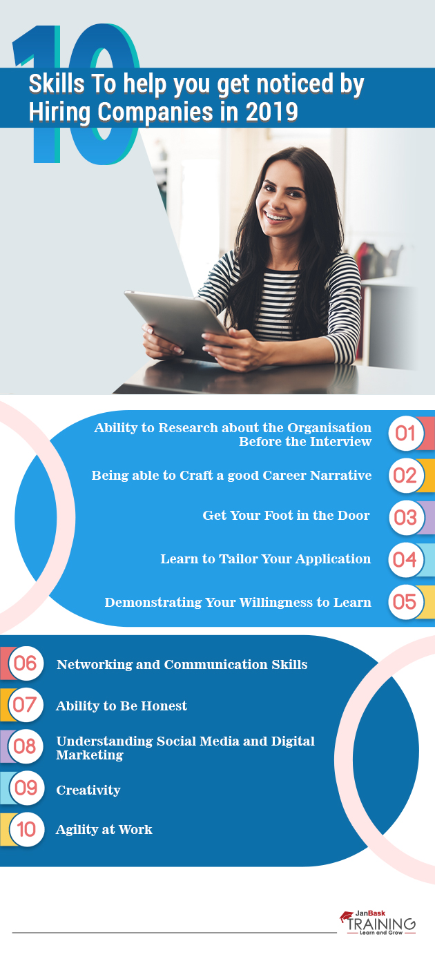
Learn to Tailor Your Application

Read: A Few Simple Ways to Organize your Life

Since you've laid all the groundwork that was required, it's the time to apply. (On the off chance that you can get an inner referral from all the systems administration you've been doing, that is far too superior.) This being your fantasy organization and all, you'll clearly not send your standard resume. Tailor that resume as you mean it, so there can be no uncertainty about the fact that you're perfect for the organization.

Next, compose an extraordinary presentation for your introductory letter. It needs to be very crisp, clear and properly formatted. Customizing your application documents is a critical piece of any pursuit of the employment process, it needs to be in accordance with the company standards. Also, see if there are any special guidelines given on the company's website regarding the format of the application or your resume or the interview.

Demonstrating Your Willingness to Learn

Expecting your prospective and current recruits to know everything about their position is relatively a very bizarre expectation these days and recruiters know that. That is in light of the fact that positions and associations have ended up being so extraordinary in their business that finding the perfect candidate isn't, for the most part, the easiest thing to do.

This is the reason associations contribute to the exertion efforts and advantages to finding someone who seems to continue with the learning methodology and work towards fulfilling his or her capacities. Demonstrating the classes, you've taken or courses you have completed on your application is a very good technique for delineating this famous aptitude.

Don't, for the most part, sit tight for your administrator to begin a preparation administration. Grab a couple of books from the area library or even consent to acknowledge an online class right now! Develop another ability and see where it takes you. 

Networking and Communication Skills

Impeccable communication aptitudes and correspondence capacities empower you to get seen by hiring managers. Passing on new innovative considerations in an indisputable and beyond any doubt a great way that can isolate you from your peers.

Read: How To Set & Achieve Professional Development Goals: Amazing Self Motivation Tips

A report by Millennial Branding, an investigation, and guiding firm, demonstrates that 84 per cent of the organizations are of the view that practical social capacities are crucial for their activity candidates. Enrolling Managers consistently ask an open-ended question just to pick up a more conspicuous cognizance of how suitably and successfully you can express your views and considerations to others at the workplace.

Ability to Be Honest

You obviously need to put your best foot forward when managing recruiters, however, it's essential to be real to life about any inadequacies you have also, says Heather Neisen, ability facilitator at Technology Advice. "Mindfulness and trustworthiness are critical. Be glad to share your qualities and interests, yet in addition have the capacity to transparently talk about regions where you need to do better — or even need to take training or certification"

Many candidates don’t realize that being honest about their shortcomings actually offers them a chance to shine, a famous talent acquisition expert says. “Admit them and offer ways you’re trying to overcome them. There are only a few things are worse than a candidate who believes they have nothing left to learn.”

Understanding Social Media and Digital Marketing

You are not expected to be exceptionally experienced or prepared modernized promoter or master of the web-based systems administration, to be considered for an occupation that doesn't by and large require those capacities. Regardless, it is considered to be great to flaunt your geeky side as well. This demonstrates your capacity to continue adopting new aptitudes and also staying up to date with respect to the latest examples and mechanical advances.

Knowing parts of substance administration, setting up profiles and the upsides of certain electronic life stages will cover the fundamentals of this expertise. Since Social Media, in numerous parts of the world, is ending up to be substantially more basic than having a physical location or even phone number for a large portion of the associations.

Creativity

Read: The Complete Guide on How to Prepare for a Technical Interview

In 2015, innovativeness as an aptitude was situated tenth on the list of skills. It's by and by outstanding amongst other three aptitudes chiefs will search for. Why? Since as we're shelled by new progressions consistently, supervisors require innovative people who can apply that tech to new things and organizations. Creative ability is a champion among the most looked for and exceptionally regarded capacities in the present occupation scenarios, and it ought to be. Associations love to get a chance to enrol specialists who are adaptable and prepared to apply their aptitudes in various conditions and can deal with unforeseen and troublesome issues easily and with conviction.

Agility at Work

Okay, do have the capacity to switch gears and conform to different people and conditions as and when they come? If yes then it’s a big plus for you as the associations today foresee that how their agents will react quickly to dynamic business circumstances. A champion among the most basic characteristics about fruitful pioneers of advancement is the essential truth that they will, in general, be helpful in choosing, dealing with issues and disposing of alternate routes. Dexterous specialists unite people, strategies, and structures to demonstrate the affiliation's focal objective and procedures.

Conclusion

All these skills are just a few tips that you can deploy to get yourself noticed. There is no assured guarantee that they would surely and surely work. However, in most cases, they do work. Try to acquire as many skills as you can and Good Luck!


fbicons FaceBook twitterTwitter lingedinLinkedIn pinterest Pinterest emailEmail

     Logo

    JanBask Training Team

    The JanBask Training Team includes certified professionals and expert writers dedicated to helping learners navigate their career journeys in QA, Cybersecurity, Salesforce, and more. Each article is carefully researched and reviewed to ensure quality and relevance.


Comments

Trending Courses

Cyber Security Course

Cyber Security

  • Introduction to cybersecurity
  • Cryptography and Secure Communication 
  • Cloud Computing Architectural Framework
  • Security Architectures and Models
Cyber Security Course

Upcoming Class

15 days 03 Oct 2025

QA Course

QA

  • Introduction and Software Testing
  • Software Test Life Cycle
  • Automation Testing and API Testing
  • Selenium framework development using Testing
QA Course

Upcoming Class

4 days 22 Sep 2025

Salesforce Course

Salesforce

  • Salesforce Configuration Introduction
  • Security & Automation Process
  • Sales & Service Cloud
  • Apex Programming, SOQL & SOSL
Salesforce Course

Upcoming Class

1 day 19 Sep 2025

Business Analyst Course

Business Analyst

  • BA & Stakeholders Overview
  • BPMN, Requirement Elicitation
  • BA Tools & Design Documents
  • Enterprise Analysis, Agile & Scrum
Business Analyst Course

Upcoming Class

1 day 19 Sep 2025

MS SQL Server Course

MS SQL Server

  • Introduction & Database Query
  • Programming, Indexes & System Functions
  • SSIS Package Development Procedures
  • SSRS Report Design
MS SQL Server Course

Upcoming Class

1 day 19 Sep 2025

Data Science Course

Data Science

  • Data Science Introduction
  • Hadoop and Spark Overview
  • Python & Intro to R Programming
  • Machine Learning
Data Science Course

Upcoming Class

8 days 26 Sep 2025

DevOps Course

DevOps

  • Intro to DevOps
  • GIT and Maven
  • Jenkins & Ansible
  • Docker and Cloud Computing
DevOps Course

Upcoming Class

-1 day 17 Sep 2025

Hadoop Course

Hadoop

  • Architecture, HDFS & MapReduce
  • Unix Shell & Apache Pig Installation
  • HIVE Installation & User-Defined Functions
  • SQOOP & Hbase Installation
Hadoop Course

Upcoming Class

8 days 26 Sep 2025

Python Course

Python

  • Features of Python
  • Python Editors and IDEs
  • Data types and Variables
  • Python File Operation
Python Course

Upcoming Class

2 days 20 Sep 2025

Artificial Intelligence Course

Artificial Intelligence

  • Components of AI
  • Categories of Machine Learning
  • Recurrent Neural Networks
  • Recurrent Neural Networks
Artificial Intelligence Course

Upcoming Class

16 days 04 Oct 2025

Machine Learning Course

Machine Learning

  • Introduction to Machine Learning & Python
  • Machine Learning: Supervised Learning
  • Machine Learning: Unsupervised Learning
Machine Learning Course

Upcoming Class

29 days 17 Oct 2025

 Tableau Course

Tableau

  • Introduction to Tableau Desktop
  • Data Transformation Methods
  • Configuring tableau server
  • Integration with R & Hadoop
 Tableau Course

Upcoming Class

8 days 26 Sep 2025

Search Posts

Reset

Receive Latest Materials and Offers on Worth To Visit Course

Interviews