Just a moment...
Just a moment...
/*Responsive Media Queries Max 320px */ @media screen and (max-width: 320px) { .sed { width: 38px !important; height: 38px !important; font-size: 22px !important; line-height: 44px !important; } ul.mega-menulist li { padding: 4px 8px !important; } .td-txt .col-xs-7 { width: 78%; } #Course p.slider-cont.blue { font-size: 13px !important; } .mobilescreen span.cont { font-size: 15px !important; } .cert { font-size: 17px !important; padding-left: 0px; } .getcall-box button.buttonctadarkbtn.btn.btn-lg { width: 86% !important; } .callto { width: 48% !important; top: 16px !important; } nav.navbar .navbar-brand { left: -68px !important; top: 10px !important; } nav.navbar .navbar-brand img.logo { width: 60px !important; } .rgt-icon p.cont2.mb0 { line-height: 48px; font-size: 14px; } .jobsare p.slider-text.white { font-size: 33px !important; } .whtlogo { margin: 70px 0 5px -26px; } .half img { width: 274px; margin: 0 auto 10px auto; } .counter .col-xs-10, .counter .col-xs-9 { padding-left: 8px !important; } .headbutton { font-size: 10px !important; width: 154px !important; } .headbutton1 { font-size: 10px; } .select2-container { margin-right: 2px !important; } nav.navbar.bootsnav { margin-bottom: 0; -moz-border-radius: 0px; -webkit-border-radius: 0px; -o-border-radius: 0px; border-radius: 0px; background-color: #fff !important; border: none; border-bottom: solid 1px #e0e0e0; z-index: 9; } .modal-content { -webkit-box-shadow: 0 5px 15px rgba(0, 0, 0, 0.5); background-image: -webkit-gradient( linear, left top, right bottom, from(#02b3e4), to(#02ccba) ); background-image: linear-gradient(to bottom right, #02b3e4, #02ccba); box-shadow: 0 5px 15px rgba(0, 0, 0, 0.5); } .modal-header { border-bottom: none; color: #fff; padding-bottom: 0px; } .modal-title { color: #fff; } } /*Responsive Media Queries Max 480px */ @media screen and (max-width: 480px) { /*Blogs*/ .blogttl { font-size: 15px; padding: 10px; box-shadow: 0 5px 20px 2px rgba(0, 0, 0, 0.12); font-weight: bold; margin-bottom: 10px; } .rght.sticky { display: none; } .blogdtlright h2 { font-size: 1.2em; font-weight: 700; line-height: 26px; margin-top: 20px; margin-bottom: 8px; } .crsbox2 { box-shadow: 0 5px 20px 2px rgba(0, 0, 0, 0.12); margin-bottom: 12px; } .crsbox2 p { position: absolute; bottom: 0; right: 12%; color: #fff; font-size: 18px; text-align: center; } /*Blogs*/ /**** JT Css *****/ nav#heder { z-index: 111111 !important; } nav.navbar.bootsnav.no-full .navbar-collapse { max-height: 227px; } .navbar-brand { float: left; height: 46px !important; } nav#heder { position: fixed !important; } .btn-store, .btn-store2 { font-size: 11px !important; line-height: 15px; width: 86px; text-align: center; padding: 3px 0px !important; } .cert { font-size: 21px; padding-left: 0px; } .select2-container { margin-right: 9px; } .mobilescreen span.cont { color: #fff; font-size: 17px; margin-bottom: 16px; display: block; } .mobilescreen button { border: 2px solid #ffffff !important; color: #fff !important; } .mobilescreen button a.dark.notxtdec { color: #fff !important; } .modal-body { position: relative; padding: 6px; } #myModal3 .modal-dialog, #myModal4 .modal-dialog, #myModal5 .modal-dialog, #myModal6 .modal-dialog { width: 100% !important; top: -20px !important; } #myModal3 .modal-content, #myModal4 .modal-content, #myModal5 .modal-content, #myModal6 .modal-content { width: 96% !important; margin: 0 auto; float: none !important; } #myModal .modal-content { width: 98% !important; background: url(https://www.janbasktraining.com/assets/demo2019/img/popup-mob.webp) top center !important; background-size: cover !important; background-repeat: no-repeat !important; padding-bottom: 61px; } #myModal .modal-dialog { width: 92% !important; } #myModal2 .modal-dialog { width: 92% !important; } #myModal2 .modal-content { width: 98% !important; background: url(https://www.janbasktraining.com/assets/demo2019//img/popup-bg3.webp) top center !important; background-size: cover !important; background-repeat: no-repeat !important; } div#myModal2 .modal-body { padding-top: 144px; } nav.navbar { padding-top: 0px !important; } nav.navbar .navbar-brand { left: -80px; top: 8px; } nav.navbar.bootsnav ul.nav > li > a { padding: 10px 15px; font-size: 15px; border-bottom: 1px solid #eee !important; } ul.phone-strip { width: 64%; background: #fff; float: none; margin: 0 auto; } ul.phone-strip li { list-style: none; float: left; padding: 8px 20px; color: #000; display: table; width: 100%; text-align: center; border: 1px solid #ab2927; margin-bottom: 20px; } ul.phone-strip li:nth-child(2) { background: #ab2927; } ul.phone-strip li:nth-child(2) a { color: #fff; } .callto { width: 40%; float: right; position: absolute; right: 0px; top: 21px; } li.signline:after { content: none; } li.mob-btn { display: none; } ul.mega-menulist li { padding: 4px 12px; font-size: 13px; border-bottom: 1px solid #eee; margin-left: -14px; background: #f7f7f7; } ul.dropdown-menu.mega-menu { min-width: 100% !important; left: 0px; transform: none; background: #fff !important; background-size: contain !important; border-bottom: 4px solid #ab2927 !important; float: left !important; position: initial !important; margin: 0 auto !important; } .lead3:after { width: 3px; height: 20px; } p.course:after { width: 3px; height: 20px; } .percentage .counter p.slider-text { font-size: 28px; margin-top: 10px; color: #414a53; } .counter .col-xs-10, .counter .col-xs-9 { padding-left: 0px; } .counter .col-xs-2 { padding-right: 0px; width: 14%; } .counter .col-xs-3 { padding-right: 0px; width: 18%; } .million .counter p.slider-text.white { font-size: 26px; } .counter p.slider-text { font-size: 26px !important; margin-top: 20px !important; } .percentage img { width: 150px; } .whtlogo img { margin-left: 20px; margin-top: 0px; } .instr-bx.inst2 p.cont2.mb0 { text-align: left; padding-left: 20px; } .padding0 { padding-left: 0px; padding-right: 0px; } .container { width: 100% !important; } .mobilescreen p.form-head.mb0 { position: absolute; background: #eeb617; } .dat { font-size: 14px; font-weight: 700; margin-bottom: 0px; } .est { font-size: 10px; margin-bottom: 0px; } .week { margin-bottom: 0px; } .getcall-box button.buttonctadarkbtn.btn.btn-lg { box-shadow: 5px 4px 3px #bbb0b0; width: 61%; margin-top: 20px; font-size: 14px; } .lineon:before { position: absolute; top: 48px; background: #777; width: 1px; height: 110px; right: 14px; content: none; } #Corporate button.buttonctadarkbtn.btn.btn-lg { padding: 6px 10px; font-size: 12px; margin-bottom: 10px; width: 138px; } .still button.buttonctadarkbtn.btn.btn-lg { padding: 6px 10px; font-size: 12px; width: 138px; } .still img { width: 120px; margin: 0 auto; display: table; } .maria img { width: 120px; margin: 0 auto; float: none !important; } .still { width: 100%; text-align: center; } .tab-pane { margin-bottom: 20px; } #accordion3 .panel-title > a { font-size: 14px !important; line-height: 20px; padding: 10px; } #accordion3 .panel.panel-default { border-radius: 0px; } #accordion3 a.collapsed { border-right: 3px solid #ab2927; border-radius: 0px; } #accordion3 a.collapsed { border-right: 3px solid #ab2927; border-radius: 0px; padding: 10px; } #accordion3 .panel.panel-default { border-radius: 0px; margin-bottom: 24px; } div#accordion3:after { background: #ab2927; position: absolute; top: 0px; content: ""; width: 3px; height: 250px; left: 40px; z-index: -1; } .star-rating-review { text-align: left; } li.fb-icon { margin-right: 0px; } div#accordion3 { position: relative; } #Course p.slider-cont.blue { margin-bottom: 20px; } .fullscreen { display: none; } .mobilescreen { display: block; } #accordion2 .panel-body span { font-size: 13px !important; line-height: 18px !important; display: block; } #accordion2 .panel-body { padding: 10px; } i.fa.fa-sort-down.pull-right { font-size: 20px; line-height: 20px; color: #3598c1; } i.fa.fa-sort-down.pull-right { line-height: 14px; } #accordion2 .panel.panel-default { border-radius: 8px; } .faq-acor #accordion1 .panel-heading .panel-title > a { font-size: 13px !important; } .panel-title > a { font-size: 14px !important; line-height: 20px; } .lead3 { font-size: 16px; line-height: 18px; } .lead2 { font-size: 18px; font-weight: 700; } .wehave { margin: 14px 0 0 0px; padding: 14px 22px; } p { margin-bottom: 10px; } .section { padding: 20px 0; } .getcall-box p.cont2.dark { font-size: 13px; text-align: left; } .getcall-box h3.slider-text2.dark { margin-bottom: 4px; } .cont2 { font-size: 15px; line-height: 20px; } .getcall-box h3.slider-text2 { font-size: 16px; padding-left: 14px; } .getcall-box h3.slider-text2:after { width: 3px; height: 20px; } .instr-bx.inst2 { margin-top: 0px; padding-left: 20px; padding-top: 10px; padding-bottom: 10px; } #Course p.course.red { font-size: 18px; padding-left: 14px; text-align: left; line-height: 20px; } div.bhoechie-tab-content { box-shadow: none; padding: 10px 0px; background: #fff; } .bhoechie-tab { background: #fff; box-shadow: 1px 1px 8px 1px #c5bdbd75; padding: 0px 10px; margin-bottom: 40px; } .instr-bx i { float: left; margin-right: 8px; line-height: 24px; display: block; font-size: 14px; color: #ffc107; } .register p.lead3 { font-size: 16px; line-height: 24px; } .tab-bx:after, .register:after { position: fixed; z-index: -1; } .asper { margin: 10px 0px; } .asper p.cont.white.mb0 { margin: 0px 0px; line-height: 18px; } .jobsare p.slider-text.white { font-size: 44px; } .doyou button.buttonctadarkbtn.btn.btn-md { margin-top: 10px; font-size: 13px; } .doyou p { font-size: 18px; line-height: 24px; } .counter { padding: 0px 0px; border-radius: 5px; } .crm, .million { height: auto; padding: 24px 0px; } .million p.slider-text.white { font-size: 22px; margin-bottom: 4px; } .crm p.slider-text.white { font-size: 22px; margin-bottom: 4px; } .lead1:after { width: 3px; height: 20px; } .lead1 { font-size: 20px; padding-left: 16px; } .headbutton1 { padding: 6px 10px; border: 2px solid #ffffff; font-size: 11px; margin-bottom: 10px; width: 104px; } .headbutton { padding: 6px 10px; border: 2px solid #ffffff; font-size: 11px; margin-bottom: 10px; width: 158px; } .bannerhome p.slider-text.white:after { bottom: -104px; } .kln { } .kln p.cont.white { margin-top: 44px !important; font-size: 13px; } .slider-text { font-size: 18px; line-height: 22px; } .slider-cont { font-size: 12px; line-height: 17px; text-align: justify; } section.sticky-nav-tabs { display: none; } select.custom-select.form-control { margin-right: 14px; } .instr-bx .col-xs-12 { border-bottom: 0px; border-right: 0px !important; padding-bottom: 4px; } .instr-bx p.cont2.mb0 { padding: 4px 0px; text-align: center; } .instr-bx { position: initial; text-align: left; border-radius: 0px; width: 100%; margin: 0 auto; display: table; float: none; box-shadow: none; background: transparent; color: #fff; margin-top: -32px; } .getcall-box { width: 100%; margin-top: 0px; padding: 16px; border-radius: 6px; } /**** JT Css End *****/ .modal-content { -webkit-box-shadow: 0 5px 15px rgba(0, 0, 0, 0.5); background-image: -webkit-gradient( linear, left top, right bottom, from(#02b3e4), to(#02ccba) ); background-image: linear-gradient(to bottom right, #02b3e4, #02ccba); box-shadow: 0 5px 15px rgba(0, 0, 0, 0.5); } .modal-header { border-bottom: none; color: #fff; padding-bottom: 0px; } .modal-title { color: #fff; } .mtpm { margin-top: -40px; } .contactleft { margin-bottom: 40px; } nav.navbar.bootsnav { margin-bottom: 0; -moz-border-radius: 0px; -webkit-border-radius: 0px; -o-border-radius: 0px; border-radius: 0px; background-color: #fff !important; border: none; border-bottom: solid 1px #e0e0e0; z-index: 9; } .fancy2 span:before, .fancy span:before { width: 72px; right: 102%; margin-right: 15px; top: 16px !important; } .fancy2, .fancy { margin-left: 94px; } .nav-justified > li { float: left; width: 25%; } #nav-tabs > li > a { padding: 10px 2px !important; float: none !important; } .events-timeline .timeline-block .content-column .event-date2 { bottom: -84px; } } @media (min-width: 600px) and (max-width: 600px) { img.img-responsive.lazy.img-rounded.kln { width: 114px; } nav.navbar.bootsnav { margin-bottom: 0; -moz-border-radius: 0px; -webkit-border-radius: 0px; -o-border-radius: 0px; border-radius: 0px; background-color: #fff !important; border: none; border-bottom: solid 1px #e0e0e0; z-index: 9; } .fancy2 span:before, .fancy span:before { top: 10px !important; } .events-timeline .timeline-block .content-column .content-box { margin-bottom: 30px; } } /*Responsive Media Queries Max 767px */ @media screen and (max-width: 767px) { div#mySidenav .temp-2-custom-bx .affix { top: 210px !important; } #body-interview .breadcrumb li a { font-size: 12px; } .section.section1.bannerhome.postDetailsBg { margin-top: 56px; } #body-interview #topfiltrbtn button.buttonctadarkbtn.btn, #body-interview #topfiltrbtn a.buttonctadarkbtn.btn { height: 40px; } #body-interview select#subcatefory, #body-interview select#filtercategory { height: 40px; } #body-interview .spa-manage { padding: 28px 0px 0!important; } #body-interview .media { padding: 10px 6px; } #body-interview .section.section1.bannerhome.tpl, .section.section1.bannerhome.salesforceHome { margin-top: 54px; padding-bottom: 30px!important; } .temp-2-custom-bx .affix { position: fixed!important; } #arrow-sidebarMob, .closebtnMob { display: block; } span#arrow-sidebarMob { position: fixed!important; right: -20px; background: #ab2927; padding: 2px 11px; border-radius: 4px; color: #fff; top: 4px; z-index: 11; cursor: pointer; font-size: 15px!important; right: initial!important; top: 208px!important; border-radius: 0px 4px 4px 0px!important; left: 0px!important; } a.closebtnMob { z-index: 11; color: #fff; font-size: 32px; right: -40px; top: 4px; display: none; background: #ab2927; padding: 4px 14px; border-radius: 4px; } .sidenav { margin-left: -298px; } div#rightarea { margin-left: 0; transition: 0.3s; } #arrow-sidebarMob{ display: block;; } #arrow-sidebar{ display: none;; } .closebtnMob { position: fixed!important; font-size: 30px!important; right: initial!important; top: 198px!important; border-radius: 0px 4px 4px 0px!important; left: 0px!important; } .blogdtlright ul, ol { margin-top: 10px; padding: 0 18px!important; } .blogdtlright h4 { font-size: 17px!important; line-height: 22px!important; } .pageheading { font-size: 20px; font-weight: 700; padding: 20px 10px 8px 10px; margin-bottom: 0px; } span#arrow-sidebar { right: -8px!important; top: 25px!important; } .blogdtlright blockquote { padding: 8px 10px; margin: 20px 0!important; font-size: 15px; border-left: 5px solid #eee; text-align: left; line-height: 17px; } .blogdtlright.new-blog-ak h4 { text-align: left; } div#contentboxdetail { padding: 40px 6px!important; } .temp-2-custom-bx .affix { top: 154px !important; } .section.section1.bannerhome.postDetails { top: 0px; } .blogttl p { min-height: auto!important; } .textinfoleft.blogtrnd ul.Real li { font-size: 11px; line-height: 12px; font-weight: 500; padding-bottom: 2px; } .course-blog button.slick-next.slick-arrow, .trend-course button.slick-next.slick-arrow { background: #eee url(https://www.janbasktraining.com/interview-questions/assets/images/right-arrow.png) no-repeat center!important; background-size: 12px!important; width: 28px!important; height: 28px!important; top: -37px!important; } .course-blog button.slick-prev.slick-arrow, .trend-course button.slick-prev.slick-arrow { right: 60px!important; background: #eee url(https://www.janbasktraining.com/interview-questions/assets/images/left-arrow.png) no-repeat center!important; background-size: 12px!important; width: 28px!important; height: 28px!important; top: -37px!important; } .search-course .slick-track { width: initial!important; } #body-interview .textinfoleft.blogtrnd .cont { font-size: 14px!important; line-height: 18px!important; padding-bottom: 6px; } #body-interview .kln { margin-top: -18px; } nav#heder { top: 0px; } #body-interview .blogttll p { margin-bottom: 6px; height: 48px; } .section.section5.latest_post .media { margin-bottom: 20px; flex-direction: column; border: 1px solid #eee; } .newsImg img{ width: 100%!important; } #body-interview .media { margin-bottom: 20px; padding: 4px 4px; } .newsImg { width: 100%!important; margin-bottom: 8px; } .blogttll p a { border-bottom: none; color: #23527c; font-size: .94em; line-height: 1.1em!important; display: block; } #body-interview span.category_name { font-size: .8em; } /* div#bannerform{ display: none; } */ .section.section5.latest_post .media { margin-bottom: 20px; flex-direction: column; } .section.section5.latest_post .media-body { width: 100%; } #body-interview .blogttll { margin: 0px!important; font-size: 1em!important; } #body-interview nav.navbar .navbar-brand img.logo { margin: 2px 0 0; width: 100px!important; } #body-interview .bannerhome { padding: 38px 0px 11px 0px; background: #edf2f5 !important; } .btnw1 img.img-responsive { width: 18px; float: left; vertical-align: middle; margin: 0px auto 0px auto; margin-right: 4px; } .btnw1 { color: #000 !important; background: #ffcc00; font-weight: 600; margin-top: 8px; padding: 4px 18px !important; border: 0; font-size: 11px !important; line-height: 20px; width: auto; border-radius: 28px; float: left; margin-right: 10px; margin-bottom: 20px; } /* .btnw1 img.img-responsive { width: 18px; float: left; vertical-align: middle; margin: 0px auto 0px auto; margin-right: 4px; } .btnw1 { color: #000 !important; background: #ffcc00; font-weight: 600; margin-top: 8px; padding: 5px 15px; border: 0; font-size: 11px; line-height: 20px; width: auto; border-radius: 28px; float: left; margin-right: 10px; margin-bottom: 20px; }*/ span.enrollbtn { border: 1px dashed #fff; padding: 0px 16px; font-size: 12px; display: block; width: 128px; line-height: 18px; margin-bottom: 10px; } .section.section1.bannerhome.auth { padding-top: 70px; } .rnewyear { display: none; } .content .kln p.cont.white.llt { margin: 0px !important; } .content .blogdtlright img { max-width: 100%; height: auto !important; } .sed { width: 48px; height: 48px; text-align: center; font-size: 22px; line-height: 54px; } .comment_dtl ul, .comment_dtl ol { padding-left: 0px; } .getcall-box.panel-default.cmtt { padding: 16px 0px; } li.bcp { display: none; } .viewall-bx { display: none; } .blogdtlright img { display: table; } #myModal6 .modal-content { width: 98% !important; background: url(https://www.janbasktraining.com/assets/demo2019//img/popup-5.webp) top center !important; background-size: cover !important; background-repeat: no-repeat !important; } div#myModal6 .modal-body { padding-top: 144px; } #myModal5 .modal-content { width: 98% !important; background: url(https://www.janbasktraining.com/assets/demo2019//img/popup-4.webp) top center !important; background-size: cover !important; background-repeat: no-repeat !important; } div#myModal5 .modal-body { padding-top: 144px; } .modal-body button { margin-top: 16px !important; } #myModal4 .modal-content { background: url(https://www.janbasktraining.com/assets/demo2019//img/popup-talk.webp) top center !important; background-size: cover !important; } div#myModal4 .modal-body { padding-top: 144px; } #layout62 .wehave { margin: 26px 0 0 0px; } .form-group { margin-bottom: 15px; float: left; width: 100%; } .section18 p.lead3.white { line-height: 22px; } .hlf { margin-top: 90px; color: #000 !important; } .section18 { margin-top: 30px; } .rgt-icon { width: 76%; margin: 12px auto; } .inst2 .col-xs-12 { border-right: none !important; } nav#heder { z-index: 111111 !important; } nav.navbar.bootsnav.no-full .navbar-collapse { max-height: 100%; overflow-y: auto !important; box-shadow: 1px 1px 8px 0px #eee; } .btn-store, .btn-store2 { font-size: 11px !important; line-height: 15px; width: 86px; text-align: center; padding: 3px 0px !important; } .cert { font-size: 21px; padding-left: 0px; } .select2-container { margin-right: 9px; } .mobilescreen span.cont { color: #fff; font-size: 17px; margin-bottom: 16px; display: block; } .mobilescreen button { border: 2px solid #ffffff !important; color: #fff !important; } .mobilescreen button a.dark.notxtdec { color: #fff !important; } .modal-body { position: relative; padding: 6px; } #myModal3 .modal-dialog { width: 100% !important; top: -20px !important; } #myModal3 .modal-content { width: 98% !important; } #myModal .modal-content { width: 98% !important; background: url(https://www.janbasktraining.com/assets/demo2019/img/popup-mob.webp) !important; background-size: cover !important; background-repeat: no-repeat !important; padding-bottom: 61px; } #myModal .modal-dialog { width: 92% !important; } #myModal2 .modal-dialog { width: 92% !important; } nav.navbar { padding-top: 0px !important; } nav.navbar .navbar-brand { left: -80px; top: 8px; } nav.navbar.bootsnav ul.nav > li > a { padding: 10px 15px; font-size: 15px; border-bottom: 1px solid #eee !important; } ul.phone-strip { } li.mob-btn { display: none; } ul.mega-menulist li { padding: 4px 12px; font-size: 13px; border-bottom: 1px solid #eee; margin-left: -14px; background: #f7f7f7; } ul.dropdown-menu.mega-menu { min-width: 100% !important; left: 0px; transform: none; background: #fff !important; background-size: contain !important; border-bottom: none !important; float: left !important; position: initial !important; margin: 0 auto !important; height: 300px; overflow: scroll; } .lead3:after { width: 3px; height: 20px; } p.course:after { width: 3px; height: 20px; } .percentage .counter p.slider-text { font-size: 28px; margin-top: 10px; color: #414a53; } .counter .col-xs-10, .counter .col-xs-9 { padding-left: 0px; } .counter .col-xs-2 { padding-right: 0px; width: 14%; } .counter .col-xs-3 { padding-right: 0px; width: 18%; } .million .counter p.slider-text.white { font-size: 26px; } .counter p.slider-text { font-size: 26px !important; margin-top: 20px !important; } .percentage img { width: 150px; } .whtlogo img { margin-left: 20px; margin-top: 0px; } .instr-bx.inst2 p.cont2.mb0 { text-align: left; padding-left: 20px; } .padding0 { padding-left: 0px; padding-right: 0px; } .container { width: 100% !important; } .mobilescreen p.form-head.mb0 { position: absolute; background: #eeb617; } .dat { font-size: 14px; font-weight: 700; margin-bottom: 0px; } .est { font-size: 10px; margin-bottom: 0px; } .week { margin-bottom: 0px; } .getcall-box button.buttonctadarkbtn.btn.btn-lg { box-shadow: 5px 4px 3px #bbb0b0; width: 61%; margin-top: 20px; font-size: 14px; } .lineon:before { position: absolute; top: 48px; background: #777; width: 1px; height: 110px; right: 14px; content: none; } #Corporate button.buttonctadarkbtn.btn.btn-lg { padding: 6px 10px; font-size: 12px; margin-bottom: 10px; width: 138px; } .still button.buttonctadarkbtn.btn.btn-lg { padding: 6px 10px; font-size: 12px; width: 138px; } .still img { width: 120px; margin: 0 auto; display: table; } .maria img { width: 120px; margin: 0 auto; float: none !important; } .still { width: 100%; text-align: center; float: left; } .tab-pane { margin-bottom: 20px; } #accordion3 .panel-title > a { font-size: 14px !important; line-height: 20px; padding: 10px; } #accordion3 .panel.panel-default { border-radius: 0px; } #accordion3 a.collapsed { border-right: 3px solid #ab2927; border-radius: 0px; } #accordion3 a.collapsed { border-right: 3px solid #ab2927; border-radius: 0px; padding: 10px; } #accordion3 .panel.panel-default { border-radius: 0px; margin-bottom: 24px; } div#accordion3:after { background: #ab2927; position: absolute; top: 0px; content: ""; width: 3px; height: 250px; left: 40px; z-index: -1; } .star-rating-review { text-align: left; } li.fb-icon { margin-right: 0px; } div#accordion3 { position: relative; } #Course p.slider-cont.blue { margin-bottom: 20px; } .fullscreen { display: none; } .mobilescreen { display: block; } #accordion2 .panel-body span { font-size: 13px !important; line-height: 18px !important; display: block; } #accordion2 .panel-body { padding: 10px; } i.fa.fa-sort-down.pull-right { font-size: 20px; line-height: 20px; color: #3598c1; } i.fa.fa-sort-down.pull-right { line-height: 14px; } #accordion2 .panel.panel-default { border-radius: 8px; } .faq-acor #accordion1 .panel-heading .panel-title > a { font-size: 13px !important; } .panel-title > a { font-size: 14px !important; line-height: 20px; } .lead3 { font-size: 16px; line-height: 18px; } .lead2 { font-size: 18px; font-weight: 700; } .wehave { margin: 14px 0 0 0px; padding: 14px 22px; } p { margin-bottom: 10px; } .section { padding: 20px 0; } .getcall-box p.cont2.dark { font-size: 13px; text-align: left; } .getcall-box h3.slider-text2.dark { margin-bottom: 4px; } .cont2 { font-size: 15px; line-height: 20px; } .getcall-box h3.slider-text2 { font-size: 16px; padding-left: 14px; } .getcall-box h3.slider-text2:after { width: 3px; height: 20px; } .instr-bx.inst2 { margin-top: 0px; padding-left: 20px; padding-top: 10px; padding-bottom: 10px; } .register { padding-bottom: 0px; background-size: cover !important; } #Course p.course.red { font-size: 18px; padding-left: 14px; text-align: left; line-height: 20px; } div.bhoechie-tab-content { box-shadow: none; padding: 10px 0px; background: #fff; } .bhoechie-tab { background: #fff; box-shadow: 1px 1px 8px 1px #c5bdbd75; padding: 0px 10px; margin-bottom: 40px; } .instr-bx i { float: left; margin-right: 8px; line-height: 24px; display: block; font-size: 14px; color: #ffc107; } .register p.lead3 { font-size: 16px; line-height: 24px; } .tab-bx:after, .register:after { position: fixed; z-index: -1; } .asper { margin: 10px 0px; } .asper p.cont.white.mb0 { margin: 0px 0px; line-height: 18px; } .jobsare p.slider-text.white { font-size: 44px; } .doyou button.buttonctadarkbtn.btn.btn-md { margin-top: 10px; font-size: 13px; } .doyou p { font-size: 18px; line-height: 24px; } .counter { padding: 0px 0px; border-radius: 5px; } .crm, .million { height: auto; padding: 24px 0px; } .million p.slider-text.white { font-size: 22px; margin-bottom: 4px; } .crm p.slider-text.white { font-size: 22px; margin-bottom: 4px; } .lead1:after { width: 3px; height: 20px; } .lead1 { font-size: 20px!important; padding-left: 14px!important; } .headbutton1 { padding: 6px 10px; border: 2px solid #ffffff; font-size: 11px; margin-bottom: 10px; width: 104px; } .headbutton { padding: 6px 10px; border: 2px solid #ffffff; font-size: 11px; margin-bottom: 10px; width: 158px; } .bannerhome p.slider-text.white:after { bottom: -104px; } .kln { margin-top: 70px; } .kln p.cont.white { margin-top: 44px !important; font-size: 13px; } .slider-text { font-size: 18px; line-height: 22px; } .slider-cont { font-size: 12px; line-height: 17px; text-align: justify; } section.sticky-nav-tabs { display: none; } select.custom-select.form-control { margin-right: 14px; } .instr-bx .col-xs-12 { border-bottom: 0px; border-right: 0px !important; padding-bottom: 4px; } .instr-bx p.cont2.mb0 { padding: 4px 0px; text-align: center; } .instr-bx { position: initial; text-align: left; border-radius: 0px; width: 100%; margin: 0 auto; display: table; float: none; box-shadow: none; background: transparent; color: #fff; margin-top: -32px; } .section.section1.bannerhome { background: linear-gradient( 135deg, rgba(82, 62, 232, 0.92), rgba(0, 220, 175, 0.92) ) !important; } .getcall-box { width: 100%; margin-top: 0px; padding: 16px; border-radius: 6px; } /**** JT Css End *****/ .modal-content { -webkit-box-shadow: 0 5px 15px rgba(0, 0, 0, 0.5); background-image: -webkit-gradient( linear, left top, right bottom, from(#02b3e4), to(#02ccba) ); background-image: linear-gradient(to bottom right, #02b3e4, #02ccba); box-shadow: 0 5px 15px rgba(0, 0, 0, 0.5); } .modal-header { border-bottom: none; color: #fff; padding-bottom: 0px; } .modal-title { color: #fff; } .mtpm { margin-top: -40px; } .contactleft { margin-bottom: 40px; } nav.navbar.bootsnav { margin-bottom: 0; -moz-border-radius: 0px; -webkit-border-radius: 0px; -o-border-radius: 0px; border-radius: 0px; background-color: #fff !important; border: none; border-bottom: solid 1px #e0e0e0; z-index: 9; } .fancy2 span:before, .fancy span:before { width: 72px; right: 102%; margin-right: 15px; top: 16px !important; } .fancy2, .fancy { margin-left: 94px; } .nav-justified > li { float: left; width: 25%; } #nav-tabs > li > a { padding: 10px 2px !important; float: none !important; } .events-timeline .timeline-block .content-column .event-date2 { bottom: -84px; } .fullscreen { display: none; } .mobilescreen { display: block; } .nav-justified > li { float: left; width: 25%; } #nav-tabs > li > a { padding: 10px 2px !important; float: none !important; } } /*Responsive Media Queries Only for 800px to 800px */ @media (min-width: 800px) and (max-width: 800px) { } /*Responsive Media Queries 768px to 991px */ @media (min-width: 768px) and (max-width: 991px) { .nav.nav-pills.nav-stacked.sidebarbg.affix { margin-top: -70px!important; } .closebtnMob, a.closebtn { position: fixed!important; font-size: 30px!important; right: initial!important; top: 198px!important; border-radius: 0 4px 4px 0!important; left: 0!important; } span#arrow-sidebarMob { top: 208px!important; } .section.section1.bannerhome.postDetailsBg { margin-top: 56px; } #body-interview div#indepe { top: -28px!important; } #body-interview .section.section1.bannerhome.tpl, #body-interview .section.section1.bannerhome.salesforceHome { margin-top: 54px; } .course-blog button.slick-next.slick-arrow, .trend-course button.slick-next.slick-arrow { background: #eee url(https://www.janbasktraining.com/interview-questions/assets/images/right-arrow.png) no-repeat center!important; background-size: 12px!important; width: 28px!important; height: 28px!important; top: -37px!important; } .course-blog button.slick-prev.slick-arrow, .trend-course button.slick-prev.slick-arrow { right: 60px!important; background: #eee url(https://www.janbasktraining.com/interview-questions/assets/images/left-arrow.png) no-repeat center!important; background-size: 12px!important; width: 28px!important; height: 28px!important; top: -37px!important; } #body-interview .media { margin-bottom: 16px!important; } #body-interview .card-hover { min-height: 148px; } #body-interview .blog-img-width, #body-interview .feat img { width: 100%; height: auto; } #body-interview .media { display: flex; margin-bottom: 10px; padding: 10px 0px; } #body-interview .fixedstripbg.fixed-form-banner{ top: 58px!important; } #body-interview #bannerform.fixed-form-banner .getcall-box.panel.panel-default { padding: 0px!important; margin: 0px!important; } div#bannerform form#search_validate fieldset { display: flex; } #body-interview .textinfoleft.blogtrnd .cont { font-size: 14px!important; line-height: 18px!important; padding-bottom: 6px; } #body-interview .kln { margin-top: -18px; } #body-interview nav.navbar .navbar-brand img.logo { width: 106px!important; } nav#heder { top: 0px!important; } #body-interview .blogttll p { margin-bottom: 6px; height: 48px; } #body-interview .bannerhome { padding: 38px 0px 11px 0px; background: #edf2f5 !important; } .section.section1.bannerhome.auth { padding-top: 110px; } .heder2 { top: 28px !important; } .comment_dtl ul, ol { padding-left: 0px; } .getcall-box.panel-default.cmtt { padding: 16px 0px; } nav.navbar.bootsnav ul.nav > li > a { padding: 12px 15px; } nav.navbar.bootsnav .navbar-nav > li { border-top: 1px solid #eee; } ul.dropdown-menu.mega-menu { background: #f7f7f7 !important; background-size: contain !important; border-bottom: 4px solid #ab2927 !important; float: left !important; } li.mob-btn, li.bcp { display: none; } .blogttl { margin-bottom: 18px; } .section.section1.bannerhome { background: linear-gradient( 135deg, rgba(82, 62, 232, 0.92), rgba(0, 220, 175, 0.92) ) !important; } .blogdtlright img { margin: 0 auto 10px auto; display: table; max-width: 100%; } .rght.sticky { display: none; } .rght { width: 100%; } nav.navbar.bootsnav .navbar-nav > li { width: 100%; } .crsbox2 { box-shadow: 0 5px 20px 2px rgba(0, 0, 0, 0.12); margin-bottom: 12px; } .crsbox2 p { position: absolute; bottom: 0; right: 12%; color: #fff; font-size: 18px; text-align: center; } #layout62 .wehave { margin: 26px 0 0 0px; } doyou button.buttonctadarkbtn.btn.btn-md { margin-top: 8px; } .doyou { padding: 14px 10px; } #layout62 .crm, #layout62 .million { height: 170px; } #layout62 .instr-bx { bottom: -79px; } .getcall-box input.form-control.mo-pt { width: 62% !important; } .select2-container { width: 30% !important; margin-right: 12px !important; } .inst2 i.fa { float: none; } .rgt-icon { width: 100%; margin: 0 auto; } nav#heder { z-index: 111111 !important; position: fixed !important; background: #fff; } nav.navbar.bootsnav .navbar-header { padding-left: 0px; padding-right: 0px; } nav.navbar .navbar-brand { left: -196px; } .callto { width: 40%; float: right; position: absolute; right: 0px; top: 21px; } #myModal3 .modal-content .close, #myModal4 .modal-content .close { margin-top: -30px !important; } .grace img { border-radius: 50%; box-shadow: 1px 1px 8px 1px #afafaf; width: 74px; height: 74px; } #Course p.slider-cont.blue { margin-bottom: 24px; } #myModal .modal-dialog { width: 94% !important; margin: 0px auto !important; display: table; } #myModal2 .modal-dialog, #myModal3 .modal-dialog, #myModal4 .modal-dialog, #myModal5 .modal-dialog, #myModal6 .modal-dialog { width: 74% !important; margin: 0px auto !important; display: table; } .modal { z-index: 1111111 !important; } .grace-bx { margin-top: 0px; } p.nophone { font-size: 24px; margin-top: 14px; } .still.maria p.slider-text.dark { margin-bottom: 0px; } .still img { width: 72px; } .still { width: 48%; float: left; margin-right: 12px; } .wehave { padding: 23px 40px; width: 100%; margin: -23px auto 0 auto; float: none; display: table; } #Course { padding-bottom: 0px; } .tab-img { width: 60%; } #accordion3 .panel-title > a { font-size: 14px !important; line-height: 20px; padding: 10px; } #accordion3 .panel.panel-default { border-radius: 0px; } #accordion3 a.collapsed { border-right: 3px solid #ab2927; border-radius: 0px; } #accordion3 a.collapsed { border-right: 3px solid #ab2927; border-radius: 0px; padding: 10px; } #accordion3 .panel.panel-default { border-radius: 0px; margin-bottom: 28px; } div#accordion3:after { background: #ab2927; position: absolute; top: 100px; content: ""; width: 3px; height: 350px; left: 40px; z-index: -1; } .form-head { margin-top: -25px; width: 114px; background: #eeb617; } #Course .row.fullscreen { display: none; } #Course .row.mobilescreen { display: block; } #Course p.course.red { font-size: 22px; padding-left: 20px; } p.course:after { height: 24px; } .register .instr-bx.inst2 { bottom: -70px !important; } .fullscreen { margin-bottom: 20px; } .register { background-size: cover !important; } .cert { font-size: 28px; line-height: 38px; } .asper p.cont.white.mb0 { margin: 0px 0px 18px 0px; line-height: 22px; padding: 0 0 21px 0; } .jobsare img { width: 73px; } .doyou p { font-size: 17px; line-height: 23px; } .opt { width: 334px; height: 394px; } .crm, .million { height: auto; } .padding0 { padding-left: 0px; padding-right: 0px; } .lead1:after { width: 4px; height: 22px; } .lead1 { font-size: 22px; padding-left: 20px; } section.sticky-nav-tabs { display: none; } .headbutton { width: 258px; } .headbutton1 { width: 258px; margin-top: 14px; } .instr-bx p.cont3.mb0 { font-size: 13px; line-height: 20px; } .instr-bx { width: 684px; float: left; border-radius: 44px; padding: 18px 0px; bottom: -78px; } .bannerhome p.slider-text.white:after { bottom: -108px; } .kln p.cont.white { margin-top: 32px !important; } select.custom-select.form-control { margin-right: 12px; } .getcall-box h3.slider-text2 { margin-bottom: 0px; } .getcall-box h3.slider-text2:after { width: 4px; height: 20px; } .getcall-box { width: 100%; float: right; padding: 16px; margin-top: 14px; } .getcall-box p.cont2.dark { font-size: 13px; text-align: left; } .slider-text { font-size: 22px; font-weight: 700; line-height: 24px; } .slider-cont { font-size: 14px; line-height: 20px; } } /*Responsive Media Queries 992px to 1024px */ @media (min-width: 992px) and (max-width: 1024px) { .section.section1.bannerhome.postDetailsBg { margin-top: 98px; } #body-interview .section.section1.bannerhome.tpl, #body-interview .section.section1.bannerhome.salesforceHome { margin-top: 94px; } #body-interview .media { margin-bottom: 16px!important; } #body-interview .card-hover { min-height: 148px; } #body-interview .blog-img-width, #body-interview .feat img { width: 100%; height: auto!important; } #body-interview nav.navbar .navbar-brand img.logo { margin: 2px 0 0; width: 118px; } #body-interview .bannerhome { background: #edf2f5 url(https://www.janbasktraining.com/interview-questions/assets/images/sfBg.png) no-repeat top right!important; background-size: contain!important; } .temp-2-custom-bx .affix { width: 300px !important; } .temp-2-custom-bx .affix { width: 146.66px; } .heder2 { top: 28px !important; } .section.section1.bannerhome.auth .kln { padding: 20px; } .section.section1.bannerhome.auth { background-size: cover !important; padding-top: 50px !important; padding-bottom: 0px !important; background-position: bottom center !important; } .whtlogo img { margin-top: 20px; width: 108px; } .rght.sticky { width: 200px !important; } .blogttl { font-size: 12px; padding: 10px; line-height: 18px; box-shadow: 0 5px 20px 2px rgba(0, 0, 0, 0.12); font-weight: bold; } .tpl { padding-bottom: 0px !important; } .getcall-box.panel.panel-default .form-group { margin-bottom: 0px !important; } #layout63 .jobsare { padding: 21px 0px; } #layout63 .asper p.cont.white.mb0 { margin: 0px 0px; line-height: 18px; font-size: 12px; } #layout63 .jobsare p.slider-text.white { font-size: 22px; } #layout63 img.img-responsive.opt { height: 298px; } #layout63 .counter { padding: 0px 0; } #layout63 .crm { height: 145px; } #layout63 .million { height: 144px; } .sticky-nav-tab h2 { color: #000; font-size: 12px; font-weight: 700; line-height: 20px; display: flex; -webkit-box-pack: center; -ms-flex-pack: center; justify-content: center; -webkit-box-align: center; -ms-flex-align: center; align-items: center; -webkit-box-flex: 1; -ms-flex: 1; padding: 0px; margin: 0px; letter-spacing: 0px; } #layout62 .wehave p.slider-text.dark { font-size: 22px; font-weight: 700; line-height: 28px; } .asper p.cont.white.mb0 { margin: 0px 0px; line-height: 22px; } .tab-content .lead3 { font-size: 16px; padding-left: 12px; } #layout62 .instr-bx { bottom: -116px; } .half { padding: 76px 0px; } .half img { width: 254px; } .doyou { padding: 10px 10px; } nav.navbar.bootsnav ul.nav > li > a { padding: 18px 10px; font-size: 16px; } li.fb-icon { margin-right: 0px; } button.buttonctadarkbtn.btn { font-size: 16px; } .still button.buttonctadarkbtn.btn.btn-lg { padding: 8px 20px; } .list-group p.cont2.mb0 { font-size: 14px; } #Course p.course.red { font-size: 20px; padding-left: 18px; } div#Corporate { padding-top: 0px; } .wehave { margin: 18px 0 0 -50px; padding: 24px; } div.bhoechie-tab-content li.cont3 { font-size: 12px; line-height: 20px; } #Course p.slider-cont.blue { margin-bottom: 20px; font-size: 11.8px; margin-top: -8px; } div.bhoechie-tab-content p.lead2.dark { font-size: 18px; margin-bottom: 4px; } .register .instr-bx.inst2 { width: 100%; } .rgt-icon { width: 86%; margin: 0 auto; } .lead1 { font-size: 20px; padding-left: 20px; } .sticky-nav-tab { font-size: 13px !important; font-weight: 700; } .counter p.slider-text { margin-bottom: 4px; } img.img-responsive.opt { height: 315px; } .percentage .counter p.slider-text { font-size: 54px !important; margin-top: 0px !important; color: #414a53; } .crm p.slider-text.white, .million p.slider-text.white { margin-bottom: 0px; } .crm { padding: 14px 10px; height: auto; } .million { padding: 14px 10px; height: auto; } .jobsare { padding: 24px 0px; } .asper p.cont.white.mb0 { font-size: 16px; } .jobsare p.slider-text.white { font-size: 25px; text-align: left; } .jobsare img { width: 74px; margin-left: -12px; } .sticky-nav-tabs { height: 11vh !important; } .instr-bx { width: 718px; bottom: -102px; } .kln { margin-top: 54px; } .getcall-box { width: 100%; margin-top: 0px; } .container { width: 94%; } input.form-control.sidemob { width: 58% !important; } span.select2.select2-container.select2-container--default { width: 58px !important; } .getcall-box input.form-control { font-size: 12px; } } /*Responsive Media Queries 992px to 1024px */ @media (min-width: 1025px) and (max-width: 1200px) { #body-interview .blog-img-width, #body-interview .feat img { width: 100%; height: auto!important; } #body-interview nav.navbar .navbar-brand img.logo { margin: 2px 0 0; width: 118px; } .section.section1.bannerhome.postDetailsBg { margin-top: 98px; } #body-interview .section.section1.bannerhome.tpl, #body-interview .section.section1.bannerhome.salesforceHome { margin-top: 94px; } #body-interview .media { margin-bottom: 16px!important; } .course-blog button.slick-next.slick-arrow, .trend-course button.slick-next.slick-arrow { background: #eee url(https://www.janbasktraining.com/interview-questions/assets/images/right-arrow.png) no-repeat center!important; background-size: 16px!important; width: 32px!important; height: 32px!important; top: -37px!important; } .course-blog button.slick-prev.slick-arrow, .trend-course button.slick-prev.slick-arrow { right: 60px!important; background: #eee url(https://www.janbasktraining.com/interview-questions/assets/images/left-arrow.png) no-repeat center!important; background-size: 16px!important; width: 32px!important; height:32px!important; top: -37px!important; } #body-interview .media { margin-bottom: 16px!important; } #body-interview .card-hover { min-height: 140px!important; } #body-interview .textinfoleft.blogtrnd .cont { font-size: 16px!important; } .tpl { padding-bottom: 0px !important; } .rght.sticky { width: 200px !important; } .rght .getcall-box.panel-default { margin-top: 0px !important; } .sticky-nav-tab h2 { color: #000; font-size: 12px; font-weight: 700; line-height: 20px; display: flex; -webkit-box-pack: center; -ms-flex-pack: center; justify-content: center; -webkit-box-align: center; -ms-flex-align: center; align-items: center; -webkit-box-flex: 1; -ms-flex: 1; padding: 0px; margin: 0px; letter-spacing: 0px; } li.fb-icon { margin-right: 0px; } button.buttonctadarkbtn.btn { font-size: 16px; } .still button.buttonctadarkbtn.btn.btn-lg { padding: 8px 20px; } .list-group p.cont2.mb0 { font-size: 14px; } #Course p.course.red { font-size: 24px; padding-left: 24px; } div#Corporate { padding-top: 0px; } .wehave { margin: 18px 0 0 -50px; padding: 24px; } div.bhoechie-tab-content li.cont3 { font-size: 12px; line-height: 20px; } #Course p.slider-cont.blue { margin-bottom: 20px; } div.bhoechie-tab-content p.lead2.dark { font-size: 18px; margin-bottom: 4px; } .register .instr-bx.inst2 { width: 100%; } .rgt-icon { width: 82%; margin: 0 auto; } .lead1 { font-size: 24px; padding-left: 20px; } .sticky-nav-tab { font-size: 13px !important; font-weight: 700; } .counter p.slider-text { margin-bottom: 4px; } img.img-responsive.opt { height: 315px; } .percentage .counter p.slider-text { font-size: 54px !important; margin-top: 0px !important; color: #414a53; } .crm p.slider-text.white, .million p.slider-text.white { margin-bottom: 0px; } .crm { padding: 14px 10px; height: auto; } .million { padding: 14px 10px; height: auto; } .jobsare { padding-top: 26px; } .asper p.cont.white.mb0 { font-size: 16px; } .jobsare p.slider-text.white { font-size: 28px; } .jobsare img { width: 106px; margin-left: -12px; } .sticky-nav-tabs { height: 11vh !important; } .instr-bx { width: 718px; } .getcall-box { width: 100%; } } @media (min-width: 1201px) and (max-width: 1280px) { #body-interview .getcall-box .card-hover { min-height: 100px!important; } .pre23.nav.nav-pills.nav-stacked.affix { width: 249.73px !important; } button.buttonctadarkbtn.btn { background: #ab2927; font-size: 12px; } .new-blog-ak p { margin-bottom: 10px; } .browsecate ul li { font-size: 12px; } .trend-course .courseinfo ul.Real { margin: 0px; padding: 0px 14px; min-height: 56px; } .rghtsideblg p { margin-bottom: 0 !important; } .temp-2-custom-bx .rght { padding: 10px 14px; } .affix .rght-new-x2, .affix .rght-new-x3 { display: none; } .rghtsideblg-new-x { background: transparent !important; display: block; float: left; padding: 0 !important; border: 1px solid #e8e8e8; /* border-bottom: 4px solid #1289ee; */ overflow: auto; margin-bottom: 10px; height: 189px; } .rghtsideblg-new-x { background: transparent !important; display: block; float: left; padding: 0 !important; border: 1px solid #e8e8e8; /* border-bottom: 4px solid #1289ee; */ overflow: auto; margin-bottom: 10px; height: 190px; } .scroll-x li a { padding: 8px 5px; font-size: 12px; line-height: 17px; } .rght-new-x .lead1 { font-size: 0.99em; padding: 8px 15px; } .temp-2-custom-bx .rght .lead5 span { font-size: 0.99em; padding: 8px 15px; } .rghtsideblg-new-x p a { padding: 8px 5px; font-size: 12px; line-height: 17px; display: block; } .temp-2-custom-bx .affix { position: fixed; width: 298px !important; } .rght-new-x.sticky { width:298px !important; } .pre1 h4 { position: absolute; left: 40%; top: -18px; font-size: 17px; } .scroll-x { height: 70vh; overflow: auto; } .select2-container--default .select2-selection--single .select2-selection__arrow b { margin-left: 9px !important; margin-top: -3px !important; } .getcall-box.panel.panel-default .form-group { } #layout63 .counter { padding: 4px 0; } #layout63 .percentage .counter p.slider-text { font-size: 70px !important; margin-top: 20px; color: #414a53; } #layout63 h4.lead3.white.hlf { font-size: 17px; } #layout63 .asper p.cont.white.mb0 { margin: 4px 0px; line-height: 20px; font-size: 14px; } .jobsare img { width: 88px; } .sticky-nav-tab h2 { color: #000; font-size: 16px; font-weight: normal; line-height: 20px; display: flex; -webkit-box-pack: center; -ms-flex-pack: center; justify-content: center; -webkit-box-align: center; -ms-flex-align: center; align-items: center; -webkit-box-flex: 1; -ms-flex: 1; padding: 0px; margin: 0px; letter-spacing: 0px; } #layout63 .instr-bx { width: 773px; } #layout62 .instr-bx { bottom: -122px; } #Course p.course.red { padding-left: 18px; } .sticky-nav-tabs-container { bottom: -22px !important; } .getcall-box { width: 100%; margin: 0 auto; float: left; } #Corporate { padding-top: 0px; } .wehave { margin: 26px 0 0 -50px; } .tab-img { padding: 36px 0; } div.bhoechie-tab-content::-webkit-scrollbar { width: 4px; height: 8px; } div.bhoechie-tab-content { height: 428px; overflow: scroll; } div.bhoechie-tab-content::-webkit-scrollbar-thumb { border-radius: 0px; background-color: rgb(171, 41, 39); } #Course p.slider-cont.blue { font-size: 15px; } .half button { margin-top: 28px !important; } .half { padding-bottom: 20px; } .best p.lead3 { font-size: 18px; } .rgt-icon { width: 70%; } .instr-bx.inst2 { width: 100%; } .doyou p { font-size: 18px; } .counter { padding: 18px 0; } section.sticky-nav-tabs { height: 16vh; } .headbutton { padding: 8px 13px; } .instr-bx { width: 758px; } .million, .crm { height: 180px; } } @media screen and (min-width: 1200px) { } @media (min-width: 1200px) and (max-width: 1299px) { .blogdtlright h2 { font-size: 23px; font-weight: 700; } .slider-text { font-size: 25px; font-weight: 700; line-height: 34px; } .scroll-now1 { overflow-y: scroll; max-height: 474px; } .bannerhome.postDetailsBg { padding: 20px 34px; } div#contentboxdetail { padding: 0px 34px; } .temp-2-custom-bx .affix { top:104px !important; } span#arrow-sidebarMob { position: fixed!important; right: -20px; background: #ab2927; padding: 2px 11px; border-radius: 4px; color: #fff; top: 4px; z-index: 11; cursor: pointer; font-size: 15px!important; right: initial!important; top: 208px!important; border-radius: 0px 4px 4px 0px!important; left: 0px!important; } .closebtn { position: fixed!important; font-size: 30px!important; right: initial!important; top: 198px!important; border-radius: 0px 4px 4px 0px!important; left: 0px!important; } .section.section1.bannerhome.postDetailsBg { margin-top: 98px; } #body-interview .section.section1.bannerhome.tpl, #body-interview .section.section1.bannerhome.salesforceHome { margin-top: 94px; } #body-interview nav.navbar .navbar-brand img.logo { width: 124px; } #body-interview .media { margin-bottom: 16px!important; } #body-interview .card-hover { min-height: 140px!important; } #body-interview .textinfoleft.blogtrnd .cont { font-size: 15px; } .sedtxt h3 { font-size: 16px; line-height: 24px; margin-bottom: 4px; text-transform: capitalize; } .sedtxt p { font-size: 12px; line-height: 20px; color: #656565; } } @media (min-width: 1300px) and (max-width: 1399px) { .blogdtlright h2 { font-size: 24px; font-weight: 700; } .slider-text { font-size: 26px; font-weight: 700; line-height: 34px; } .bannerhome.postDetailsBg { padding: 20px 34px; } div#contentboxdetail { padding: 0px 34px; } .scroll-now1 { overflow-y: scroll; max-height: 530px; } span#arrow-sidebarMob { position: fixed!important; right: -20px; background: #ab2927; padding: 2px 11px; border-radius: 4px; color: #fff; top: 4px; z-index: 11; cursor: pointer; font-size: 15px!important; right: initial!important; top: 208px!important; border-radius: 0px 4px 4px 0px!important; left: 0px!important; } .closebtn { position: fixed!important; font-size: 30px!important; right: initial!important; top: 198px!important; border-radius: 0px 4px 4px 0px!important; left: 0px!important; } .section.section1.bannerhome.postDetailsBg { margin-top: 98px; } #body-interview .section.section1.bannerhome.tpl, #body-interview .section.section1.bannerhome.salesforceHome { margin-top: 94px; } #body-interview .getcall-box .card-hover { min-height: 100px!important; } #body-interview nav.navbar .navbar-brand img.logo { width: 124px; } #body-interview .media { margin-bottom: 16px!important; } #body-interview .card-hover { min-height: 140px!important; } .sedtxt h3 { font-size: 16px; line-height: 24px; margin-bottom: 4px; text-transform: capitalize; } .sedtxt p { font-size: 12px; line-height: 20px; color: #656565; } .pre23.nav.nav-pills.nav-stacked.affix { width: 249.73px !important; } .new-blog-ak p { margin-bottom: 10px; } .browsecate ul li { font-size: 12px; } .trend-course .courseinfo ul.Real { margin: 0px; padding: 0px 14px; min-height: 56px; } .rghtsideblg p { margin-bottom: 0 !important; } .rghtsideblg-new-x { background: transparent !important; display: block; float: left; padding: 0 !important; border: 1px solid #e8e8e8; /* border-bottom: 4px solid #1289ee; */ overflow: auto; margin-bottom: 10px; height: 270px; } .scroll-x li a { padding: 8px 5px; font-size: 12px; line-height: 17px; } .rght-new-x .lead1 { font-size: 0.99em; padding: 8px 15px; } .rghtsideblg-new-x p a { padding: 8px 5px; font-size: 12px; line-height: 17px; display: block; } .temp-2-custom-bx .affix { position: fixed; top: 104px !important; width: 298px !important; } .rght-new-x.sticky { width: 298px !important; } .pre1 h4 { position: absolute; left: 40%; top: -18px; font-size: 17px; } .scroll-x { height: 75vh; overflow: auto; } } /*Responsive Media Queries only for 1440px */ @media (min-width: 1400px) and (max-width: 1440px) { .blogdtlright h2 { font-size: 24px; font-weight: 700; } .slider-text { font-size: 26px; font-weight: 700; line-height: 34px; } .bannerhome.postDetailsBg { padding: 20px 34px; } div#contentboxdetail { padding: 0px 34px; } .scroll-now1 { overflow-y: scroll; max-height: 620px; } #body-interview .temp-2-custom-bx .affix { top: 108px; } span#arrow-sidebarMob { position: fixed!important; right: -20px; background: #ab2927; padding: 2px 11px; border-radius: 4px; color: #fff; top: 4px; z-index: 11; cursor: pointer; font-size: 15px!important; right: initial!important; top: 208px!important; border-radius: 0px 4px 4px 0px!important; left: 0px!important; } .closebtn { position: fixed!important; font-size: 30px!important; right: initial!important; top: 198px!important; border-radius: 0px 4px 4px 0px!important; left: 0px!important; } .section.section1.bannerhome.postDetailsBg { margin-top: 98px; } #body-interview .section.section1.bannerhome.tpl, #body-interview .section.section1.bannerhome.salesforceHome { margin-top: 94px; } #body-interview nav.navbar .navbar-brand img.logo { width: 124px; } .pre23.nav.nav-pills.nav-stacked.affix { position: fixed !important; top: 110px !important; width: 233.73px !important; margin: 0; box-shadow: none !important; } .rght-new-x.sticky { width: 298px !important; } .temp-2-custom-bx .affix { position: fixed; width: 298px !important; } .pre1 h4 { position: absolute; left: 40%; top: -18px; font-size: 17px; } .scroll-x { height: 75vh; overflow: auto; } .rght { background: #f7f7f7; display: inline-block; padding: 20px 14px; box-shadow: 3px 3px 0px #00000024; } .sticky-nav-tabs-container { bottom: -22px !important; } .affix .rght-new-x2, .affix .rght-new-x3, .affix .rght-new-x4 { display: none !important; } } @media (min-width: 1600px) and (max-width: 1678px) { #body-interview .lead1 { font-size: 1.7em; padding-left: 28px; } .sedtxt .comment-para { font-size: 15px !important; line-height: 22px !important; color: #656565; } .sedtxt a { font-size: 21px !important; font-weight: 400 !important; } div#style-2 ul li p { font-size: 15px; } .temp-2-custom-bx .affix { top: 120px !important; } .rght-new-x.sticky { width: 298px !important; } .temp-2-custom-bx .affix { position: fixed; width: 298px !important; } .pre1 h4 { position: absolute; left: 40%; top: -18px; font-size: 17px; } .scroll-x { height: 80vh; overflow: auto; } .rght.sticky { min-width: 325px !important; } .blogttl { font-size: 15px; padding: 10px; box-shadow: 0 5px 20px 2px rgba(0, 0, 0, 0.12); font-weight: bold; min-height: 125px !important; } div#batches { background-size: cover !important; } div.bhoechie-tab-content { box-shadow: 1px 1px 8px 1px #eee; padding: 16px 20px; height: 460px; overflow: scroll; } div.bhoechie-tab-content li.cont3 { font-size: 18px; } div.bhoechie-tab-menu div.list-group > a p.cont2.mb0 { font-size: 17px; line-height: 22px; } .sticky-nav-tabs-container { bottom: -22px !important; } .bannerhome p.slider-text.white:after { bottom: -98px; } .instr-bx { bottom: -95px; } .counter { padding: 20px 0 4px 0px; } .sticky-nav-tabs, .spa-slide { height: 14vh !important; } img.img-responsive.opt { height: 394px; width: 100%; } .tab-img { padding: 0px 0px 20px 0; } } @media (min-width: 1679px) and (max-width: 1680px) { .sedtxt .comment-para { font-size: 15px !important; line-height: 22px !important; color: #656565; } .sedtxt a { font-size: 22px !important; font-weight: 400 !important; } div#style-2 ul li p { font-size: 14px !important; line-height: 22px; } div#mainNav .temp-2-custom-bx .affix { position: fixed; width: 318.98px !important; } div#style-2 ul li p { font-size: 15px; } .rght-new-x.sticky { width: 249.98px !important; } .temp-2-custom-bx .affix { position: fixed; width: 249.98px !important; } .pre1 h4 { position: absolute; left: 40%; top: -18px; font-size: 17px; } .scroll-x { height: 80vh; overflow: auto; } .blog-img-width, .feat img { width: 100%; height: auto!important; } a.crtfdbutton { line-height: 30px !important; margin-top: 22px; } .blogttl { font-size: 18px; } .rghtsideblg p { line-height: 24px; } .rght { margin-top: 10px; } a.crtfdbutton { margin: 22px 0px 22px 14px; padding: 6px 14px !important; font-size: 19px !important; border-radius: 48px; } a.crtfdbutton:hover { margin: 22px 0px 22px 14px; padding: 6px 14px !important; font-size: 19px !important; border-radius: 48px; } .rght.sticky { width: 319px !important; } #layout63 .instr-bx { width: 998px; padding: 28px 0px; } div#why-Salesforce .padding0 { padding-left: 15px; padding-right: 15px; } .tab-img img { width: 95%; } .tab-img { height: 581px; } div.bhoechie-tab-content { box-shadow: 1px 1px 8px 1px #eee; padding: 16px 20px; height: 582px; overflow: scroll; } div.bhoechie-tab-content li.cont3 { font-size: 18px; } div.bhoechie-tab-menu div.list-group > a p.cont2.mb0 { font-size: 17px; line-height: 22px; } .sticky-nav-tabs-container { bottom: -22px !important; } .bannerhome p.slider-text.white:after { width: 170px; bottom: -172px; } div#Corporate { padding-top: 0px; } .rgt-icon { width: 77%; margin: 0 auto; } .instr-bx.inst2 { width: 100%; bottom: -108px !important; } img.img-responsive.opt { height: 454px; width: 328px; margin: 0 auto; } .instr-bx { background: #f7f7f7; width: 940px; bottom: -122px !important; } .getcall-box { border: 0px; border-radius: 0px; text-align: center; padding: 26px 23px; width: 100%; float: right; margin-top: 0px; } .kln .col-sm-12.col-lg-4 { width: 34%; } .tab-img { padding: 14px 0px 80px 0; } div#batches { background-size: cover !important; } } @media screen and (min-width: 1601px) { .blogdtlright h3 { font-size: 24px; padding: 20px 0 0 0; } body { font-family: 'Urbanist', sans-serif; /* font-family: 'Open Sans', sans-serif;*/ position: relative; font-size: 18px; line-height: 26px; color: #222; } a { color: #222; } a, a:active, a:focus, a:hover { outline: none; -webkit-transition: all 0.3s ease-in-out; -moz-transition: all 0.3s ease-in-out; -o-transition: all 0.3s ease-in-out; -ms-transition: all 0.3s ease-in-out; transition: all 0.3s ease-in-out; } a:hover { text-decoration: none; } .container { width: 84% !important; } ul.survive li { font-size: 18px; } .blogdtlright h1 { font-size: 1.6em; } .blogdtlright h2 { font-size: 30px; } .blogdtlright h3 { font-size: 24px; } .blogdtlright h4 { font-size: 20px; } .blogdtlright h6 { font-size: 16px; } .blogdtlright h5 { font-size: 13px; } .cont2 { font-size: 22px; line-height: 30px; } .cont3 { font-size: 18px; line-height: 24px; } .dropdown-menu { font-size: 18px; } .slider-text { font-size: 30px; font-weight: 700; line-height: 36px; } .slider-cont { font-size: 22px; line-height: 34px; } .section { padding: 70px 0px; } .slider-text2 { font-size: 34px; color: #1b87cb; letter-spacing: 0; line-height: 44px; } .slider-texthome { font-size: 42px; color: #1b87cb; letter-spacing: 0; line-height: 54px; } .lead1 { font-size: 1.3em; padding-left: 28px; } .lead2 { font-size: 24px; } .getcall-box h3.slider-text2 { font-size: 34px; font-weight: bold; } .getcall-box p.cont2.dark { font-size: 20px; text-align: left; } .headbutton { font-size: 17px; font-weight: normal; } .instr-bx p.cont3.mb0 { font-size: 18px; } .blogdtlright pre { font-size: 18px; } .form-control { font-size: 17px; } .sticky-nav-tabs-container { height: 88px; } .sticky-nav-tab { font-size: 24px !important; height: 7vh !important; } .sticky-nav-tabs { height: 14vh !important; } ul.mega-menulist li { padding: 4px 12px; font-size: 16px; } div#why-Salesforce { padding-top: 88px; padding-bottom: 70px !important; } .crm p.slider-text.white, .million .counter p.slider-text.white { font-size: 44px; } .cont { font-size: 20px; line-height: 28px; } .crm, .million { height: 222px; } .padding0 { padding-left: 0px; padding-right: 0px; } .doyou p { font-size: 25px; line-height: 28px; } .counter .col-lg-4 { width: 23%; } .counter .col-lg-3 { width: 20%; } .crm p.slider-text.white, .million p.slider-text.white { font-size: 48px; } .doyou { background: #f7f7f7; color: #360d0e; padding: 22px 10px; box-shadow: 1px 1px 8px 1px #c5bdbd75; width: 100%; float: left; } .td-start { font-size: 20px !important; padding: 20px 0px; } .td-txt { font-size: 20px; } .dat { font-size: 17px; } .kln { margin-top: 0px; } .est { font-size: 14px; margin-bottom: 0px; } .btn-store, .btn-store2 { font-size: 15px !important; padding: 6px 14px; } .btn-store1 { padding: 6px 16px !important; } .headbutton1 { font-size: 17px; } .percentage { height: 453px; } .asper p.cont.white.mb0 { line-height: 28px; font-size: 21px; } .jobsare { padding: 8px 10px; } .cert { font-size: 40px; text-align: center; font-weight: 700; } .td-txt { padding: 16px 0px; } .half img { width: 406px; margin: 20px auto 10px auto; } .lead3 { font-size: 27px; padding-bottom: 20px; } .inst2 i.fa { font-size: 20px; } div#batches { background-size: cover !important; } #Course p.course.red { font-size: 34px; } div.bhoechie-tab-menu div.list-group > a.active p.form-head { background: #eda900; font-weight: bold; color: #000; font-size: 16px; } div.bhoechie-tab-menu div.list-group > a.active, div.bhoechie-tab-menu div.list-group > a.active .glyphicon, div.bhoechie-tab-menu div.list-group > a.active .fa { padding: 20px 10px; } div.bhoechie-tab-menu div.list-group > a { padding: 20px 10px; } .lead2 { font-size: 28px; } div.bhoechie-tab-content ul li { font-size: 21px; line-height: 32px; } div.bhoechie-tab-content::-webkit-scrollbar { width: 4px; height: 8px; } div.bhoechie-tab-content::-webkit-scrollbar-thumb { border-radius: 0px; background-color: rgb(171, 41, 39); } .tab-img img { width: 79%; margin: 14px auto 14px auto; } .tab-img { padding: 20px 0; } #Corporate img { width: 872px; } .wehave p.lead3.red { line-height: 34px; font-size: 30px; } .wehave .lead3:after { top: 32%; } .wehave { margin: 54px 0 0 -160px; padding: 54px 70px; } .wehave .slider-text { font-size: 48px; line-height: 58px; } .grace p.lead2.dark { font-size: 26px; margin-bottom: 8px; } .faq-acor .panel-title > a { padding: 12px 15px; font-size: 20px; } .still p.slider-text.dark { font-size: 34px; } .still.maria p.slider-text.dark { font-size: 36px; font-weight: normal; } .still.maria span.red { font-size: 30px; font-weight: bold; } p.nophone { font-size: 34px; margin-top: 0px; } .grace p.lead4.red.mb0 { line-height: 54px; font-size: 28px; } .lineon { position: relative; line-height: 46px; font-size: 21px; } .footlnk li a { font-size: 16px; line-height: 20px; } .lead3:after { top: 32%; } #resp-tab1 span.cont { font-size: 24px; line-height: 28px; } nav.navbar .navbar-brand img.logo { margin: 6px 0 0; width: auto; } nav.navbar.bootsnav ul.nav > li > a { padding: 33px 20px; font-size: 22px; } ul.phone-strip { padding: 26px 0px; font-size: 22px; } li.mob-btn { border-radius: 48px; line-height: 40px; width: 194px; margin: 22px 0px 22px 14px; } nav.navbar .navbar-brand img.logo { margin-top: 14px; } .modal { z-index: 1111111 !important; } .half { padding: 46px 0px; } .grace-bx { height: 440px; } .blogdtlright td { padding: 5px 14px; font-size: 16px; } } @media (min-width: 1900px) and (max-width: 1920px) { .sidenav { width: 322.73px; } .temp-2-custom-bx .affix { width: 322.73px; } input#myInput::placeholder { font-size: 14px; } li.third-child-menu-left a { font-size: 15px!important; font-weight: 500; line-height: 18px; } .scroll-now1 { max-height: 682px; } .section.section4.postbx { margin-top: 128px; } .section.section1.bannerhome.postDetailsBg { margin-top: 126px; } #body-interview .lead1 { font-size: 1.7em; padding-left: 28px; } /* InterView Question CSS */ #body-interview .blogttll { margin: 0px 0px 0px 15px; font-size: 16px; font-weight: bold; margin-bottom: 10px; line-height: 20px; } #body-interview .blogttll p { margin-bottom: 6px; height: 78px; } /* InterView Question CSS End */ .sedtxt .comment-para { font-size: 15px !important; line-height: 22px !important; color: #656565; } .sedtxt a { font-size: 22px !important; font-weight: 400 !important; } div#mainNav .temp-2-custom-bx .affix { width: 306.16px !important; } .scroll-x li { border-bottom: 0px; padding: 2px 0px; } div#style-2 ul li p { font-size: 16px !important; } .scroll-x li a { padding: 10px 10px; color: #323232; font-size: 14px; line-height: 20px; } .rght-new-x.sticky { width: 287.16px !important; } .blogdtlright li { padding-bottom: 10px; font-size: .93em; line-height: 1em; text-align: justify; margin-bottom: 0px; } .blogdtlright p { font-size: .93em; line-height: 1.3em; text-align: justify; margin-bottom: 10px; font-weight: 500; } .temp-2-custom-bx .affix { position: fixed!important; top:134px!important; margin: 0; } nav.navbar .navbar-brand { padding: 11px 0; float: left; } .blog-img-width, .feat img { width: 100%; height: auto!important; } a.crtfdbutton { margin: 22px 0px 22px 14px; padding: 10px 14px !important; font-size: 19px !important; border-radius: 48px; } a.crtfdbutton:hover { margin: 22px 0px 22px 14px; padding: 10px 14px !important; font-size: 19px !important; border-radius: 48px; } .blogttl { font-size: 18px; } .rghtsideblg p { line-height: 24px; } .rght { margin-top: 10px; } a.crtfdbutton:hover .blogttl { font-size: 15px; padding: 10px; box-shadow: 0 5px 20px 2px rgba(0, 0, 0, 0.12); font-weight: bold; min-height: 130px; } .rght.sticky { width: 369px !important; background: #f7f7f7 !important; } div#batches { background-size: cover !important; } .sticky-nav-tabs-container { bottom: -22px !important; } .bannerhome p.slider-text.white:after { width: 170px; bottom: -172px; } img.img-responsive.opt { height: 454px; width: 392px; } .instr-bx { border-radius: 62px; padding: 30px 0px; font-size: 18px; bottom: -122px; } .getcall-box { padding: 28px 28px; width: 100%; } .headbutton { font-size: 17px; font-weight: normal; } .kln .col-sm-12.col-lg-4 { width: 30%; } img.img-responsive.opt { height: 454px; width: 377px; } .whtlogo { width: 100%; float: left; } .instr-bx.inst2 { position: initial; } .instr-bx.inst2 .cont2 { font-size: 21px; line-height: 30px; } div#why-Salesforce { padding-top: 88px; padding-bottom: 70px !important; } .iconav { width: 40px; height: 40px; } img.img-responsive.opt { height: 454px; width: 378px; } ul.phone-strip { padding: 30px 0px; font-size: 22px; } .sticky-nav-tab-slider { bottom: -1px !important; } .tab-img { padding: 50px 0px 80px 0; } .instr-bx p.cont3.mb0 { font-size: 18px !important; } div.bhoechie-tab-content { height: 608px; } .tab-img img { width: 79%; margin: 14px auto 14px auto; } .best p.lead3 { margin-bottom: 0px; font-size: 25px; } .best { margin-top: 0px; margin-bottom: 40px; font-size: 30px; } .panel-title > a { font-size: 22px !important; text-decoration: none; } } /*css*/ .content .header { display: none; } .blog-img-width, .feat img { width: 100%; } Just a moment...

Grab Deal : Upto 30% off on live classes + 2 free self-paced courses - SCHEDULE CALL

sddsfsf

Different Types of DBAs and Their Roles


The database is the heart of any application. It contains tables, views, and other objects. Maintaining the database requires an expert person to perform. Here comes the database administrator (DBA), a technician responsible for all the activities involved in maintaining a successful database, including directing and controlling all necessary functions. DBA’s sole responsibility is to ensure that any organization's databases and related applications operate efficiently without any hindrance.

In this blog, we will cover Who Database Administrators (DBA) are and learn about different types of DBA in dbms.

Database administrators (DBAs) are primarily responsible for specific databases in the subsystem. Data is stored and organized by database administrators using specialized software. The duties could include backup and data recovery, capacity planning, installation, configuration, database design, migration, performance monitoring, security, and troubleshooting.

What does a Database Administrator do?

Database administrators work in various departments concerning databases. They manage and administrate database sets in an organization and help in data management. Here are some other roles DBAs perform in an organization:

  • Defining and implementing event triggers that will alert on potential database performance or integrity issues
  • Performing database housekeeping, such as tuning, indexing, and so on
  • Supporting database design, creation, and testing activities
  •  Managing the availability and performance of the database, including incident and problem management
  • Administering database objects to achieve optimum utilization
  • Keeping an eye on usage, transaction volumes, response times, concurrency levels, and other factors.
  • Designing a backup, archiving, and storage strategy for databases
  • Identifying reporting issues and managing database security, audit trails, and forensics.

Types of Database Administrators

Different types of DBA in SQL Server are as below

  • System DBA. 
  • Database analyst. 
  • Application DBA. ...
  • Task-oriented DBA. ...
  • Performance analyst. 
  • Data warehouse administrator. 
  •  Cloud DBA.

Different Types of Database Administrators

System DBA

In this position, the DBA focuses primarily on system administration-related technical issues rather than business issues. System DBA also installs the most recent DBMS versions, applies maintenance fixes, sets system parameters, sets the operating system, installs the third-party DBA tools, transaction processors, and networks that will be utilized to run on the DBMS, makes it possible for the DBMS to work with storage management software and devices, ensures that the DBMS has enough storage, and connects to other technology needed for database applications.

System DBAs rarely take part in the successful implementation of databases and applications. When OS settings or intricate DBMS settings need to be changed, they might assist in adjusting applications. Work for the DBA system exists only if the organization has no official system administration or a system programming department.

Database Architect

Some organizations establish distinct positions as database architects to create and implement new databases. The database architect is not involved in the administration, upkeep, or modification of existing databases and applications but is in charge of new design and development work. Database Architect shares data management and modeling expertise with general-purpose DBA.

Task-Oriented DBA

Large businesses may employ highly specialized DBAs to concentrate on a single DBA task. Outside of large organizations, they are very uncommon. Recovery and backup DBAs, who ensure organizations' databases can be recovered, are examples of task-oriented database administrators. These task-oriented DBAs will ensure that highly skilled specialists are engaged in crucial DBA tasks.

Performance Analyst

One particular kind of task-oriented DBA is performance analysis. They occur more frequently than task-oriented DBAs. They only focus on the database applications' performance. They must be able to create performance databases and comprehend all the nuances of SQL coding for performance. They know much about DBMS technology and can change the DBMS and system settings when needed. However, the system DBA is not expected to be something other than the performance analyst. He should be able to contact programmers to help them make the right program changes for performance.

The Performance Analyst is typically the most experienced and qualified among the DBA staff. He has grown up playing this role because of the experience and respect he gained from previous tuning efforts.

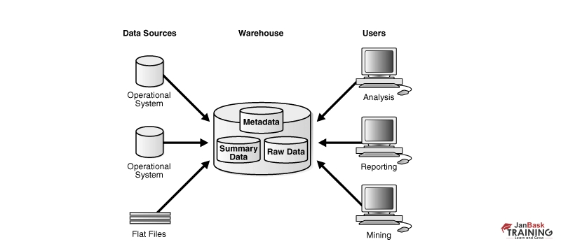
Data Warehouse Administrator

DBAs are frequently employed to carry out in-depth data analytics. The person needs to be a competent DBA who knows the differences between databases supporting OLTP and data warehouses. ETL skills, knowledge of data warehousing technologies, and experience with business intelligence and query tools are required. Data warehousing, etc., specialized database design.
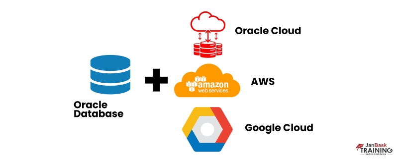
Cloud DBA

With database-as-a-service (DBaaS), the cloud provider will be responsible for some traditional DBA tasks. DBaaS is a cloud computing managed service that prepares access to a database without needing the set-up of physical hardware, the installation of software, or the configuration of the database.

cta14 icon

SQL Testing Training

  • Personalized Free Consultation
  • Access to Our Learning Management System
  • Access to Our Course Curriculum
  • Be a Part of Our Free Demo Class

Conclusion

The blog gives us a sneak peek at Database administrators and their various scopes of work. It also gives us an idea about the different types of DBAs and what they each do. The blog is an exciting read for those interested in database administration. Multiple courses are available if you want to be an expert in this field and be a Microsoft SQL Professional.

Trending Courses

Cyber Security icon

Cyber Security

  • Introduction to cybersecurity
  • Cryptography and Secure Communication 
  • Cloud Computing Architectural Framework
  • Security Architectures and Models
Cyber Security icon1

Upcoming Class

2 days 20 Sep 2025

QA icon

QA

  • Introduction and Software Testing
  • Software Test Life Cycle
  • Automation Testing and API Testing
  • Selenium framework development using Testing
QA icon1

Upcoming Class

4 days 22 Sep 2025

Salesforce icon

Salesforce

  • Salesforce Configuration Introduction
  • Security & Automation Process
  • Sales & Service Cloud
  • Apex Programming, SOQL & SOSL
Salesforce icon1

Upcoming Class

1 day 19 Sep 2025

Business Analyst icon

Business Analyst

  • BA & Stakeholders Overview
  • BPMN, Requirement Elicitation
  • BA Tools & Design Documents
  • Enterprise Analysis, Agile & Scrum
Business Analyst icon1

Upcoming Class

1 day 19 Sep 2025

MS SQL Server icon

MS SQL Server

  • Introduction & Database Query
  • Programming, Indexes & System Functions
  • SSIS Package Development Procedures
  • SSRS Report Design
MS SQL Server icon1

Upcoming Class

1 day 19 Sep 2025

Data Science icon

Data Science

  • Data Science Introduction
  • Hadoop and Spark Overview
  • Python & Intro to R Programming
  • Machine Learning
Data Science icon1

Upcoming Class

8 days 26 Sep 2025

DevOps icon

DevOps

  • Intro to DevOps
  • GIT and Maven
  • Jenkins & Ansible
  • Docker and Cloud Computing
DevOps icon1

Upcoming Class

-1 day 17 Sep 2025

Hadoop icon

Hadoop

  • Architecture, HDFS & MapReduce
  • Unix Shell & Apache Pig Installation
  • HIVE Installation & User-Defined Functions
  • SQOOP & Hbase Installation
Hadoop icon1

Upcoming Class

8 days 26 Sep 2025

Python icon

Python

  • Features of Python
  • Python Editors and IDEs
  • Data types and Variables
  • Python File Operation
Python icon1

Upcoming Class

2 days 20 Sep 2025

Artificial Intelligence icon

Artificial Intelligence

  • Components of AI
  • Categories of Machine Learning
  • Recurrent Neural Networks
  • Recurrent Neural Networks
Artificial Intelligence icon1

Upcoming Class

16 days 04 Oct 2025

Machine Learning icon

Machine Learning

  • Introduction to Machine Learning & Python
  • Machine Learning: Supervised Learning
  • Machine Learning: Unsupervised Learning
Machine Learning icon1

Upcoming Class

29 days 17 Oct 2025

 Tableau icon

Tableau

  • Introduction to Tableau Desktop
  • Data Transformation Methods
  • Configuring tableau server
  • Integration with R & Hadoop
 Tableau icon1

Upcoming Class

8 days 26 Sep 2025